TagBox - Appearance Customization
- 4 minutes to read
The DevExpress Blazor TagBox component allows you to customize its appearance: the size, the appearance of the edit box, items, and column cells. This topic lists available options.
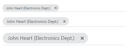
Size Modes
Use the SizeMode property to specify a TagBox size. The following code snippet applies different size modes to TagBox components:
@using StaffData

<DxTagBox Data="@Staff.DataSource"
          TextFieldName="@nameof(Person.Text)"
          @bind-Values="@SelectedStaff"
          SizeMode="SizeMode.Small"></DxTagBox>

<DxTagBox Data="@Staff.DataSource"
          TextFieldName="@nameof(Person.Text)"
          @bind-Values="@SelectedStaff"
          SizeMode="SizeMode.Medium"></DxTagBox>

<DxTagBox Data="@Staff.DataSource"
          TextFieldName="@nameof(Person.Text)"
          @bind-Values="@SelectedStaff"
          SizeMode="SizeMode.Large"></DxTagBox>

@code {
    IEnumerable<Person> SelectedStaff = new List<Person>() { Staff.DataSource[0] };
}
For additional information, refer to the following help topics:
Drop-Down List Width
Use the DropDownWidthMode property to specify the width of the drop-down list. The following values are available:
ContentOrEditorWidth(Default) - The list displays item text completely. The minimum list width matches the editor.ContentWidth- The list width is equal to the width of the longest list item.EditorWidth- The list width matches the editor. If item text does not fit the editor width, item text is displayed across multiple lines.
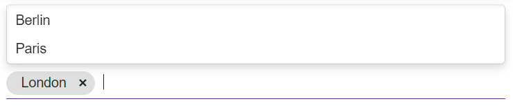
Drop-Down Window Direction
Use the DropDownDirection property to specify the direction in which the TagBox’s drop-down window is displayed relative to the input element. The default value is Down. The following code changes the direction to Up:
<DxTagBox Data="@Cities" @bind-Values="@Values" DropDownDirection="DropDownDirection.Up" />

@code {
    IEnumerable<string> Cities = new List<string>() {
        "London",
        "Berlin",
        "Paris",
    };

    IEnumerable<string> Values { get; set; }
}
Note
If the editor is close to a browser window’s edge and there is not enough space to display the drop-down window in the specified direction, the drop-down window is displayed in the opposite direction.
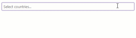
Clear Button and Placeholder
Set the ClearButtonDisplayMode property to Auto to show the Clear button when the TagBox has tags. Users can click this button to clear all the displayed tags (set the Tags property to null).
Use the NullText property to display the prompt text (placeholder) in TagBox when its Tags property is set to null.
<DxTagBox NullText="Select countries..."
          Data="@CountryData.Countries"
          @bind-Values="@SelectedCountries"
          TextFieldName="@nameof(Country.CountryName)"
          ClearButtonDisplayMode="DataEditorClearButtonDisplayMode.Auto">
</DxTagBox>

@code {
    IEnumerable<Country> SelectedCountries { get; set; }
}
Templates
TagBox templates are RenderFragment<TValue> properties. They replace the default content area rendering and allow you to arrange custom content in TagBox elements. For additional information, review the following topic: TagBox - Templates.