Popup
- 2 minutes to read
The Popup component is a pop-up window that overlays the current view.
Get Started Video
API Reference
Refer to the following list for the component API reference: DxPopup Members.
Features
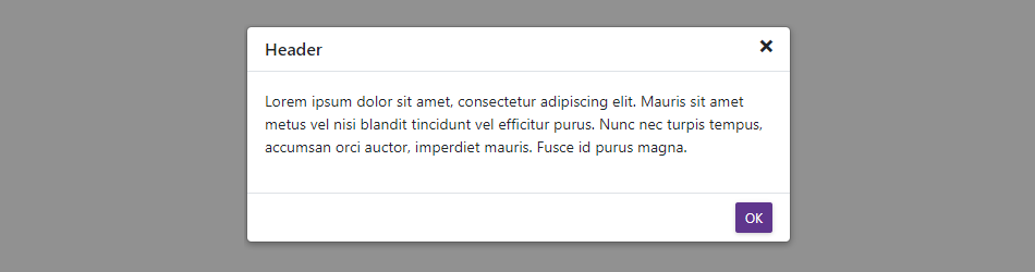
Popup Content and Appearance
The pop-up window consists of the header, body, and footer elements. Set the ShowHeader to false to hide the header and ShowFooter properties to true to display the footer.
HeaderText, BodyText, and FooterText properties specify text displayed in the Popup elements. You can also apply custom CSS rules to Popup elements: use BodyCssClass, HeaderCssClass, and FooterCssClass properties. To add custom content, use templates.
Horizontal and Vertical Alignment
Specify HorizontalAlignment and VerticalAlignment properties to position the Popup on the screen. You can also use PositionX and PositionY to display the component at specific coordinates.
Dragging
Activate the AllowDrag option to allow users to drag the pop-up window by its header to a new position. If you disable the AllowDragByHeaderOnly option, users can start dragging by any element – header, body, or footer.
Sizing
You can specify the component’s width, height, and their minimum and maximum values. Enable the AllowResize option to allow users to resize Popup by its edges and corners.
Localization
The Popup component’s UI elements such as labels, context menus, and error messages are displayed in English. Localization automatically adapts the component to the user’s preferred language.
DevExpress components include predefined satellite resource assemblies for German, Spanish, and Japanese. Use the DevExpress Localization Service to create and download a custom set of satellite assemblies, and modify resources.