Flyout
- 2 minutes to read
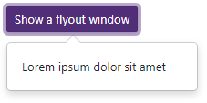
The Flyout component allows you to create a flyout window in your Blazor application.
API Reference
Refer to the following list for the component API reference: DxFlyout Members.
Features
Flyout Content and Appearance
The Flyout component consists of the header, body, and footer elements. The header and footer are initially hidden. Set the HeaderVisible and FooterVisible properties to true to display these elements.
HeaderText, BodyText, and FooterText properties specify text displayed in the Flyout elements. You can also apply custom CSS rules to Flyout elements: use BodyCssClass, HeaderCssClass, and FooterCssClass properties. To add custom content, use templates.
Relative Position
Use the Position property to specify the Flyout position relative to a target element or to a rectangle object.
Automatic Position Adjustment
The Flyout can recalculate its position in response to page layout changes (for instance, when a user scrolls or resizes the page). Use the RestrictionMode property to restrict the Flyout position and the FitToRestriction property to specify whether the Flyout can overlap restriction boundaries.
Localization
The Flyout component’s UI elements such as labels, context menus, and error messages are displayed in English. Localization automatically adapts the component to the user’s preferred language.
DevExpress components include predefined satellite resource assemblies for German, Spanish, and Japanese. Use the DevExpress Localization Service to create and download a custom set of satellite assemblies, and modify resources.