Columns in Blazor TreeList
- 19 minutes to read
DevExpress Blazor TreeList supports several column types: data columns, selection columns, and band columns. You can declare columns within the Columns template.
Column Types
The DevExpress Blazor TreeList component supports the following column types:
Data column
Data columns get their values from the bound data source. Declare a DxTreeListDataColumn object in the Columns template and specify the FieldName property to bind the column to a data field.
The TreeList generates a column caption based on the assigned field’s name. The TreeList adds a space between parts of the field name that begin with an uppercase letter. For instance, the “Employee Name“ caption is displayed for the EmployeeName field. Use the Caption property to specify a custom column name.
@inject EmployeeTaskService EmployeeTaskService

<DxTreeList Data="TreeListData" KeyFieldName="Id" ParentKeyFieldName="ParentId">
    <Columns>
        <DxTreeListDataColumn FieldName="Name" Caption="Task" />
        <DxTreeListDataColumn FieldName="EmployeeName" />
        <DxTreeListDataColumn FieldName="StartDate" />
        <DxTreeListDataColumn FieldName="DueDate" />
    </Columns>
</DxTreeList>

@code {
    List<EmployeeTask> TreeListData { get; set; }

    protected override void OnInitialized() {
        TreeListData = EmployeeTaskService.GenerateData();
    }
}

Selection Column
Declare a DxTreeListSelectionColumn object in the Columns template to display a selection column.
<DxTreeList Data="TreeListData" KeyFieldName="Id" ParentKeyFieldName="ParentId">
    <Columns>
        <DxTreeListSelectionColumn Width="50" />
        <!-- ... -->
    </Columns>
</DxTreeList>
When the SelectionMode property is set to Multiple (the default value), the selection column displays checkboxes. Users can click them to select and deselect individual rows.

In Multiple selection mode, the selection column displays the Select All checkbox in the column header. A user can click this checkbox to select or deselect all rows on the current page or on all treelist pages depending on the SelectAllCheckboxMode property value. Available property values are as follows:
- Page
- The Select All checkbox does not affect child rows of collapsed items and selects/deselects rows on the current page only.
- AllPages
- The Select All checkbox affects child rows of collapsed items and selects/deselects all rows on all pages.
- Mixed
- The Select All checkbox does not affect child rows of collapsed items and selects/deselects rows on the current page only. An additional drop-down button displays a context menu that allows users to select and deselect all rows on all pages.
<DxTreeList Data="TreeListData"
            KeyFieldName="Id"
            ParentKeyFieldName="ParentId"
            SelectAllCheckboxMode="TreeListSelectAllCheckboxMode.Mixed">
    <Columns>
        <!-- ... -->
    </Columns>
</DxTreeList>

Note
The Select All checkbox functionality has limitations. For more information, refer to the following section: Selection Limitations.
To hide the Select All checkbox, disable the column’s AllowSelectAll option.
When the SelectionMode property is set to Single, the selection column displays radio buttons. Users can click a button to select one row at a time.
<DxTreeList Data="TreeListData"
            KeyFieldName="Id"
            ParentKeyFieldName="ParentId"
            SelectionMode="TreeListSelectionMode.Single">
    <Columns>
        <DxTreeListSelectionColumn />
        <!-- ... -->
    </Columns>
</DxTreeList>

Band Column (Header Bands)
You can combine columns into logical groups called bands. To create such a group, declare a DxTreeListBandColumn object and specify child columns in the Columns template. You can create as many nesting levels as your business task requires.

<DxTreeList Data="TreeListData" KeyFieldName="ID" ParentKeyFieldName="RegionID">
    <Columns>
        <DxTreeListBandColumn Caption="Sales">
            <Columns>
                <DxTreeListDataColumn FieldName="Region" />
                <DxTreeListDataColumn FieldName="MarchSales" Caption="March" DisplayFormat="c0" />
                <DxTreeListDataColumn FieldName="SeptemberSales" Caption="September" DisplayFormat="c0" />
            </Columns>
        </DxTreeListBandColumn>
        <DxTreeListBandColumn Caption="Year-Over-Year Comparison">
            <Columns>
                <DxTreeListDataColumn FieldName="MarchChange" Caption="March" DisplayFormat="p2" />
                <DxTreeListDataColumn FieldName="SeptemberChange" Caption="September" DisplayFormat="p2" />
            </Columns>
        </DxTreeListBandColumn>
        <DxTreeListDataColumn FieldName="MarketShare" DisplayFormat="p0" />
    </Columns>
</DxTreeList>

@code {
    object TreeListData { get; set; }
    protected override void OnInitialized() {
        TreeListData = SalesByRegionDataProvider.GenerateData();
    }
}
Column Settings
Column Order
TreeList layout can include multiple column zones. The display order of zones is as follows:
In a zone, the TreeList component displays columns based on their visible indexes in the following order:
Columns with non-negative visible indexes. The leftmost column has the smallest index value.
Columns with unset and negative visible indexes. Columns appear in the same order as in treelist markup.
Users can reorder columns by dragging headers within the column header panel or in the column chooser. Set the DxTreeList.AllowColumnReorder or DxTreeListColumn.AllowReorder property to false to prevent users from reordering columns.
Column Width
DxTreeList uses the fixed table layout algorithm to render HTML, and column widths never depend on the column content - the component does not adjust column width based on column content automatically. Refer to the following topic for more information about treelist layout specifics: Column Layout Specifics.
You can use the following column properties to specify the treelist column layout:
- Width
- Specifies the column’s width in CSS units.
- MinWidth
- Specifies a column’s minimum width in pixels.
Note that a non-empty band ignores these properties. The band width is the total width of nested column widths.
You can also call the AutoFitColumnWidths() method to adjust column widths to their content automatically. The following example calls the AutoFitColumnWidths method to calculate initial optimal column widths:
<DxTreeList @ref="TreeList" Data="Data" KeyFieldName="Id" ParentKeyFieldName="ParentId">
    <Columns>
        <DxTreeListDataColumn FieldName="Name" Caption="Task" Width="100px" />
        <DxTreeListDataColumn FieldName="EmployeeName" Width="100px"/>
        <DxTreeListDataColumn FieldName="StartDate" />
        <DxTreeListDataColumn FieldName="DueDate" />
    </Columns>
</DxTreeList>

@code {
    ITreeList TreeList { get; set; }
    List<EmployeeTask> Data { get; set; }

    protected override void OnInitialized() {
        Data = EmployeeTaskService.GenerateData();
    }
    protected override void OnAfterRender(bool firstRender) {
        if(firstRender) {
            TreeList.AutoFitColumnWidths();
        }
    }
}
Column Resize
Use the ColumnResizeMode property to allow users to resize treelist columns. If allowed, the following resize operations are available to users:
- Drag a column header’s right border.
- Double-click a column’s right border to apply the optimal width based on the column’s content.
You can set the ColumnResizeMode property to one of the following values:
- Disabled
- A user cannot resize columns.
- NextColumn
- When a user resizes a column, the width of the column to the right changes (considering the MinWidth value), but the TreeList’s total width does not change. Users cannot change the width of the rightmost column.
- ColumnsContainer
- When a user resizes a column, all other columns retain their widths, but the width of the container that stores all TreeList columns changes.
Cell Text Overflow and Alignment
When a value does not fit into a cell as a single line, the cell displays multiple lines of text. Set the TextWrapEnabled property to false to disable word wrap (trim extra words). Instead of trimmed characters, the TreeList component displays an ellipsis. Users can hover over the cell to display complete cell text in a tooltip.

Use one of the following properties to align text in data cells or column captions:

Fixed (Anchored) Columns
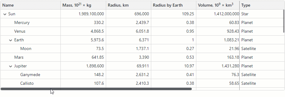
If the combined column width exceeds the size of the component, DxTreeList displays a horizontal scrollbar. If you want a column to always stay within the view, regardless of horizontal scrolling, anchor that column to the component’s left or right edge.
Users can reorder and resize fixed columns. They can control their visibility in the column chooser. However, users cannot move regular columns to a fixed column zone and vice versa.
Set a column’s FixedPosition property to Left or Right to freeze the column.
The following code snippet anchors (fixes) Name and Type columns to the treelist’s left and right edges:
<DxTreeList Data="Data" ChildrenFieldName="Satellites">
<Columns>
<DxTreeListDataColumn FieldName="Name" Width="200px"
FixedPosition="TreeListColumnFixedPosition.Left" />
<DxTreeListDataColumn FieldName="TypeOfObject" Caption="Type" Width="150px"
FixedPosition="TreeListColumnFixedPosition.Right" />
<DxTreeListDataColumn FieldName="Mass10pow21kg" Width="150px">
<HeaderCaptionTemplate>Mass, 10<sup>21</sup> × kg</HeaderCaptionTemplate>
</DxTreeListDataColumn>
<DxTreeListDataColumn FieldName="MeanRadiusInKM" Caption="Radius, km" Width="150px" />
<DxTreeListDataColumn FieldName="MeanRadiusByEarth" Caption="Radius, Ratio to Earth" Width="160px" />
<DxTreeListDataColumn FieldName="Volume10pow9KM3" Width="150px">
<HeaderCaptionTemplate>Volume, 10<sup>9</sup> × km<sup>3</sup></HeaderCaptionTemplate>
</DxTreeListDataColumn>
<DxTreeListDataColumn FieldName="VolumeRByEarth" Caption="Volume, Ratio to Earth" Width="160px" />
<DxTreeListDataColumn FieldName="SurfaceGravity" Width="150px">
<HeaderCaptionTemplate>Gravity, m/s<sup>2</sup></HeaderCaptionTemplate>
</DxTreeListDataColumn>
<DxTreeListDataColumn FieldName="SurfaceGravityByEarth" Caption="Gravity, Ratio to Earth" Width="160px" />
</Columns>
</DxTreeList>
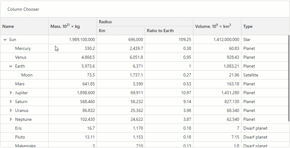
Column Chooser
The column chooser is a pop-up window that lists all treelist columns (data, selection, and band) unless a column’s or its parent band’s ShowInColumnChooser property is set to false.
<DxTreeList Data="Data" ChildrenFieldName="Satellites">
<Columns>
<DxTreeListDataColumn FieldName="Name" FixedPosition="TreeListColumnFixedPosition.Left" />
<DxTreeListDataColumn FieldName="TypeOfObject" FixedPosition="TreeListColumnFixedPosition.Right" Caption="Type"/>
<DxTreeListDataColumn FieldName="Mass10pow21kg" AllowReorder="false">
<HeaderCaptionTemplate>Mass, 10<sup>21</sup> × kg</HeaderCaptionTemplate>
</DxTreeListDataColumn>
<DxTreeListBandColumn Caption="Radius">
<Columns>
<DxTreeListDataColumn FieldName="MeanRadiusInKM" Caption="Km" />
<DxTreeListDataColumn FieldName="MeanRadiusByEarth" Caption="Ratio to Earth"/>
</Columns>
</DxTreeListBandColumn>
<DxTreeListDataColumn FieldName="Volume10pow9KM3" Caption="Mass" ShowInColumnChooser="false">
<HeaderCaptionTemplate>Volume, 10<sup>9</sup> × km<sup>3</sup></HeaderCaptionTemplate>
</DxTreeListDataColumn>
<DxTreeListDataColumn FieldName="SurfaceGravity" Caption="Gravity" Visible="false" />
</Columns>
</DxTreeList>

The column chooser allows users to perform the following actions:
- Show or hide columns
- A user can select or clear a checkbox in the chooser to show or hide the corresponding column. This action changes the column’s Visible property value.
- Reorder columns
- A user can move a column to a new position within the column chooser. Such an operation changes the column’s VisibleIndex property value. Note that the chooser draws a thick line between regular and fixed columns. Columns cannot cross that line. Non-reorderable columns have a lock icon.
Call any of the ShowColumnChooser method overloads to display the column chooser.
<DxTreeList @ref="TreeList" Data="Data" ChildrenFieldName="Satellites">
    <Columns>
        <!-- ... -->
    </Columns>
    <ToolbarTemplate>
        <DxToolbar ItemRenderStyleMode="ToolbarRenderStyleMode.Plain">
            <DxToolbarItem Text="Column Chooser" Click="ColumnChooserButton_Click" />
        </DxToolbar>
    </ToolbarTemplate>
</DxTreeList>

@code {
    ITreeList TreeList { get; set; }

    void ColumnChooserButton_Click() {
        TreeList.ShowColumnChooser();
    }
}
To customize the appearance of column chooser items, handle the CustomizeElement event. The following code snippet highlights fixed columns in the column chooser.
<style>
    .highlighted-item {
        background-color: lightyellow !important;
    }
</style>

<DxTreeList @ref="@TreeList"
            Data="TreeListData"
            KeyFieldName="Id"
            ParentKeyFieldName="ParentId"
            CustomizeElement="CustomizeColumnChooserItems">
    <Columns>
        <DxTreeListSelectionColumn FixedPosition="TreeListColumnFixedPosition.Left" />
        <DxTreeListDataColumn FieldName="Name" Caption="Task" FixedPosition="TreeListColumnFixedPosition.Right" />
        <DxTreeListDataColumn FieldName="EmployeeName" />
        <DxTreeListDataColumn FieldName="StartDate" />
        <DxTreeListDataColumn FieldName="DueDate" />
    </Columns>
</DxTreeList>

@code {
    //...
    void CustomizeColumnChooserItems(TreeListCustomizeElementEventArgs e) {
        if(e.ElementType == TreeListElementType.ColumnChooserItem && e.Column.FixedPosition != TreeListColumnFixedPosition.None) {
            e.CssClass = "highlighted-item";
        }
    }
}

Task-Based Examples
This section contains code samples that demonstrate column functionality.
Create Columns at Runtime
The following code snippet creates TreeList columns at runtime. Note that you can combine columns declared in markup and created at runtime.
@using System.Reflection
@using System.ComponentModel
@inject EmployeeTaskService EmployeeTaskService

<DxTreeList @ref="@TreeList"
            Data="@Data"
            KeyFieldName="@keyFieldName"
            ParentKeyFieldName="@parentKeyFieldName">
    <Columns>
        <DxTreeListSelectionColumn />
        @BuildTreeListColumns(typeof(EmployeeTask))
    </Columns>
</DxTreeList>

@code {
    ITreeList TreeList { get; set; }
    List<EmployeeTask> Data { get; set; }
    string keyFieldName = "Id";
    string parentKeyFieldName = "ParentId";

    protected override void OnInitialized() {
        Data = EmployeeTaskService.GenerateData();
    }
    RenderFragment BuildTreeListColumns(Type itemType) {
        var props = TypeDescriptor.GetProperties(itemType);
        return b => {
            foreach (PropertyDescriptor prop in props) {
                if (prop.Name != keyFieldName && prop.Name != parentKeyFieldName) {
                    b.OpenComponent(0, typeof(DxTreeListDataColumn));
                    b.AddAttribute(1, "FieldName", prop.Name);
                    b.CloseComponent();
                }
            }
        };
    }
}
Display Text Instead of Checkboxes in a Column with Boolean Values
The treelist shows checkboxes instead of column cell values if a column is bound to the Boolean or Nullable Boolean type.
Set the ShowCheckBoxInDisplayMode property to false to show text strings instead of checkboxes in display mode. To customize these strings, specify the following properties:
<DxTreeList Data="Data"
            KeyFieldName="Id"
            ParentKeyFieldName="ParentId">
    <Columns>
        <DxTreeListDataColumn FieldName="Name" Caption="Task" />
        <DxTreeListDataColumn FieldName="EmployeeName" />
        <DxTreeListDataColumn FieldName="StartDate" />
        <DxTreeListDataColumn FieldName="DueDate" />
        <DxTreeListDataColumn FieldName="Completed" Caption="Progress">
            <EditSettings>
                <DxCheckBoxSettings ShowCheckBoxInDisplayMode="false"
                                    CheckedDisplayText="Completed"
                                    UncheckedDisplayText="In progress" />
            </EditSettings>
        </DxTreeListDataColumn>
    </Columns>
</DxTreeList>

@code {
    List<EmployeeTask> Data { get; set; }

    protected override void OnInitialized() {
        Data = EmployeeTaskService.GenerateData();
    }
}

Sort Columns in Alphabetical Order in Column Chooser
The TreeList displays columns in the column chooser in the same order as they appear in the TreeList. This allows users to reorder TreeList columns with the column chooser.
If the column chooser in your application does not require the column reorder functionality, you can implement a custom column chooser that displays columns alphabetically.
In the following code snippet, the DxListBox<TData, TValue> component lists treelist columns. When a user selects or deselects List Box items, the SelectedItemsChanged event fires. The event handler changes the Visible property value according to the current item selection.
<style>
    .my-list-box{
        width: 300px;
        height: 182px;
        margin-bottom: 10px;
    }
</style>

<DxListBox CssClass="my-list-box"
           Data="AllColumns"
           SelectionMode="ListBoxSelectionMode.Multiple"
           ShowCheckboxes="true"
           TextFieldName="Caption"
           Values="VisibleColumns"
           ValuesChanged="@((IEnumerable<ITreeListColumn> values) => SelectedItemsChanged(values))" />
<DxTreeList @ref="TreeList"
            Data="Data"
            KeyFieldName="Id"
            ParentKeyFieldName="ParentId">
    <Columns>
        <DxTreeListSelectionColumn Caption="Selection Column" />
        <DxTreeListDataColumn FieldName="Name" Caption="Task" Width="40%" />
        <DxTreeListDataColumn FieldName="EmployeeName" Caption="Employee Name" />
        <DxTreeListDataColumn FieldName="StartDate" Caption="Start Date" />
        <DxTreeListDataColumn FieldName="DueDate" Caption="Due Date" />
        <DxTreeListDataColumn FieldName="Completed" Caption="Progress" />
    </Columns>
</DxTreeList>

@code {
    ITreeList TreeList { get; set; }
    object Data { get; set; }
    public IEnumerable<ITreeListColumn> AllColumns { get; set; }
    public IEnumerable<ITreeListColumn> VisibleColumns { get; set; }

    protected override void OnInitialized() {
        Data = EmployeeTaskService.GenerateData();
    }
    void SelectedItemsChanged(IEnumerable<ITreeListColumn> values) {
        TreeList.BeginUpdate();
        foreach (var column in TreeList.GetColumns())
            column.Visible = values.Contains(column);
        TreeList.EndUpdate();
        VisibleColumns = values;
    }

    protected override void OnAfterRender(bool firstRender) {
        if (firstRender) {
            AllColumns = TreeList.GetColumns().OrderBy(i => i, ColumnsComparerImpl.Default).ToList();
            VisibleColumns = TreeList.GetVisibleColumns();
            StateHasChanged();
        }
    }

    class ColumnsComparerImpl : IComparer<ITreeListColumn> {
        public static IComparer<ITreeListColumn> Default { get; } = new ColumnsComparerImpl();
        ColumnsComparerImpl() { }
        int IComparer<ITreeListColumn>.Compare(ITreeListColumn x, ITreeListColumn y) {
            if (x is ITreeListSelectionColumn)
                return -1;
            if (x is ITreeListDataColumn xData && y is ITreeListDataColumn yData) {
                var xName = !string.IsNullOrEmpty(xData.Caption) ? xData.Caption : xData.FieldName;
                var yName = !string.IsNullOrEmpty(yData.Caption) ? yData.Caption : yData.FieldName;
                return string.Compare(xName, yName);
            }
            return 0;
        }
    }
}

Display an Image Column
To display an image from a binary source, place an <img> element into CellDisplayTemplate and specify the src property. Review the example below:
<DxTreeListDataColumn FieldName="ImageData">
    <CellDisplayTemplate>
        <img style="width: 300px;" src="@GetImageSource(context)" />
    </CellDisplayTemplate>
</DxTreeListDataColumn>
const string ImageSourceFormat = "data:image/gif;base64,{0}";

void GetImageSource(TreeListCellDisplayTemplateContext context) {
    return string.Format(ImageSourceFormat, Convert.ToBase64String((byte[])context.Value));
}