Blazor TreeList
- 9 minutes to read
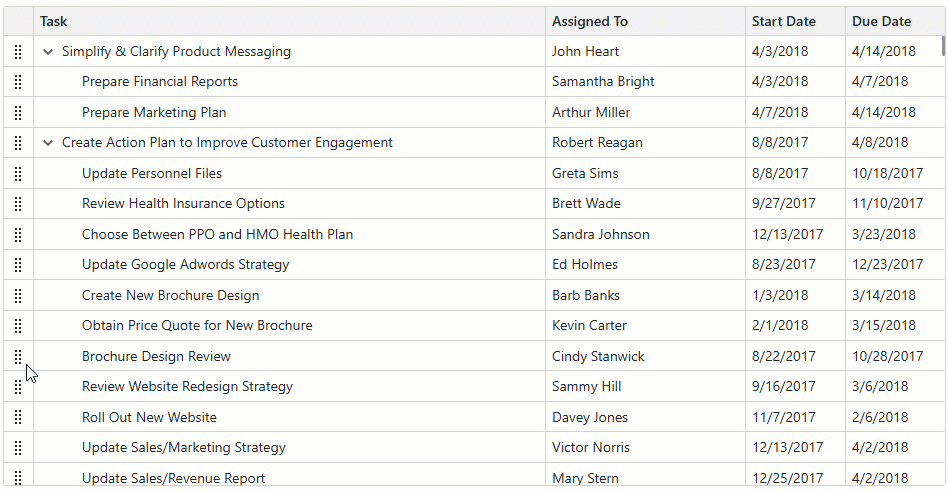
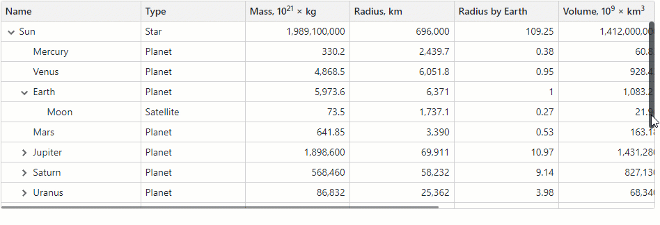
The DevExpress TreeList for Blazor (DxTreeList) combines the power of a traditional Grid with a TreeView in a single UI component. Use our TreeList component to display, manage, and shape hierarchical data.

API Reference
Refer to the following list for the component API reference: DxTreeList Members.
Data Binding
The DevExpress Blazor TreeList supports various data binding scenarios:
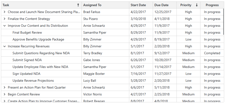
Sort Data
Users can sort data by an unlimited number of columns. The sort glyph indicates the current sort order (ascending or descending). You can also sort data in code.
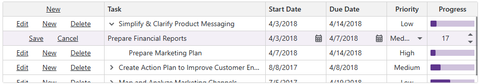
Edit Data
DevExpress Blazor TreeList supports multiple data edit modes:
- Inline Edit Form
- The TreeList displays the edit form instead of the edited data row.
- Pop-Up Edit Form
- The TreeList displays the edit form in a pop-up window.
- Inline Edit Row
- The TreeList displays inline editors instead of the edited row.
- Cell Editing
- The TreeList displays an in-place editor instead of focused cell content. Unlike other modes, the TreeList in
EditCellmode allows users to click a data cell to edit it. The TreeList validates and saves all cell values simultaneously when focus leaves the edited row. - Batch Editing
- You can implement batch data editing based on the
EditCellmode. Batch data editing allows users to accumulate changes in memory and post them to the database when desired.
Validate User Input
The TreeList uses the standard DataAnnotationsValidator to validate user input (based on data annotation attributes defined in an edit model). Once a user removes focus from data editors or attempts to save an edited row, the TreeList component marks editors with colored outlines or displays validation icons.
You can implement your custom validator components and declare them in the CustomValidators template. To disable input validation, set the ValidationEnabled option to false.

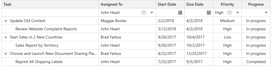
Filter Data
The DevExpress Blazor TreeList ships with the following elements that allow users to filter data.
Filter Row
The filter row displays in-place editors where users can type filter values. You can also manage filter options in code.
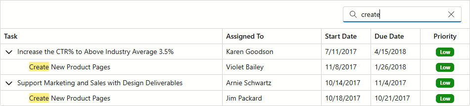
Search Box
Users can type text in the search box to filter and highlight data. You can use the SearchText property to specify search text in code.
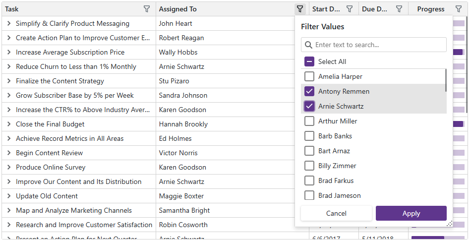
Column Filter Menu
The Excel-inspired filter menu displays unique column values as a checklist with a Select All option. An integrated search box is also available. You can modify the value list or implement a template to completely customize the menu.
Filter in Code
The DevExpress Blazor TreeList allows you to filter its data in code. To apply filter criteria, create a criteria operator object that specifies the filter expression and send this object to one of the following methods:
- SetFilterCriteria
- Applies a filter to TreeList data.
- SetFieldFilterCriteria
- Applies a filter to the specified data field.
These methods allow you to filter TreeList data by every data source field, including fields that are not displayed in the TreeList. When a filter is applied, the TreeList raises the FilterCriteriaChanged event.
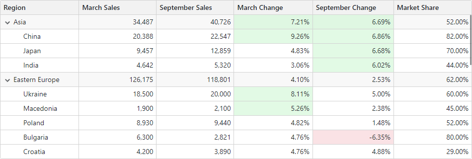
Summary
You can compute total summaries across all TreeList records. The TreeList includes predefined aggregate functions: Sum, Min, Max, Avg, and Count. In addition to these functions, custom logic can also be used to calculate summary values.
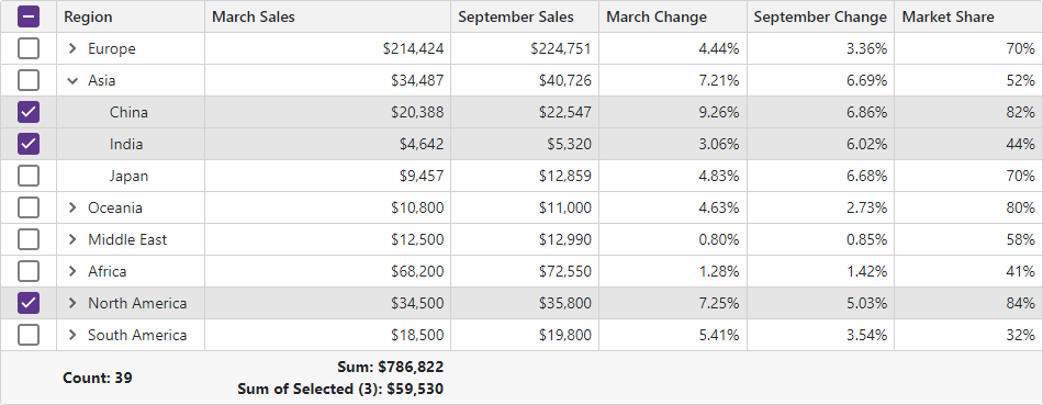
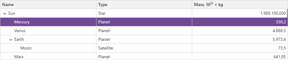
Selection
The DevExpress Blazor TreeList supports single and multiple row selection. Users can click rows or use a specially-designed column to select/deselect records. You can also manage selection in code.
Focus
Set the FocusedRowEnabled property to true to display the focused row in the TreeList. Users can click a row to focus it. You can call the SetFocusedRowIndex(Int32) method to move focus in code. When the focused row changes, the component raises the FocusedRowChanged event.
Templates
The TreeList implements a number of template properties that allow you to customize content and appearance of different TreeList elements. Templates implement a context parameter that contains element-related data and a reference to the TreeList component, so you can access its API.
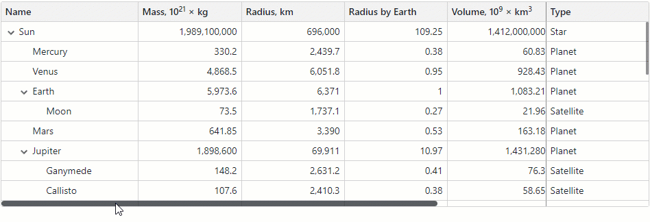
Columns
The DevExpress Blazor TreeList includes different column types:
- Data column
- Obtains values from the bound data source.
- Command column
- Displays CRUD-related buttons (New, Edit, and Delete) and the Clear button that resets values in the filter row.
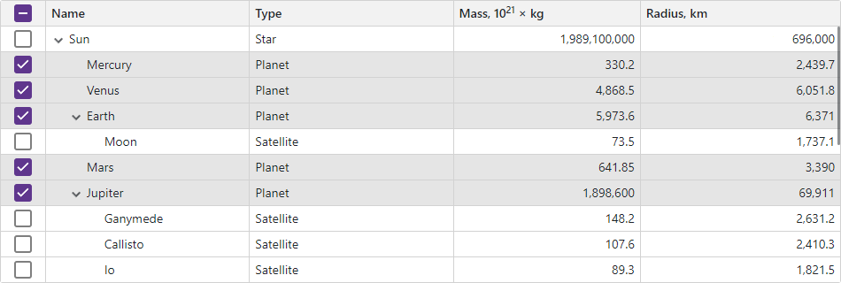
- Selection column
- Allows users to select and deselect rows. This column displays checkboxes in multiple selection mode and radio buttons in single selection mode.
- Band Column
- Allows you to combine columns into logical groups called bands. Each group has its own header.
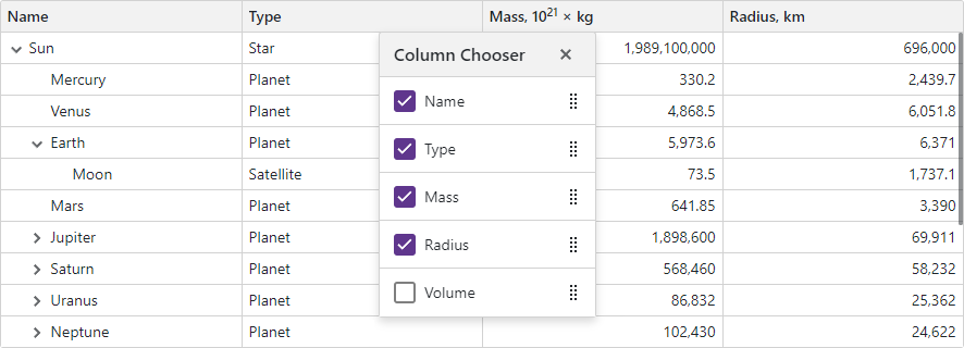
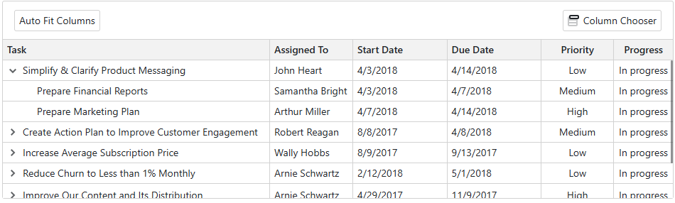
Column Reorder
Users can reorder TreeList columns at runtime. The TreeList also supports the Column Chooser that allows users to manage column visibility and position. You can prevent users from reordering columns.
Column Resize
Users can resize columns at runtime. You can also call the AutoFitColumnWidths method to adjust column widths to their content.
Fixed Columns
The TreeList allows you to anchor columns to the TreeList’s left or rightmost edge. The anchored columns remain visible when a user scrolls the TreeList horizontally. Users can display and hide fixed columns or change their order and size. However, users cannot move regular columns to a fixed column zone and vice versa.
Set a column’s FixedPosition property to Left or Right to freeze the column.
Toolbar
You can use the ToolbarTemplate property to add a toolbar at the top edge of a TreeList component. Implement required commands and thus make them immediately available to users. The embedded toolbar automatically synchronizes its layout and styles with the TreeList component.
Save and Restore Layout
You can save and restore the TreeList’s layout. Layout information includes the current page, column sort order and direction, column position, and filter values.
To save and restore the component layout, handle the following events:
- LayoutAutoSaving
- Raised when layout settings change. The event’s Layout argument contains a TreeListPersistentLayout object with updated layout settings. Save this object to the desired storage.
- LayoutAutoLoading
- Raised when the TreeList is initialized. The component starts loading the layout after it applies the initial state specified in the markup. To load layout settings from a previously saved TreeListPersistentLayout object, assign it to this event’s Layout argument.
You can call the SaveLayout and LoadLayout methods to save and restore the TreeList layout on demand.
Export Data
The TreeList allows you to export data to XLS, XLSX, CSV, and PDF. The output file reflects the current filter settings and sort order. Call the following methods to export data:
All these methods accept a parameter that allows you to customize export settings.
The TreeList exports data from every data column. A column whose Visible property is set to false is hidden in the document (has a zero width). Set a column’s ExportEnabled property to false to prevent column data from being exported.
Appearance
Handle the CustomizeElement event to customize the appearance of most TreeList UI elements based on custom conditions.
Size Mode
Specify the SizeMode property to display TreeList elements (for instance, text size and row height) and other built-in TreeList components (for instance, pager and buttons) in small, medium, or large predefined size.
Localization
The TreeList component’s UI elements such as labels, context menus, and error messages are displayed in English. Localization automatically adapts the component to the user’s preferred language.
DevExpress components include predefined satellite resource assemblies for German, Spanish, and Japanese. Use the DevExpress Localization Service to create and download a custom set of satellite assemblies, and modify resources.
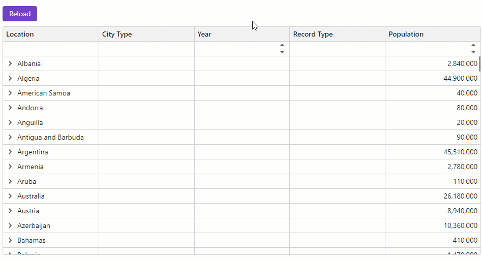
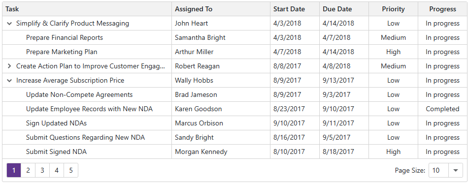
Paging and Scrolling
Paging
The DevExpress Blazor TreeList splits data rows across multiple pages and displays a pager to enable data navigation. The pager can contain the page size selector, which allows users to change page size at runtime.
Scrolling
The DevExpress Blazor TreeList ships with a built-in scrollbar. The scrollbar appears automatically if content does not fit the component container.
Virtual Scrolling
Set the VirtualScrollingEnabled property to true to enable virtual scrolling in the TreeList. In this mode, the TreeList hides the pager, lists all data rows on one page and displays the vertical scrollbar for navigation. To optimize performance, our TreeList only renders rows that appear in the component viewport.
Keyboard Support
Users can access every UI element in the TreeList with a keyboard. Keyboard navigation is implemented on the client and works seamlessly in Blazor Server apps with a slow connection.
Note
Keyboard support allows users who cannot use a mouse or rely on assistive technologies (like screen readers or switch devices) to interact with application content. Refer to the Accessibility help topic for information on other accessibility areas that we address.
Drag and Drop Rows
The DevExpress Blazor TreeList supports drag-and-drop operations. You can reorder rows, move them between components, and change the component hierarchy.