Templates in Blazor TreeList
- 10 minutes to read
TreeList templates are RenderFragment<TValue> type properties. These render fragments can contain both markup and other Razor components. A template’s Razor markup can access the implicit context parameter that is derived from the TValue type and contains template-related members.
<DxTreeList Data="TreeListData" KeyFieldName="Id" ParentKeyFieldName="ParentId">
    <Columns> @* ... *@ </Columns>
    <ToolbarTemplate>
        <DxToolbar ItemRenderStyleMode="ToolbarRenderStyleMode.Contained">
            <Items>
                <DxToolbarItem Text="Auto Fit Columns" Click="() => context.TreeList.AutoFitColumnWidths()" />
            </Items>
        </DxToolbar>
    </ToolbarTemplate>
</DxTreeList>
You can use the Context attribute to change the parameter name. This name change is important when you nest components that contain RenderFragment<TValue> properties. Otherwise, the following error can occur: The child content element ‘ChildContent’ of component ‘X’ uses the same parameter name (‘context’) ….
<DxTreeList Data="TreeListData" ChildrenFieldName="Satellites" EditMode="TreeListEditMode.EditForm">
    <Columns> @* ... *@ </Columns>
    <EditFormTemplate Context="editFormContext">
        <DxFormLayout>
            <DxFormLayoutItem Caption="Name:">
                @editFormContext.GetEditor("Name")
            </DxFormLayoutItem>
            <DxFormLayoutItem Caption="Type:">
                @editFormContext.GetEditor("TypeOfObject")
            </DxFormLayoutItem>
        </DxFormLayout>
    </EditFormTemplate>
</DxTreeList>
Data Column Templates
This section lists data column properties that allow you to create templates for various elements.


| Element | Property |
|---|---|
| Column Header Caption | HeaderCaptionTemplate |
| Filter Row Cell | FilterRowCellTemplate |
| Cell (Edit Mode) | CellEditTemplate |
| Cell (Display Mode) | CellDisplayTemplate |
| Column Footer | FooterTemplate |
| Column Filter Menu | FilterMenuTemplate |
Command Column Templates
This section lists command column properties that allow you to create templates for various elements.

| Element | Property |
|---|---|
| Column Header | HeaderCaptionTemplate, HeaderTemplate |
| Filter Row Cell | FilterRowCellTemplate |
| Cell (Edit Mode) | CellEditTemplate |
| Cell (Display Mode) | CellDisplayTemplate |
| Column Footer | FooterTemplate |
Selection Column Templates
This section lists selection column properties that allow you to create templates for various elements.

| Element | Property |
|---|---|
| Column Header | HeaderCaptionTemplate, HeaderTemplate |
| Filter Row Cell | FilterRowCellTemplate |
| Cell (Display Mode) | CellDisplayTemplate |
| Column Footer | FooterTemplate |
TreeList-Level Templates
This section lists template properties available on the component level. These properties serve two main purposes:
- Modify elements that are not part of columns.
- Specify templates that apply to all columns of a particular type.


| Element | TreeList Property |
|---|---|
| Search Box | SearchBoxTemplate |
| Edit Form | EditFormTemplate |
| Cell (Display Mode) | DataColumnCellDisplayTemplate |
| Cell (Edit Mode) | DataColumnCellEditTemplate |
| Empty Data Area | EmptyDataAreaTemplate |
| Column Header Caption | ColumnHeaderCaptionTemplate |
| Toolbar | ToolbarTemplate |
| Filter Row Cell | DataColumnFilterRowCellTemplate |
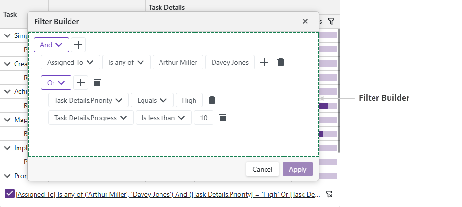
| Filter Builder | FilterBuilderTemplate |
| Column Filter Menu | DataColumnFilterMenuTemplate |
| Column Footer | ColumnFooterTemplate |
Task-Based Examples
This section contains code samples that demonstrate template functionality.
Create a Template at Runtime
You can specify a template as a method that returns required content (RenderFragment<TValue>). If the method returns null, the TreeList renders the default element.
The following code snippet demonstrates two options used to specify the template - in the markup and in the AfterRender method.
@inject EmployeeTaskService EmployeeTaskService

<DxTreeList @ref="TreeList"
            Data="TreeListData"
            KeyFieldName="Id"
            ParentKeyFieldName="ParentId"
            ShowFilterRow="true">
    <Columns>
        <DxTreeListDataColumn FieldName="Name" Caption="Task" />
        <DxTreeListDataColumn FieldName="EmployeeName" FilterRowCellTemplate="GetFilterTemplate(false)" />
        <DxTreeListDataColumn FieldName="StartDate" FilterRowCellTemplate="GetFilterTemplate(true)" />
        <DxTreeListDataColumn FieldName="DueDate" FilterRowCellTemplate="GetFilterTemplate(true)" />
    </Columns>
</DxTreeList>

@code {
    ITreeList TreeList { get; set; }
    List<EmployeeTask> TreeListData { get; set; }

    protected override void OnInitialized() {
        TreeListData = EmployeeTaskService.GenerateData();
    }
    protected override void OnAfterRender(bool firstRender) {
        if (firstRender) {
            TreeList.BeginUpdate();
            var column = TreeList.GetDataColumns().First(c => c.FieldName == "Name");
            column.CellDisplayTemplate = context => {
                return @<text><b>@context.DisplayText</b></text>;
            };
            column.FilterRowCellTemplate = GetFilterTemplate(false);
            TreeList.EndUpdate();
        }
        base.OnAfterRender(firstRender);
    }
    RenderFragment<TreeListDataColumnFilterRowCellTemplateContext> GetFilterTemplate(bool isCustom) {
        if (!isCustom) return null;
        return context => {
            return __builder => {
                <DxDateEdit Date="(DateTime?)context.FilterRowValue"
                            NullText="Select a date"
                            DateChanged="(DateTime? v) => context.FilterRowValue = v" />
            };
        };
    }
}
Custom Pager
DxTreeList does not support a template for the pager. However, you can set the PagerVisible property to false to hide the default pager and use custom components for navigation.
In the following code snippet, a custom DxPager component allows users to navigate between pages. An external <div> displays the total number of records next to the pager.
.treelist-container {
    width: 950px;
}
.pager-container {
    display: flex;
    justify-content: space-between;
    padding: 8px;
    border: 1px solid #d2d2d2;
    border-top: none;
}
<div class="treelist-container">
    <DxTreeList @ref="@TreeList"
                Data="@TreeListData"
                KeyFieldName="Id"
                ParentKeyFieldName="ParentId"
                @bind-PageIndex="@ActivePageIndex"
                PagerVisible="false"
                PageSize="@PageSize"
                FooterDisplayMode="TreeListFooterDisplayMode.Never">
    <Columns>
        <DxTreeListDataColumn FieldName="Name" Caption="Task" />
        <DxTreeListDataColumn FieldName="EmployeeName" />
        <DxTreeListDataColumn FieldName="StartDate" />
        <DxTreeListDataColumn FieldName="DueDate" />
    </Columns>
        <TotalSummary>
            <DxTreeListSummaryItem SummaryType="TreeListSummaryItemType.Count"
                                   FieldName="@RowCountField"
                                   Visible="false" />
        </TotalSummary>
</DxTreeList>
    <div class="pager-container">
        <DxPager PageCount="@PageCount" @bind-ActivePageIndex="@ActivePageIndex" />
        <div>
            Total: @TotalRecords records
        </div>
    </div>
</div>

@code {
    ITreeList TreeList { get; set; }
    List<EmployeeTask> TreeListData { get; set; }
    int PageCount { get; set; }
    int TotalRecords { get; set; }
    int PageSize { get; set; } = 5;
    int ActivePageIndex { get; set; } = 0;
    string RowCountField { get; set; } = "DueDate";

    protected override void OnInitialized() {
        TreeListData = EmployeeTaskService.GenerateData();
    }
    protected override void OnAfterRender(bool firstRender) {
        TotalRecords = (int)(TreeList.GetTotalSummaryValue(TreeList?.GetTotalSummaryItems().First()));
        PageCount = (int)Math.Ceiling((decimal)TotalRecords / PageSize);
        StateHasChanged();
        base.OnAfterRender(firstRender);
    }
}

Display Images in TreeList Cells
To display an image from a binary source, place an <img> element into CellDisplayTemplate and specify the src property. Review the following example:
<DxTreeListDataColumn FieldName="ImageData">
    <CellDisplayTemplate>
        <img style="width: 300px;" src="@GetImageSource(context)" />
    </CellDisplayTemplate>
</DxTreeListDataColumn>
const string ImageSourceFormat = "data:image/gif;base64,{0}";

void GetImageSource(TreeListCellDisplayTemplateContext context) {
    return string.Format(ImageSourceFormat, Convert.ToBase64String((byte[])context.Value));
}
Display Links in TreeList Cells
To display links in TreeList cells, implement a CellDisplayTemplate and add a link element to it.
The following code snippet displays links to Wikipedia pages:
@inject SpaceObjectDataProvider SpaceObjectDataProvider
<DxTreeList Data="TreeListData" ChildrenFieldName="Satellites">
<Columns>
<DxTreeListDataColumn FieldName="Name" />
<DxTreeListDataColumn FieldName="TypeOfObject" Caption="Type" />
<DxTreeListDataColumn FieldName="Mass10pow21kg" Caption="Mass, kg" DisplayFormat="N2">
<HeaderCaptionTemplate>Mass, 10<sup>21</sup> × kg</HeaderCaptionTemplate>
</DxTreeListDataColumn>
<DxTreeListDataColumn FieldName="MeanRadiusInKM" Caption="Radius, km" DisplayFormat="N2" />
<DxTreeListDataColumn FieldName="Volume10pow9KM3" DisplayFormat="N2">
<HeaderCaptionTemplate>Volume, 10<sup>9</sup> × km<sup>3</sup></HeaderCaptionTemplate>
</DxTreeListDataColumn>
<DxTreeListDataColumn FieldName="SurfaceGravity" DisplayFormat="N2">
<HeaderCaptionTemplate>Gravity, m/s<sup>2</sup></HeaderCaptionTemplate>
</DxTreeListDataColumn>
<DxTreeListDataColumn FieldName="WikiPage" AllowSort="false" Width="150px">
<CellDisplayTemplate><a href="@context.Value">Open Wikipedia</a></CellDisplayTemplate>
</DxTreeListDataColumn>
</Columns>
</DxTreeList>
@code {
object TreeListData { get; set; }
protected override async Task OnInitializedAsync() {
TreeListData = SpaceObjectDataProvider.GenerateData();
}
}
