Masks
- 4 minutes to read
This topic lists available mask types.
Date-Time
Date-time masks allow users to enter only date and/or time values. Users can navigate between mask sections (such as months, days, and hours) and increase/decrease section values with the Up and Down arrow keys and mouse wheel.

You can choose a mask from a number of predefined patterns or use a standard or custom date and time format string. The following components support date-time masks:
Date-Time Offset
Date-time offset masks allow users to enter only date and/or time values, including the time’s offset from Coordinated Universal Time (UTC). Users can navigate between mask sections (such as months, days, and hours) and increase/decrease section values with the Up and Down arrow keys and mouse wheel.
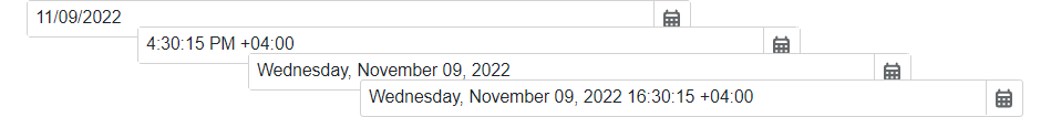
You can choose a mask from a number of predefined patterns or use a standard or custom date and time format string. The following components support date-time offset masks:
Date Only
Date only masks allow users to enter only date values. Users can navigate between mask sections (such as days and months) and increase/decrease section values with the Up and Down arrow keys and mouse wheel.
You can choose a mask from a number of predefined patterns or use a standard or custom date and time format string. The following components support date-time offset masks:
Time Only
Time only masks allow users to enter only time values. Users can navigate between mask sections (such as hours and minutes) and increase/decrease section values with the Up and Down arrow keys and mouse wheel.
You can choose a mask from a number of predefined patterns or use a standard or custom date and time format string. The following components support date-time offset masks:
Time Span
Time span masks allow users to enter only time intervals. Users can navigate between mask sections (such as days, hours, and minutes) and increase/decrease section values with the Up and Down arrow keys and mouse wheel.

You can choose a mask from a number of predefined patterns or use a standard or custom time span format string. The Masked Input component supports time span masks.
Numeric
Numeric masks allow users to enter only numeric values. Users can navigate between digits and increase/decrease digit values with the Up and Down arrow keys and mouse wheel.

You can choose a mask from a number of predefined patterns or use a standard or custom numeric format string. The following components support numeric masks:
Text
Text masks allow users to enter only strings of limited length, such as phone numbers, zip codes, and social security numbers.

To create a text mask pattern, combine metacharacters, special characters, and literal characters. You can apply the resulting mask to the Masked Input component.
Regular Expression
If the mask types listed above do not meet your requirements, you can use regular expression masks. This mask type allows you to create advanced masks of variable length with multiple acceptable patterns and a limited range of character input.

To create a regular expression mask pattern, combine metacharacters, quantifiers, and literal characters. You can apply the resulting mask to the Masked Input component.
Masked Editor Validation
You can use one of the following ways to validate masked editors (DxMaskedInput<T>, DxDateEdit<T>, DxTimeEdit<T>, and DxSpinEdit) in Blazor applications.
Standard Validation with Data Annotations
Use Blazor standard EditForm to validate masked editors based on data annotation attributes defined in your model. This approach works with standalone editors or the Form Layout component.
Mask Pattern Validation
Display a validation message when user input does not match the mask pattern. Use the InvalidInputNotificationText property to specify the error message.
DxDateEdit Example
@using System.Globalization

<DxDateEdit @bind-Date="@date"
            Mask="@DateTimeMask.ShortDate">
    <DxDateOnlyMaskProperties CaretMode="@MaskCaretMode.Advancing"
                              Culture="Culture"
                              InvalidInputNotificationText="The date is invalid."
                              UpdateNextSectionOnCycleChange="true" />
</DxDateEdit>

@code {
    DateOnly date { get; set; } = new DateOnly(2024, 6, 1);
    CultureInfo Culture = new CultureInfo("fr-FR");
}
DxMaskedInput Example
<DxMaskedInput @bind-Value="@starship.Value"
               Mask=".{6,}"
               MaskMode="MaskMode.RegEx">
    <DxRegExMaskProperties InvalidInputNotificationText="The value '{0}' is invalid. It must be at least 6 symbols." />
</DxMaskedInput>
Custom Validation
Implement custom validation logic to handle complex validation scenarios that go beyond standard data annotations or mask pattern validation.