ASPxDiagram Class
A diagram control.
Namespace: DevExpress.Web.ASPxDiagram
Assembly: DevExpress.Web.ASPxDiagram.v26.1.dll
Declaration
public class ASPxDiagram :
    ASPxDataWebControl,
    IDialogUtilsOwner,
    IParentSkinOwner,
    ISkinOwner,
    IPropertiesOwner,
IRibbonBarOwnerRemarks
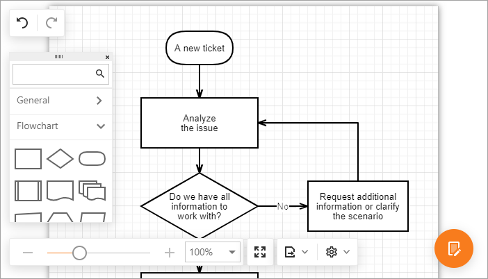
The ASPxDiagram control allows you to design diagrams, flowcharts, and org charts online, or display data diagrams without manual drawing. You can also save and load diagrams in the JSON format, or export to image formats.
The ASPxDiagram ships with a comprehensive shape library that includes business, technical and multi-purpose diagram shape types. Custom shapes are also supported.
Create a Diagram Control
Design Time
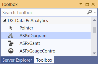
The ASPxDiagram control is available on the DX.26.1: Data & Analytics toolbox tab in the Microsoft Visual Studio IDE.
Drag the control onto a form and customize the control’s settings, or paste the control markup in the page’s source code.
Note
To properly function, DevExpress controls require that special modules, handlers and options are registered in the the Web.config file. Switch the Microsoft Visual Studio IDE to the Design tab to automatically update the Web.config file with the required DevExpress information.
<dx:ASPxDiagram ID="Diagram" runat="server">
</dx:ASPxDiagram>
Run Time
using DevExpress.Web.ASPxDiagram;
// ...
protected void Page_Load(object sender, EventArgs e) {
        ASPxDiagram diagram = new ASPxDiagram();
        diagram.ID = "ASPxDiagram1";
        // Add the created control to the page
        Page.Form.Controls.Add(diagram);
}
Client-Side API
The ASPxDiagram‘s client-side API uses JavaScript and is exposed by the ASPxClientDiagram object.
Availability | Available by default. |
Client object type | |
Access name | |
Events |
Bind to Data
The ASPxDiagram control can create diagrams from hierarchical (tree-like) and graph data structures, and automatically arrange this data on the page.
The supported data structures are listed below.
Node and Edge Data Sources
If the information about nodes is maintained separately from the information about edges, bind the control to data as follows.
- Specify a data source for shapes (NodeDataSourceID).
- Specify a data source for shape connectors (EdgeDataSourceID).
- Add mapping information for a shape’s Key and a connector’s Key, FromKey and ToKey properties.
- Optionally specify other mapping properties for shapes and mapping properties for connectors.
<dx:ASPxDiagram ID="Diagram" runat="server" Width="100%" Height="600px"
    NodeDataSourceID="FlowNodeDataSource" EdgeDataSourceID="FlowEdgeDataSource">
    <SettingsAutoLayout Type="Layered" Orientation="Vertical" />
    <Mappings>
        <Node Key="itemId" />
        <Edge Key="id" FromKey="beginItemId" ToKey="endItemId" />
    </Mappings>
</dx:ASPxDiagram>
Tree-Like Data Structure
If a diagram has tree-like structure, and nodes are connected by Id - Parent Id relation, bind the control to data as follows.
- Specify a data source (NodeDataSourceID).
- Specify the Key and ParentKey properties that allow the ASPxDiagram control to transform the linear structure to hierarchical.
- Optionally specify other mapping properties for shapes.
<dx:ASPxDiagram ID="Diagram" runat="server" Width="100%" Height="600px" NodeDataSourceID="DepartmentsDataSource">
    <Mappings>
        <Node Key="Id" ParentKey="ParentId" />
    </Mappings>
</dx:ASPxDiagram>
Auto Layout
Use the SettingsAutoLayout property to specify the auto-layout algorithm and the diagram’s orientation.
If the SettingsAutoLayout.Type property is set to Auto, you can get shape coordinates from data source fields specified by the Left and Top properties.
Default Shape and Connector Settings
The ASPxDiagram control allows you to specify default settings for its items in the following ways:
- Specify settings contained in the DefaultItemProperties property.
- Handle the EdgeDataBound and NodeDataBound events to define common settings for data-bound edges and nodes.
<dx:ASPxDiagram ID="Diagram" runat="server" EdgeDataSourceID="FlowEdgeData" NodeDataSourceID="FlowNodeData"
    OnEdgeDataBound="Diagram_EdgeDataBound" OnNodeDataBound="Diagram_NodeDataBound">
    <DefaultItemProperties ConnectorLineType="Straight" Style="stroke-width: 3px" />
</dx:ASPxDiagram>
protected void Diagram_EdgeDataBound(object sender, DevExpress.Web.ASPxDiagram.DiagramEdgeEventArgs e) {
    e.Edge.Style = "stroke: red";
}

protected void Diagram_NodeDataBound(object sender, DevExpress.Web.ASPxDiagram.DiagramNodeEventArgs e) {
    e.Node.TextStyle = "fill: green";
}
Load and Save Diagram
You can import and export diagram data from/to a file on the server and client sides.
Note
The ASPxDiagram stores diagram data in its own text format. Do not modify data that the Export method returns, because a modified document may be loaded incorrectly.
Server Side
Use the Import(String) and Export() methods to load and save diagram data in the JSON format server side.
<dx:ASPxDiagram ID="Diagram" runat="server" Width="100%" Height="600px"/>
<dx:ASPxButton ID="btnSave" runat="server" Text="Save" OnClick="btnSave_Click"/>
<dx:ASPxButton ID="btnLoad" runat="server" Text="Load" OnClick="btnLoad_Click" />
using System.IO;
// ...
protected void btnSave_Click(object sender, EventArgs e) {
    using (StreamWriter diagramData = File.CreateText(MapPath(diagramDataPath))) {
        diagramData.WriteLine(Diagram.Export());
    }
}
protected void btnLoad_Click(object sender, EventArgs e) {
    Diagram.Import(File.ReadAllText(MapPath(diagramDataPath)));
}
Client Side
Use the Import(data) and Export methods to load and save diagram data in the JSON format client side.
<script>
    var diagramData;
    function SaveDiagramData(s, e) {
        diagramData = diagram.Export();
    };
    function LoadDiagramData(s, e) {
        diagram.Import(diagramData);
    };
</script>

<dx:ASPxDiagram ID="ASPxDiagram1" runat="server" ClientInstanceName="diagram" />

<dx:ASPxButton ID="btnSave" runat="server" Text="Save" AutoPostBack="False" ClientSideEvents-Click="SaveDiagramData" />
<dx:ASPxButton ID="btnLoad" runat="server" Text="Load" AutoPostBack="False" ClientSideEvents-Click="LoadDiagramData" />
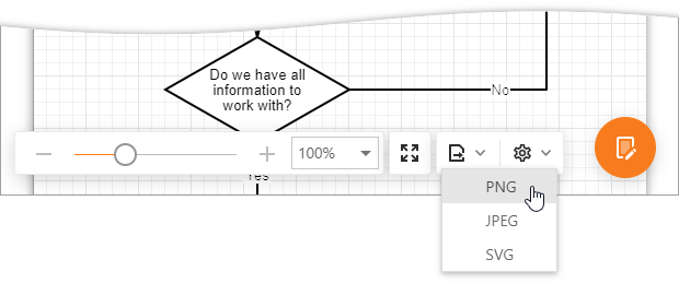
Export to PNG, JPEG, SVG
To export a diagram, call the ExportTo(format, callback) method. Users can click Export and select the file format to download a diagram in the corresponding image format.
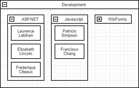
Collapsible Shape Containers
Use horizontal and vertical containers to arrange shapes into collapsible groups.
You can load a diagram with containers from a data source. Use the ContainerKey property to specify the name of a data source field that provides a parent container’s key. Note, the parent container node must be of the VerticalContainer or HorizontalContainer type.
<dx:ASPxDiagram ID="Diagram" runat="server" NodeDataSourceID="NodeDataSource" Width="100%" Height="600px">
    <Mappings>
        <Node Key="ID" ContainerKey="ContainerID" Type="Type" Text="Text" Left="X" Top="Y"
              Width="Width" Height="Height" />
    </Mappings>
    // ...
</dx:ASPxDiagram>
OrgChart Shapes
The ASPxDiagram control ships with OrgChart shapes. An OrgChart shape can display an image. You can find these shapes in the Org Chart toolbox group.
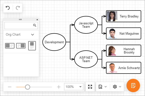
When the ASPxDiagram is bound to a data source, use the ImageUrl property to specify the name of a field that provides a path to images.
<dx:ASPxDiagram ID="Diagram" runat="server" Width="600" Height="350px"
    NodeDataSourceID="OrgItemDemoDataSource" EdgeDataSourceID="OrgLinkDemoDataSource">
    <SettingsAutoLayout Type="Tree" Orientation="Horizontal" />
    <Mappings>
        <Node Key="ID" Text="Text" Type="Type" ImageUrl="Picture" />
        <Edge Key="ID" FromKey="FromID" ToKey="ToID" />
    </Mappings>
    <SettingsToolbox>
        <Groups>
            <dx:DiagramToolboxGroup Category="OrgChart" />
        </Groups>
    </SettingsToolbox>
</dx:ASPxDiagram>
Custom Shapes
Use the CustomShapes property to extend the collection of built-in shapes with custom shapes. To add a custom shape category to the shape toolbox, use the SettingsToolbox property.
You can create a custom shape from scratch and specify its background image, shape size, text, etc. Alternatively, you can create a custom shape based on a default shape type and customize only the required settings, for instance the shape text.
Note, the Type property identifies custom shapes, therefore it must be specified and unique.
Base Type Shapes
Use the BaseType property to specify a base type for a shape.
protected void Page_Load(object sender, EventArgs e) {
    if (!IsPostBack) {
        Diagram.Import(File.ReadAllText(MapPath("~/App_Data/diagram-employees.json")));
        Diagram.CustomShapes.AddRange(GetEmployeesShapes());
    }
}
static IEnumerable<DiagramCustomShape> GetEmployeesShapes() {
    return CompanyEmployeesDataProvider.GetCompanyEmployees().Select(e => new DiagramCustomShape {
        Type = "emp" + e.EmployeeID,
        BaseType = DiagramShapeType.Rectangle,
        DefaultText = e.FirstName + " " + e.LastName,
        CategoryName = "CategoryEmployees"
    });
}
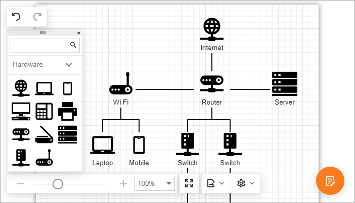
Shapes with Custom Background SVG Images
Use the BackgroundImageUrl property to specify a background image for a shape.
Note
Shape images should be supplied as SVG files.
<dx:ASPxDiagram ID="Diagram" runat="server" Width="100%" Height="600px">
    <SettingsToolbox>
        <Groups>
            <dx:DiagramToolboxGroup Category="Custom" CustomCategoryName="hardware" Title="Hardware" />
        </Groups>
    </SettingsToolbox>
    <CustomShapes>
        <dx:DiagramCustomShape CategoryName="hardware" Type="internet" Title="Internet"
        BackgroundImageUrl="../Content/customshapes/shapes/internet.svg"
        BackgroundImageLeft="0.15" BackgroundImageTop="0" BackgroundImageWidth="0.7" BackgroundImageHeight="0.7"
        DefaultWidth="0.75" DefaultHeight="0.75" DefaultText="Internet" AllowEditText="true"
        TextLeft="0" TextTop="0.7" TextWidth="1" TextHeight="0.3">
            <ConnectionPoints>
                <dx:DiagramShapeConnectionPoint Left="0.5" Top="0" />
                <dx:DiagramShapeConnectionPoint Left="0.9" Top="0.5" />
                <dx:DiagramShapeConnectionPoint Left="0.5" Top="1" />
                <dx:DiagramShapeConnectionPoint Left="0.1" Top="0.5" />
            </ConnectionPoints>
        </dx:DiagramCustomShape>
        <%-- ...  --%>
    </CustomShapes>
</dx:ASPxDiagram>
Templates
Handle the client CustomShapeCreateTemplate event to provide a template for custom shapes. The event argument’s item property provides access to the currently processed item. Add the template content, which must be presented as SVG elements, to the container property.
function onCustomShapeCreateTemplate(s, e) {
    var department = getDepartment(e.item.key);
    var svgNS = "http://www.w3.org/2000/svg"
    var svgEl = document.createElementNS(svgNS, "svg");
    svgEl.setAttribute("class", "template");
    e.container.appendChild(svgEl);
    var textEl = document.createElementNS(svgNS, "text");
    textEl.setAttribute("class", "template-name");
    textEl.setAttribute("x", "50%");
    textEl.setAttribute("y", "50%");
    textEl.textContent = department.DepartmentName;
    textEl.onclick = function () {
        var content = "<p>Department Name: <b>" + department.DepartmentName + "</b></p>" +
            "<p>Budget: <b>$" + department.Budget + "</b></p>";
        popup.SetContentHTML(content);
        popup.Show();
    };
    svgEl.appendChild(textEl);
}
<dx:ASPxDiagram ID="Diagram" ClientInstanceName="diagram" runat="server" NodeDataSourceID="DepartmentDemoDataSource">
    <ClientSideEvents CustomShapeCreateTemplate="onCustomShapeCreateTemplate" />
    <%-- ...  --%>
</dx:ASPxDiagram>
<dx:ASPxPopupControl ID="Popup" CssClass="popup" ClientInstanceName="popup" runat="server" ... />
Handle the CustomShapeCreateToolboxTemplate event to create a template for custom shapes in the toolbox.
Simple View
Set the SimpleView option to true to enable Simple View mode.
In Simple View mode, the control does not divide the work area into pages and the diagram occupies all the available area inside the control.
<dx:ASPxDiagram ID="Diagram" runat="server" Width="100%" Height="600px" SimpleView="true">
</dx:ASPxDiagram>
Restrict Edit Operations
The ASPxDiagram control allows you to restrict edit operations. To prohibit an operation, set the corresponding Allow{Operation} property to false. The RequestEditOperation event allows you to implement custom logic to determine whether an operation is allowed.
Read Only Mode
Set the ReadOnly property to true to protect the ASPxDiagram control from edit operations. In this mode the control hides its UI elements: toolbox, history toolbar, and properties panel. Use the read only mode to visualize data from a data source or to display an imported diagram.
<dx:ASPxDiagram ID="Diagram" runat="server" Width="100%" Height="600px" ReadOnly="true">
</dx:ASPxDiagram>
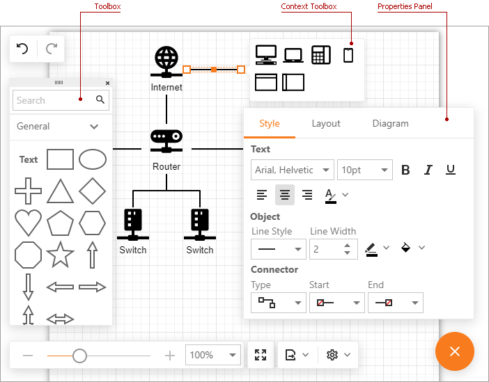
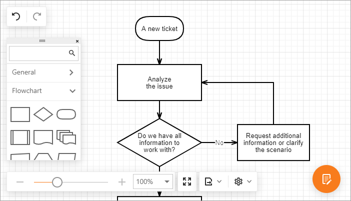
Diagram Tools
The table below lists the control tools that can be customized with the corresponding settings properties.
| Tool | Settings Property |
|---|---|
| Context Toolbox | SettingsContextToolbox |
| Properties Panel | SettingsPropertiesPanel |
| Toolbox | SettingsToolbox |
<dx:ASPxDiagram ID="Diagram" runat="server" Width="100%" Height="600px">
    <SettingsPropertiesPanel Visibility="Visible" />
    <SettingsToolbox>
        <Groups>
            <dx:DiagramToolboxGroup Category="General" />
            <dx:DiagramToolboxGroup Category="Custom" CustomCategoryName="hardware" Title="Hardware" />
        </Groups>
    </SettingsToolbox>
    <SettingsContextToolbox>
        <Shapes>
            <dx:DiagramToolboxShape CustomShapeType="pc" />
            <dx:DiagramToolboxShape CustomShapeType="laptop" />
            <dx:DiagramToolboxShape CustomShapeType="phone" />
            <dx:DiagramToolboxShape CustomShapeType="mobile" />
            <dx:DiagramToolboxShape Type="VerticalContainer" />
            <dx:DiagramToolboxShape Type="HorizontalContainer" />
        </Shapes>
    </SettingsContextToolbox>
    <CustomShapes>
        <dx:DiagramCustomShape CategoryName="hardware" Type="pc" Title="PC".../>
        <%-- ...  --%>
    </CustomShapes>
</dx:ASPxDiagram>