GridView Table Layout
- 11 minutes to read
The ASPxGridView uses a table-based algorithm to render its content and supports two table layout modes:
- Automatic - The grid calculates the column widths proportionally based on the grid’s width and cells’ content.
- Fixed - A column’s width depends on the grid’s and other columns’ widths and does not depend on the cells’ content.
A grid with a fixed or automatic layout supports non-responsive and responsive modes.
Note
This topic contains examples that illustrate how a grid with 5 data columns and 2 command columns renders its columns with different settings. The grid’s footer displays the calculated column widths in the sample images.
Automatic Table Layout
A grid should meet the following conditions to enable automatic table layout mode:
- The vertical and horizontal scrollbars should be hidden.
- Grid cells should not display ellipsis buttons (ASPxGridBehaviorSettings.AllowEllipsisInText).
- Columns should not be resizable in the UI.
- The ASPxGridViewSettings.UseFixedTableLayout property should be set to
false.
The grid uses the automatic table layout algorithm to calculate the minimum column width required to fit the column’s content. A rendered column’s width depends on the following settings:
- the column’s calculated minimum width
- the grid width
- the column’s GridViewDataColumn.Width property
Non-Responsive mode
The following examples illustrate different grid layouts in non-responsive mode:
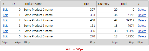
The grid (width=600px) automatically adjusts its columns if their widths are not specified.

The grid renders a column (“ID”) with the calculated minimum width (34px) if the column’s Width property is set to a value (for example, 5px or 1%) that does not allow the column to display all its content.

The grid renders its columns as follows if a column width is set to a value that is larger than the calculated maximum width (for example, 400px or 100%):
- All column widths (except the “ID” column) are equal to the calculated minimum width values.
- The “ID” column’s width is calculated based on the remaining grid’s width. Set the Styles.Cell.Wrap property to
falseto disable the wrap feature for cell content.

The widths of the “Product Name” and command columns are specified in relative values. The grid calculates other column widths based on the remaining grid width.
<dx:GridViewCommandColumn ShowEditButton="true" Width="5%" />
<dx:GridViewDataTextColumn FieldName="OrderID" Caption="ID" />
<dx:GridViewDataTextColumn FieldName="ProductName" Width="40%"/>
<dx:GridViewDataTextColumn FieldName="Price"/>
<dx:GridViewDataTextColumn FieldName="Quantity" />
<dx:GridViewDataTextColumn UnboundType="Integer" FieldName="Total" Caption="Total" />
<dx:GridViewCommandColumn ShowDeleteButton="true" Width="5%"/>
Note that the grid proportionally increases/decreases the column widths when the browser width changes.

Responsive Mode
In responsive mode (ASPxGridViewAdaptivitySettings.AdaptivityMode=GridViewAdaptivityMode.HideDataCells), the grid automatically hides columns one by one when the content does not fit the columns. The grid hides columns according to their visible indices (GridViewDataColumn.VisibleIndex).
Use the GridViewColumn.AdaptivePriority property to specify the column priority in responsive mode. The grid hides columns in descending order based on the GridViewColumn.AdaptivePriority property value.
Note
The grid hides command columns after data columns if they have the same AdaptivePriority property values.
The following examples illustrate how a grid with different layouts resizes and hides columns in responsive mode:
In this example, the command columns have a minimum width (5%) and the “Product Name” column occupies 40% of the grid width. The AdaptivePriority property is not specified.
The grid proportionally decreases its column widths to the minimum values when the screen’s width changes. If the columns’ content (cell values, header text, etc.) does not fit these minimum widths, the grid hides columns according to their visible indices.
<dx:GridViewCommandColumn ShowEditButton="true" Width="5%" />
<dx:GridViewDataTextColumn FieldName="OrderID" Caption="ID" />
<dx:GridViewDataTextColumn FieldName="ProductName" Width="40%"/>
<dx:GridViewDataTextColumn FieldName="Price"/>
<dx:GridViewDataTextColumn FieldName="Quantity" />
<dx:GridViewDataTextColumn UnboundType="Integer" FieldName="Total" Caption="Total" />
<dx:GridViewCommandColumn ShowDeleteButton="true" Width="5%"/>
The grid hides columns with the specified AdaptivePriority property in the following order:
- The “ID” column (the AdaptivePriority property is set to 3).
- Command columns (the AdaptivePriority property of each command column is set to 2).
- The “Price” and “Quantity” columns (the AdaptivePriority property is set to 1).
- The “Product Name” and “Total” columns. The GridViewColumn.AdaptivePriority property is not specified for these columns, and the grid hides them last.
<dx:GridViewCommandColumn ShowEditButton="true" Width="5%" AdaptivePriority="2"/>
<dx:GridViewDataTextColumn FieldName="OrderID" Caption="ID" AdaptivePriority="3"/>
<dx:GridViewDataTextColumn FieldName="ProductName" Width="40%"/>
<dx:GridViewDataTextColumn FieldName="Price" AdaptivePriority="1"/>
<dx:GridViewDataTextColumn FieldName="Quantity" AdaptivePriority="1"/>
<dx:GridViewDataTextColumn UnboundType="Integer" FieldName="Total" Caption="Total" />
<dx:GridViewCommandColumn ShowDeleteButton="true" Width="5%" AdaptivePriority="2"/>
Fixed Table Layout
Do one of the following to use the fixed table layout in a grid:
- Enable the vertical or horizontal scrollbar.
- Make columns resizable.
- Enable the ASPxGridViewSettings.UseFixedTableLayout property or display ellipsis buttons in cells.
The grid uses the fixed table layout algorithm to calculate column widths in table layout mode. In this mode, the grid’s horizontal layout depends only on the grid width, column widths, borders, and cell spacing as described below:
- The column widths are not specified. The grid renders columns with proportional widths.
- The column widths are specified. The grid renders columns with the specified widths and does not take the cells’ content into account.
- The grid contains at least one column with an unspecified width while other column widths are specified. The grid renders the columns with the specified widths. Columns with no specified widths equally occupy the remaining grid width.
Note
In HorizontalScrollBarMode, do the following to correctly display columns with undefined widths:
Specify percentage widths for these columns to allow them to occupy the remaining grid width.
Specify the MinWidth property for these columns to prevent them from collapsing.
The grid supports the following combinations of column width values:
- All column widths are absolute values (in pixels).
- All column widths are percentage values. The sum of all column widths should be equal to 100%.
- Several column widths are specified in absolute values whereas other column widths are not specified.
- Several column widths are specified in absolute values whereas other column widths are specified in percentage values. There are no columns with unspecified widths. For columns with percentage widths, the sum of their widths should be equal to 100%.
Note
A grid does not support a layout when at least one column has an undefined width while other column widths are specified in percentage values. In this case, the grid layout can vary in different browsers.
Non-Responsive Mode
In this mode, a grid uses its width and specified column widths to calculate the layout. The grid equally distributes the remaining width among columns with unspecified widths.
The following examples illustrate different grid layouts in non-responsive mode:
The grid (width=700px) applies an equal width (100px) to each of its 7 columns with undefined widths.
The rendered column widths remain the same if you set a column’s width to 55px. In this case, the calculated grid width is 7 columns*55px=385px, which is less than the specified grid width (ASPxWebControl.Width) - 700px. The grid proportionally increases the column widths until the total sum of column widths equals 700px.
Note that if you allow users to resize columns (the ColumnResizeMode property), the width of the first 6 columns will be 55px and the rightmost column will have a percentage width.

In this example, the “Product Name” column with an unspecified width occupies the remaining grid width after the browser renders all grid columns with specified widths.
<dx:GridViewCommandColumn ShowEditButton="true" Width="55px" />
<dx:GridViewDataTextColumn FieldName="OrderID" Caption="ID" Width="55px" />
<dx:GridViewDataTextColumn FieldName="ProductName"/>
<dx:GridViewDataTextColumn FieldName="Price" Width="55px" />
<dx:GridViewDataTextColumn FieldName="Quantity" Width="55px" />
<dx:GridViewDataTextColumn UnboundType="Integer" FieldName="Total" Caption="Total" Width="55px" />
<dx:GridViewCommandColumn ShowDeleteButton="true" Width="55px" />
If only one column has a specified width (the “Product Name” column’s width is 300px), the grid distributes its remaining width among other columns.

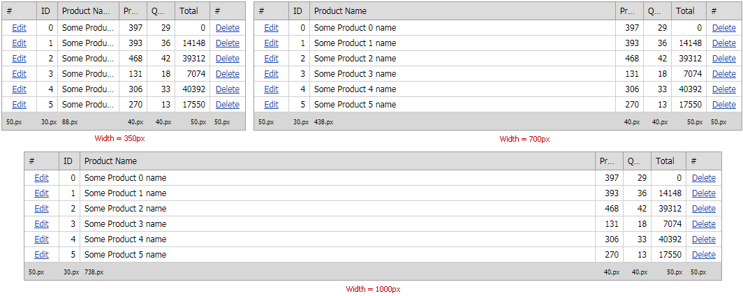
The examples below illustrate how to implement different grid layouts when column widths are in absolute and/or percentage values for different grid widths: 350px, 700px, and 1000px. Set a column’s ASPxGridBehaviorSettings.AllowEllipsisInText property to true to truncate a column caption that does not match its width and add an ellipsis.
The grid has the following column settings:
- Columns that contain only numbers (“ID”, “Price”, “Quantity”) or short strings (command columns) have 40px and 50px widths;
- The “Product Name” column has an unspecified width so it occupies the remaining grid width.
The grid renders its layout in correct proportions on a narrow screen (350px). On a large one, the “Product Name” column occupies too much space.
<dx:GridViewCommandColumn ShowEditButton="true" Width="50px" />
<dx:GridViewDataTextColumn FieldName="OrderID" Caption="ID" Width="30px" Settings-AllowEllipsisInText="True" />
<dx:GridViewDataTextColumn FieldName="ProductName" Settings-AllowEllipsisInText="True" />
<dx:GridViewDataTextColumn FieldName="Price" Width="40px" Settings-AllowEllipsisInText="True" />
<dx:GridViewDataTextColumn FieldName="Quantity" Width="40px" Settings-AllowEllipsisInText="True" />
<dx:GridViewDataTextColumn UnboundType="Integer" FieldName="Total" Caption="Total" Width="50px" Settings-AllowEllipsisInText="True" />
<dx:GridViewCommandColumn ShowDeleteButton="true" Width="50px" />
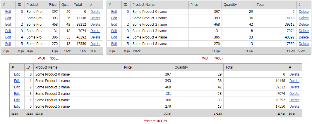
The grid’s columns have correct proportions on a larger screen if you set the “Product Name”, “Price”, “Quantity”, and “Total” column widths to percentage values.
Note
You should first arrange columns on a narrow screen (350px) to choose appropriate percentage widths for them.
<dx:GridViewCommandColumn ShowEditButton="true" Width="50px" />
<dx:GridViewDataTextColumn FieldName="OrderID" Caption="ID" Width="30px" Settings-AllowEllipsisInText="True" />
<dx:GridViewDataTextColumn FieldName="ProductName" Settings-AllowEllipsisInText="True" Width="35%"  />
<dx:GridViewDataTextColumn FieldName="Price" Settings-AllowEllipsisInText="True" Width="20%"  />
<dx:GridViewDataTextColumn FieldName="Quantity" Settings-AllowEllipsisInText="True" Width="20%" />
<dx:GridViewDataTextColumn UnboundType="Integer" FieldName="Total" Caption="Total" Settings-AllowEllipsisInText="True" Width="25%" />
<dx:GridViewCommandColumn ShowDeleteButton="true" Width="50px" />
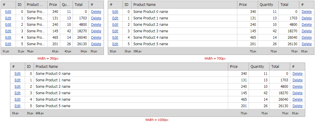
The grid does not stretch the “Price”, “Quantity”, and “Total” columns to the appropriate percentage widths when you specify their maximum widths.
Note
In v18.2 and higher, ASPxGridView has the GridViewColumn.MaxWidth property.
Note that the GridViewColumn.MaxWidth property is not in effect if the grid width is not specified.
<dx:GridViewCommandColumn ShowEditButton="true" Width="50px" />
<dx:GridViewDataTextColumn FieldName="OrderID" Caption="ID" Width="30px" Settings-AllowEllipsisInText="True" />
<dx:GridViewDataTextColumn FieldName="ProductName" Settings-AllowEllipsisInText="True" Width="35%"  />
<dx:GridViewDataTextColumn FieldName="Price" Settings-AllowEllipsisInText="True" Width="20%" MaxWidth="70" />
<dx:GridViewDataTextColumn FieldName="Quantity" Settings-AllowEllipsisInText="True" Width="20%" MaxWidth="70" />
<dx:GridViewDataTextColumn UnboundType="Integer" FieldName="Total" Caption="Total" Settings-AllowEllipsisInText="True" Width="25%" MaxWidth="70" />
<dx:GridViewCommandColumn ShowDeleteButton="true" Width="50px" />
You can do the following to prevent column content truncation on narrow screens (350px):
- Enable the horizontal scrollbar (ASPxGridSettings.HorizontalScrollBarMode).
- Switch the grid to responsive mode.
Important
The ASPxGridSettings.HorizontalScrollBarMode property is not in effect in the previous example since the data column widths are specified in percentage. In v18.2 and higher, you can use the GridViewColumn.MinWidth property to restrict the minimum column width and enable the horizontal scrollbar.
The following example illustrates how to specify the minimum column widths to display the horizontal scrollbar in the grid on narrow screens.
<dx:GridViewCommandColumn ShowEditButton="true" Width="50px" />
<dx:GridViewDataTextColumn FieldName="OrderID" Caption="ID" Width="30px" Settings-AllowEllipsisInText="True" />
<dx:GridViewDataTextColumn FieldName="ProductName" Settings-AllowEllipsisInText="True" Width="35%" MinWidth="135" />
<dx:GridViewDataTextColumn FieldName="Price" Settings-AllowEllipsisInText="True" Width="20%" MaxWidth="70" MinWidth="45" />
<dx:GridViewDataTextColumn FieldName="Quantity" Settings-AllowEllipsisInText="True" Width="20%" MaxWidth="70" MinWidth="62" />
<dx:GridViewDataTextColumn UnboundType="Integer" FieldName="Total" Caption="Total" Settings-AllowEllipsisInText="True" Width="25%" MaxWidth="70" MinWidth="50" />
<dx:GridViewCommandColumn ShowDeleteButton="true" Width="50px" />
Responsive Mode
In this mode, the grid hides columns in order according to the corresponding GridViewColumn.AdaptivePriority property values if column content (cells values, header text, etc.) does not fit the minimum column widths.
The examples below illustrate how to customize a grid’s layout in responsive mode:
The grid column settings:
- The “ID” column’s AdaptivePriority property is set to 3.
- The “Edit” and “Delete” columns’ AdaptivePriority property is set to 2.
- The “Price” and “Quantity” columns’ AdaptivePriority property is set to 1.
- The grid hides the “Product Name” and “Total” columns last as their GridViewColumn.AdaptivePriority property is not specified.
The grid hides its columns when header captions (for the “Price”, “Quantity”, and “Total” columns) or values (for the “Total” and “Product Name” columns) do not fit the cells.
<dx:GridViewCommandColumn ShowEditButton="true" Width="50px" AdaptivePriority="2" />
<dx:GridViewDataTextColumn FieldName="OrderID" Caption="ID" Width="30px" AdaptivePriority="3" />
<dx:GridViewDataTextColumn FieldName="ProductName" Width="35%"   />
<dx:GridViewDataTextColumn FieldName="Price" Width="20%" MaxWidth="70" AdaptivePriority="1" />
<dx:GridViewDataTextColumn FieldName="Quantity" Width="20%" MaxWidth="70" AdaptivePriority="1" />
<dx:GridViewDataTextColumn UnboundType="Integer" FieldName="Total" Caption="Total" Width="25%" MaxWidth="70"  />
<dx:GridViewCommandColumn ShowDeleteButton="true" Width="50px" AdaptivePriority="2" />
In v18.2 and higher, enable the ASPxGridViewAdaptivitySettings.AllowHideDataCellsByColumnMinWidth property and specify the GridViewColumn.MinWidth property to resize and hide columns as follows: decrease the column widths to the MinWidth property value, truncate the content, and then hide the columns.
The columns have the following MinWidth property values:
- The “Price” and “Quantity” columns: 35px
- The “Total” column: 40px
- The “Product Name” column: 90px
<dx:GridViewCommandColumn ShowEditButton="true" Width="50px" AdaptivePriority="2" />
<dx:GridViewDataTextColumn FieldName="OrderID" Caption="ID" Width="30px" AdaptivePriority="3" />
<dx:GridViewDataTextColumn FieldName="ProductName" Width="35%" MinWidth="90" />
<dx:GridViewDataTextColumn FieldName="Price" Width="20%" MaxWidth="70" MinWidth="35" AdaptivePriority="1" />
<dx:GridViewDataTextColumn FieldName="Quantity" Width="20%" MaxWidth="70" MinWidth="35" AdaptivePriority="1" />
<dx:GridViewDataTextColumn UnboundType="Integer" FieldName="Total" Caption="Total" Width="25%" MaxWidth="70" MinWidth="40" />
<dx:GridViewCommandColumn ShowDeleteButton="true" Width="50px" AdaptivePriority="2" />
In this example, the grid truncates the “Product Name” column and hides other columns only when the “Product Name” column’s width equals its minimum value (MinWidth property). The current column settings minimize the “Product Name” column before other columns. As a result, the grid hides the “Price”, “Quantity”, and “Total” columns before the widths reach their specified minimum values.

Adjust the column widths proportionally to their minimum widths (90px, 40px, 40px, 35px) to change this behavior:
- “Product Name” column’s width: 35% -> 50%
- “Price” column’s width: 20% -> 15%
- “Quantity” column’s width: 20% -> 15%
- “Total” column’s width: 25% -> 20%
<dx:GridViewCommandColumn ShowEditButton="true" Width="50px" AdaptivePriority="2" />
<dx:GridViewDataTextColumn FieldName="OrderID" Caption="ID" Width="30px" AdaptivePriority="3" />
<dx:GridViewDataTextColumn FieldName="ProductName" Width="50%" MinWidth="90" />
<dx:GridViewDataTextColumn FieldName="Price" Width="15%" MaxWidth="70" MinWidth="35" AdaptivePriority="1" />
<dx:GridViewDataTextColumn FieldName="Quantity" Width="15%" MaxWidth="70" MinWidth="35" AdaptivePriority="1" />
<dx:GridViewDataTextColumn UnboundType="Integer" FieldName="Total" Caption="Total" Width="20%" MaxWidth="70" MinWidth="40" />
<dx:GridViewCommandColumn ShowDeleteButton="true" Width="50px" AdaptivePriority="2" />