TrackBar
- 3 minutes to read
TrackBar is a slider that provides end-users with fast and easy visual data selection capabilities.
Implementation Details
TrackBar is realized by the TrackBarExtension class. Its instance can be accessed via the ExtensionsFactory.TrackBar helper method, which is used to add a TrackBar extension to a view. This method’s parameter provides access to the TrackBar‘s settings implemented by the TrackBarSettings class, allowing you to fully customize the extension.
TrackBar‘s client counterpart is represented by the ASPxClientTrackBar object.
Declaration
TrackBar can be added to a view in the following manner.
View code (ASPX):
<%
    Html.DevExpress().TrackBar(
        settings => {
            settings.Name = "myTrackBar";
            settings.Properties.SmallTickFrequency = 5;
            settings.Properties.LargeTickInterval = 10;
            settings.Properties.MaxValue = 50;
            settings.Position = 10;
            settings.Properties.ScalePosition = ScalePosition.RightOrBottom;
        }
    )
    .Render();
%>
View code (Razor):
@Html.DevExpress().TrackBar(
     settings => {
          settings.Name = "myTrackBar";
          settings.Properties.SmallTickFrequency = 5;
          settings.Properties.LargeTickInterval = 10;
          settings.Properties.MaxValue = 50;
          settings.Position = 10;
          settings.Properties.ScalePosition = ScalePosition.RightOrBottom;
     }
).GetHtml()
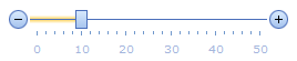
The code result is demonstrated in the image below.
Main Features
Various Orientation and Direction
TrackBar supports two orientation modes that can be specified with the TrackBarSettings.Properties.Orientation (TrackBarProperties.Orientation) property: horizontal and vertical.
TrackBar can be displayed in a normal or reversed mode. This is controlled by the TrackBarSettings.Properties.Direction (TrackBarProperties.Direction) property. In a reversed mode, the TrackBar direction (from MinValue to MaxValue) turns from left to right to right to left (or from up to down to down to up if it is in a vertical orientation mode).
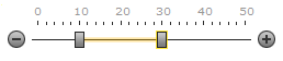
Single and Range Value Selection Modes
TrackBar has the ability to display two drag handles allowing end-users to select a range of values instead of a single value. Set the TrackBarSettings.Properties.AllowRangeSelection (TrackBarProperties.AllowRangeSelection) property to True to enable the range selection mode. In the range selection mode, the TrackBarSettings.PositionStart and TrackBarSettings.PositionEnd properties are used to specify main and secondary drag handle positions respectively.
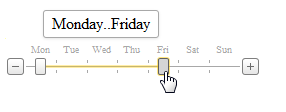
Items Mode Support
TrackBar allows you to display custom items instead of automatically generated decimal scale marks. Populate the TrackBarSettings.Properties.Items (TrackBarProperties.Items) collection to activate TrackBar’s items display mode.
Full Scale and Layout Customization
TrackBar supports full scale customization. You can customize value selection, look-and-feel, scale layout and appearance. See this topic to learn more: TrackBar Scale Settings.
Value Selection
End-users can select a value within the TrackBar by positioning the handle within a range of values limited by a developer (using MinValue and MaxValue).
Full-Featured Client-Side API
TrackBar provides you with a comprehensive client-side API. This API is implemented using JavaScript and is exposed via the ASPxClientTrackBar object. The ASPxClientTrackBar object serves as a client-side equivalent of the TrackBar extension.