DateEdit
- 4 minutes to read
DateEdit combines the functionality of a single-line text editor, button editor and dropdown calendar. The editor’s dropdown displays a single-month calendar that allows end-users to select dates, and navigate through months and years. Specifying a date (by selecting it on the calendar or by manually typing it into the text box) changes the editor’s edit value.
To learn more about DateEdit and see it in action, refer to our online demos.
Implementation Details
DateEdit is realized by the DateEditExtension class. Its instance can be accessed via the ExtensionsFactory.DateEdit helper method, which is used to add a DateEdit extension to a view. This method’s parameter provides access to the DateEdit‘s settings implemented by the DateEditSettings class, allowing you to fully customize the extension.
DateEdit‘s client counterpart is represented by the MVCxClientDateEdit object.
Declaration
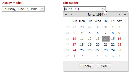
DateEdit can be added to a view in the following manner.
@Html.DevExpress().DateEdit(settings => {
    settings.Name = "dateEdit1";
    settings.Properties.DisplayFormatString = "D";
    settings.Date = new DateTime(1984, 06, 14);
}).GetHtml()
Note
The Partial View should contain only the extension’s code.
The code result is demonstrated in the image below.
Main Features
The DateEdit extension is a date editor that combines the functionalities of a single-line text editor, button editor and dropdown calendar. The editor’s dropdown displays a calendar that allows end-users to select dates, and navigate through months and years.
The DateEdit offers the following features.
Shared Drop-Down Calendar
Using the DateEditSettings.PopupCalendarOwnerName property, an individual date editor’s popup calendar (and its settings) can be shared between several date editors, which decreases the size of the HTML code rendered into the web page by date editors.
Null Prompt Text
The prompt text can be displayed if the editor’s value is null and the editor is not focused. The prompt text disappears when the editor receives focus. You can define the prompt text via the DateEditSettings.Properties.NullText (DateEditProperties.NullText) property.
Edit Formatting
You can specify how an editor value is represented within the edit boxes. For display and edit purposes, the edited value can be displayed in the following formats.
View
Affected Properties

EditFormat=”Time”

EditFormat= “Date”

EditFormat=”DateTime”
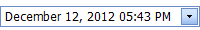
EditFormat=”Custom”
EditFormatString:=”MMMM dd, yyyy hh:mm tt”
Display Formatting
The editor display value can be formatted for display purposes when the editor is not focused via the DateEditSettings.Properties.DisplayFormatString (DateEditProperties.DisplayFormatString) property.
Masked Input
If the DateEditSettings.Properties.UseMaskBehavior (DateEditProperties.UseMaskBehavior) property is set to true, the DateEdit editor supports masked input. In this mode, the pattern defined via the DateEditSettings.Properties.EditFormatString (DateEditProperties.EditFormatString) property serves as a mask.
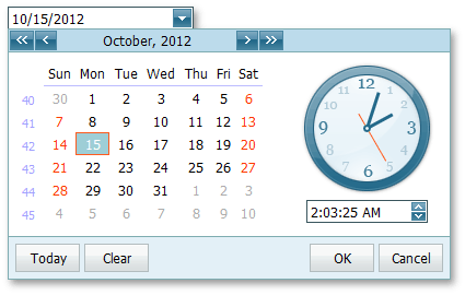
Month-Year Picker Mode
The Month-year Picker mode allows you to specify which date component an end user can select: a day, a month or a year. You can click the header to change the calendar view (fast navigation). Use the following settings to specify the date selection and restrict the available calendar views:
Property Description DateEditProperties.PickerType Specifies a date component an end user can select (a day, month or year). CalendarFastNavProperties.InitialView Specifies the initial calendar view. CalendarFastNavProperties.MaxView Specifies the earliest available calendar view. For example, if the CalendarFastNavProperties.MaxView property is set to “Months”, the picker displays the months of a particular year and January is the earliest available calendar view item. Easy Date Selection
The DateEdit allows end-users to edit a date value by selecting it within a drop-down calendar, or by typing a date directly into the editor’s text box, or by using the mouse wheel or keyboard.
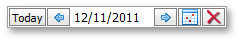
Customizable Button Collection
The DateEdit extension provides a collection to maintain its custom edit buttons. Each button exposes a set of properties allowing the button’s appearance and behavior to be defined. The settings of the default button, which invokes the dropdown calendar when clicked, can be customized as well.
Built-in Validation
The DateEdit extension allows you to perform data validation both on the client and server side. See the Built-in Validation topic to learn more.
Full-Featured Client-Side API
DateEdit provides you with a comprehensive client-side API. This API is implemented using JavaScript and is exposed via the ASPxClientDateEdit object. The ASPxClientDateEdit object serves as a client-side equivalent of the DateEdit extension.
You can modify editor behavior using the following methods.
Method Description ASPxClientDateEdit.GetCalendar Returns the calendar of the date editor. ASPxClientDateEdit.GetDate Gets the date that is the editor’s value. ASPxClientDateEdit.GetMaxDate Gets the maximum date of the editor. ASPxClientDateEdit.GetMinDate Gets the minimum date of the editor. ASPxClientDateEdit.SetMaxDate Sets the maximum date of the editor. ASPxClientDateEdit.SetMinDate Sets the minimum date of the editor.