Calendar
- 4 minutes to read
The Calendar extension allows end-users to select dates and navigate through months and years.
Implementation Details
Calendar is realized by the CalendarExtension class. Its instance can be accessed via the ExtensionsFactory.Calendar helper method, which is used to add a Calendar extension to a view. This method’s parameter provides access to the Calendar‘s settings, implemented by the CalendarSettings class, allowing you to fully customize the extension.
Calendar‘s client counterpart is represented by the MVCxClientCalendar object.
Declaration
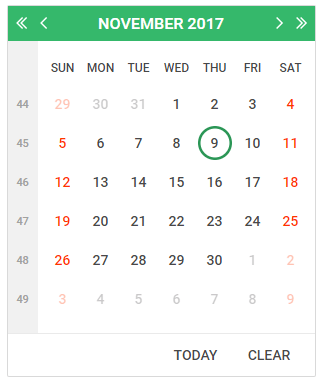
Calendar can be added to a view in the following manner.
@Html.DevExpress().Calendar(settings => {
settings.Name = "calendar1";
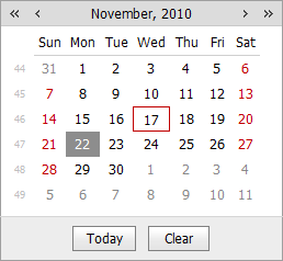
settings.SelectedDate = new DateTime(2010, 11, 22);
}).GetHtml()
Note
The Partial View should contain only the extension’s code.
The code result is demonstrated in the image below.
Main Features
Multiple Date Selection
The Calendar allows end-users to work in a single or multiple date selection mode. This can be defined with the CalendarSettings.Properties.EnableMultiSelect (CalendarProperties.EnableMultiSelect) property.
Date Highlighting
Weekends and today can be highlighted in standard or custom ways.
Fully Customizable Appearance
You can customize the look-and-feel of all elements.
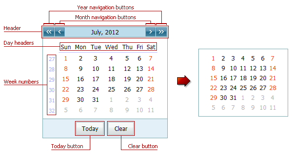
Element Visibility Appearance Today Button CalendarProperties.ShowTodayButton CalendarProperties.ButtonStyle Clear Button CalendarProperties.ShowClearButton CalendarProperties.ButtonStyle Week Numbers CalendarProperties.ShowWeekNumbers CalendarProperties.WeekNumberStyle Day Headers CalendarProperties.ShowDayHeaders CalendarProperties.DayHeaderStyle Header CalendarProperties.ShowHeader CalendarProperties.HeaderStyle Month Navigation Buttons CalendarProperties.EnablePeriodNavigation CalendarProperties.NextPeriodImage, CalendarProperties.PrevPeriodImage Year Navigation Buttons CalendarProperties.EnableLargePeriodNavigation CalendarProperties.NextLargePeriodImage, CalendarProperties.PrevLargePeriodImage You can customize the extension appearance using predefined built-in visual themes. See this topic to learn more: Applying Themes.
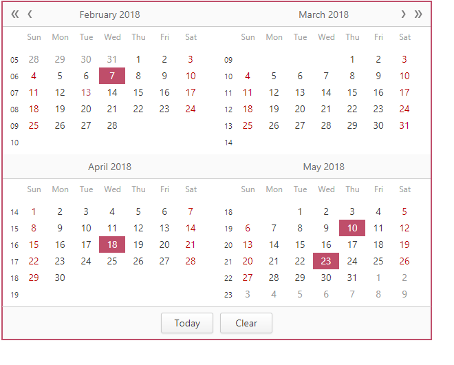
Multi-Month View
The Calendar editor is able to display multiple months at the same time, organizing them in several rows and columns. You can define the number of columns via the CalendarSettings.Properties.Columns (CalendarProperties.Columns) property and a number of rows via the CalendarSettings.Properties.Rows (CalendarProperties.Rows) property.
Month-Year Picker Mode
The Month-year Picker mode allows you to specify which date component an end user can select: a day, a month or a year. You can click the header to change the calendar view (fast navigation). Use the following settings to specify the date selection and restrict the available calendar views:
Property Description DateEditProperties.PickerType Specifies a date component an end user can select (a day, month or year). CalendarFastNavProperties.InitialView Specifies the initial calendar view. CalendarFastNavProperties.MaxView Specifies the earliest available calendar view. For example, if the CalendarFastNavProperties.MaxView property is set to “Months”, the picker displays the months of a particular year and January is the earliest available calendar view item. Custom Day Rendering
The Calendar editor allows you to conditionally change the manner with which you render calendar days.
Built-in Validation
The Calendar extension allows you to perform data validation both on the client and server side. See the Built-in Validation topic to learn more.
Full-Featured Client-Side API
The Calendar provides you with a comprehensive client-side API. This API is implemented using JavaScript and is exposed via the MVCxClientCalendar object. The MVCxClientCalendar object serves as a client-side equivalent of the Calendar extension.
You can modify editor behavior using the following methods.
Method Description ASPxClientCalendar.ClearSelection Deselects all the selected dates within the calendar. ASPxClientCalendar.DeselectDate Deselects the specified date within the calendar. ASPxClientCalendar.DeselectRange Deselects the specified range of dates within the calendar. ASPxClientCalendar.GetMaxDate Gets the maximum date on the calendar. ASPxClientCalendar.GetMinDate Gets the minimum date on the calendar. ASPxClientCalendar.GetSelectedDate Returns the calendar’s selected date. ASPxClientCalendar.GetSelectedDates Returns a list of dates which are selected within the calendar. ASPxClientCalendar.GetVisibleDate Gets the date that determines the month and year that are currently displayed in the calendar. ASPxClientCalendar.IsDateSelected Tests whether the specified date is selected. ASPxClientCalendar.SelectDate Selects the specified date within the calendar. ASPxClientCalendar.SelectRange Selects the specified range of dates within the calendar. ASPxClientCalendar.SetMaxDate Sets the maximum date of the calendar. ASPxClientCalendar.SetMinDate Sets the minimum date of the calendar. ASPxClientCalendar.SetSelectedDate Sets the calendar’s selected date. ASPxClientCalendar.SetVisibleDate Sets the date that specifies the month and year to be displayed in the calendar.