DropDownEdit
- 4 minutes to read
DropDownEdit represents an editor containing an edit box to display the editor value and a specific button, which opens a dropdown window whose content can be templated. The main purpose of DropDownEdit is to allow you to define its value based upon the value(s) of another control(s) integrated into the editor’s dropdown window template.
To learn more about DropDownEdit and see it in action, refer to our online demos.
Implementation Details
DropDownEdit is realized by the DropDownEditExtension class. Its instance can be accessed via the ExtensionsFactory.DropDownEdit helper method, which is used to add a DropDownEdit extension to a view. This method’s parameter provides access to the DropDownEdit‘s settings implemented by the DropDownEditSettings class, allowing you to fully customize the extension.
DropDownEdit‘s client counterpart is represented by the ASPxClientDropDownEdit object.
Declaration
DropDownEdit can be added to a view in the following manner.
<script type="text/javascript">
//<![CDATA[
    var textSeparator = ";";

    function UpdateText() {
        var selectedItems = listBox1.GetSelectedItems();
        dropDownEdit1.SetText(GetSelectedItemsText(selectedItems));
    }

    function GetSelectedItemsText(items) {
        var texts = [];
        for (var i = 0; i < items.length; i++)
            texts.push(items[i].text);
        return texts.join(textSeparator);
    }

    function SynchronizeListBoxValues(dropDown, args) {
        listBox1.UnselectAll();
        var texts = dropDown.GetText().split(textSeparator);
        var values = GetValuesByTexts(texts);
        listBox1.SelectValues(values);
        UpdateText();
    }

    function GetValuesByTexts(texts) {
        var actualValues = [];
        var item;
        for (var i = 0; i < texts.length; i++) {
            item = listBox1.FindItemByText(texts[i]);
            if (item != null)
                actualValues.push(item.value);
        }
        return actualValues;
    }
// ]]>
</script>

@Html.DevExpress().DropDownEdit(settings => {
    settings.Name = "dropDownEdit1";
    settings.Text = "Chrome;IE";
    settings.Width = 210;
    settings.SetDropDownWindowTemplateContent(c => {
        @Html.DevExpress().ListBox(listBoxSettings => {
            listBoxSettings.Name = "listBox1";
            listBoxSettings.Width = Unit.Percentage(100);
            listBoxSettings.Properties.SelectionMode = ListEditSelectionMode.CheckColumn;
            listBoxSettings.Properties.Items.Add("Chrome", "0");
            listBoxSettings.Properties.Items.Add("Firefox", "1");
            listBoxSettings.Properties.Items.Add("IE", "2");
            listBoxSettings.Properties.Items.Add("Opera", "3");
            listBoxSettings.Properties.Items.Add("Safari", "4");
            listBoxSettings.Properties.ClientSideEvents.SelectedIndexChanged = "function(s, e){ UpdateText(); }";
        }).Render();
        ViewContext.Writer.Write("<table style=\"width:100%\"><tr><td align=\"right\">");
        @Html.DevExpress().Button(buttonSettings => {
            buttonSettings.Name = "buttonClose";
            buttonSettings.Text = "Close";
            buttonSettings.ClientSideEvents.Click = "function(s, e){ dropDownEdit1.HideDropDown(); }";
        }).Render();
        ViewContext.Writer.Write("</td></tr></table>");
    });
    settings.Properties.ClientSideEvents.TextChanged="SynchronizeListBoxValues";
    settings.Properties.ClientSideEvents.DropDown = "SynchronizeListBoxValues";
}).GetHtml()
Note
The Partial View should contain only the extension’s code.
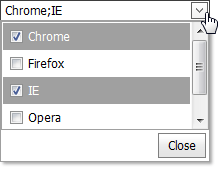
The code result is demonstrated in the image below.

Main Features
The DropDownEdit represents an editor containing an edit box to display the editor value and a specific button that opens a dropdown window whose content can be templated. The main purpose of the DropDownEdit is to allow you to define its value based upon the value(s) of another control(s) integrated into the editor’s DropDownWindowTemplate.
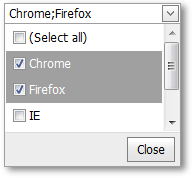
The image below demonstrates the DropDownEdit extension that contains the ListBox and the Button editors templated into the dropdown window.

The DropDownEdit offers the following features.
Templated Content
The dropdown window’s content can be templated (using the DropDownEditSettings.Properties.DropDownWindowTemplate (DropDownEditProperties.DropDownWindowTemplate) property).
Null Prompt Text
You can use the editor’s DropDownEditSettings.Properties.NullText (DropDownEditProperties.NullText) property to display a prompt in the editor’s edit box. The prompt text disappears when the editor receives focus.
Customizable Button Collection
The DropDownEdit extension provides a collection to maintain its custom edit buttons. Each button exposes a set of properties allowing the button’s appearance and behavior to be defined. You can use the Buttons property to populate the button collection.
Built-in Validation
The DropDownEdit extension allows you to perform data validation both on the client and server side. See the Built-in Validation topic to learn more.
Full-Featured Client-Side API
The DropDownEdit provides you with a comprehensive client-side API. This API is implemented using the JavaScript and is exposed via the ASPxClientDropDownEdit object. The ASPxClientDropDownEdit object serves as the client-side equivalent of the DropDownEdit extension.
You can operate with the editor values using the following methods.
Method Description ASPxClientDropDownEdit.GetKeyValue Obtains the key value associated with the text displayed within the editor’s edit box. ASPxClientDropDownEdit.SetKeyValue Specifies the key value associated with the text displayed within the editor’s edit box. ASPxClientDropDownEditBase.HideDropDown Closes the opened drop down window of the editor. ASPxClientDropDownEditBase.ShowDropDown Invokes the editor’s drop down window.