Button
- 3 minutes to read
Button represents a push button control. The Button extends a standard button functionality by providing an enhanced client API, supporting the DevExpress’ appearance customization mechanism (Themes) and allowing all verifiable elements on a web page to be automatically validated on both the client side and server side.
Implementation Details
Button is realized by the ButtonExtension class. Its instance can be accessed via the ExtensionsFactory.Button helper method, which is used to add a Button extension to a view. This method’s parameter provides access to the Button‘s settings implemented by the ButtonSettings class, allowing you to fully customize the extension.
Button‘s client counterpart is represented by the ASPxClientButton object.
Declaration
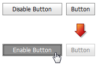
Button can be added to a view in the following manner.
<script type="text/javascript">
    function button1_CheckedChanged(s, e) {
        if (s.GetChecked()) {
            button2.SetEnabled(false);
            s.SetText("Enable Button");
        } else {
            button2.SetEnabled(true);
            s.SetText("Disable Button");
        }
    }
</script>

@Html.DevExpress().Button(settings => {
    settings.Name = "button1";
    settings.Text = "Disable Button";
    settings.Width = 120;
    settings.GroupName = "FakeGroup";
    settings.ClientSideEvents.CheckedChanged = "button1_CheckedChanged";
}).GetHtml()

@Html.DevExpress().Button(settings => {
    settings.Name = "button2";
    settings.EnableClientSideAPI = true;
}).GetHtml()
Note
The Partial View should contain only the extension’s code.
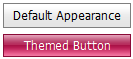
The code result is demonstrated in the image below.
Main Features
The DevExpress ASP.NET MVC Button extension provides extended button functionality.
Radio Button Functionality
You can use the ButtonSettings.Checked and ButtonSettings.GroupName properties to group several buttons and use them as radio buttons. Use the ASPxButton.CheckedStyle property to customize the button’s checked state appearance. The extension generates the ASPxClientButton.CheckedChanged event when a user checks the button.
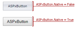
Native Render
Set the ButtonSettings.Styles.Native (ButtonControlStyles.Native) property to true to render the Button as a native HTML input element (button). This reduces the amount of generated HTML code and improves the editor’s performance. In native mode, the button’s appearance depends on how the client browser renders native HTML elements.
Render Modes
The ButtonSettings.RenderMode property allows you to specify how the browser renders the button.
Render Mode ASPxButton ButtonRenderMode.Button 
ButtonRenderMode.Danger 
ButtonRenderMode.Link 
ButtonRenderMode.Outline 
ButtonRenderMode.Secondary 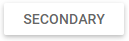
Built-in Validation
The Button extension allows you to validate its data on the client and server side.
Appearance Customization
Appearance
Description
Remarks
Native HTML button input element
When the Button extension is rendered as a native HTML button input element, a button appearance depends on how a client browser renders native HTML elements.
Affected property: ButtonSettings.Styles.Native (ButtonControlStyles.Native)
Applying DevExpress Themes
This feature allows you to change how an extension looks.
You can customize the extension appearance using predefined built-in visual themes. See this topic to learn more: Applying Themes
Use of different button appearance properties
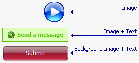
The Button allows its contents to be represented by the following elements.
- Image. The whole button is represented by a single image.
- Image and Text. A button’s content is represented using the combination of an image and text.
- Background Image and Text. A button’s content is represented using the combination of a background image and text.
Affected properties:
Full-Featured Client-Side API
The Button extension provides you with a comprehensive client-side API. This API is implemented using JavaScript and is exposed via the ASPxClientButton object. The ASPxClientButton object serves as a client-side equivalent of the Button extension.
You can operate with editor values using the following methods.
Method Description ASPxClientButton.DoClick Simulates a mouse click on the button. ASPxClientButton.Focus Focuses the button. ASPxClientButton.GetChecked Specifies whether the button is checked. ASPxClientButton.SetChecked Specifies the button’s checked status. ASPxClientButton.GetEnabled Indicates whether the button is enabled. ASPxClientButton.SetEnabled Enables the button. ASPxClientButton.GetImageUrl Returns the URL of the button’s image. ASPxClientButton.SetImageUrl Specifies the URL of the button’s image. ASPxClientButton.GetText Returns the button’s text. ASPxClientButton.SetText Sets the button’s text.