IModelLayoutGroup.IsCollapsibleGroup Property
Specifies whether a layout group can be collapsed.
Namespace: DevExpress.ExpressApp.Model
Assembly: DevExpress.ExpressApp.v25.2.dll
NuGet Package: DevExpress.ExpressApp
Declaration
[DefaultValue(false)]
[ModelBrowsable(typeof(ModelLayoutCollapsibleGroupVisibilityCalculator))]
bool IsCollapsibleGroup { get; set; }Property Value
| Type | Default | Description |
|---|---|---|
| Boolean | false |
|
Remarks
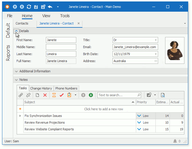
The IsCollapsibleGroup property enables the expand/collapse button in a group of View Items. This feature helps users to organize complex Detail Views in WinForms and ASP.NET Core Blazor applications.
- WinForms

- ASP.NET Core Blazor

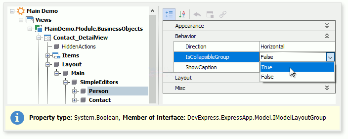
To make a selected group collapsible in WinForms and ASP.NET Core Blazor projects, double-click the MySolution\Module\Model.xamfl file to invoke Model Editor. Navigate to the Views | <DetailView> | Layout node, expand the layout group node, focus the group item node, and set the IsCollapsibleGroup property value to True.

Alternatively, you can access this property in a platform-specific module (MySolution\Blazor.Server\Model.xamfl or MySolution\Win\Model.xamfl file) and change the setting for the ASP.NET Core Blazor or Windows Forms project respectively.