BlazorControlViewItem Class
A container for custom ASP.NET Core Blazor components displayed in a Detail View.
Namespace: DevExpress.ExpressApp.Blazor.Editors
Assembly: DevExpress.ExpressApp.Blazor.v25.1.dll
NuGet Package: DevExpress.ExpressApp.Blazor
Declaration
Remarks
The following code snippet uses BlazorControlViewItem to create a custom component:
File: CS\MainDemo.Blazor.Server\Editors\ButtonComponent.razor
@using DevExpress.Blazor
@using DevExpress.ExpressApp
@using DevExpress.ExpressApp.Blazor.Editors

<DxButton Text="Click me!" Click=@ClickFromUI />

@code {
    [CascadingParameter] public BlazorControlViewItem ViewItem { get; set; }

    void ClickFromUI() {
        ViewItem.Application.ShowViewStrategy.ShowMessage("Action is executed!");
    }
}
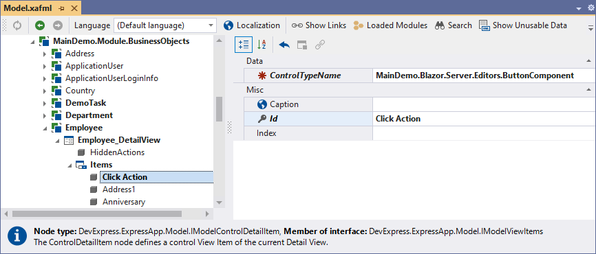
When you add the custom component to a Detail View, specify the component type as the ControlTypeName property value in the Model Editor:
For more information about custom ASP.NET Core Blazor View Items, refer to the following topics:
- How to Add an Unbound Control (Button) to the Form Layout in an XAF View (with a Fully Custom ViewItem)
- How to: Show a Custom Data-Bound Control in an XAF View (Blazor) - External Data
Implements
Inheritance
Object
ViewItem
ControlViewItem
BlazorControlViewItem
See Also