Editors
- 5 minutes to read
All editors support the following features:
- You can bind them to a data field;
- They can all be used for standalone or in-place editing within DevExpress container controls (XtraGrid, XtraVerticalGrid, XtraTreeList, XtraBars, etc). See Repositories and Repository Items to learn how to embed editors into container controls;
- They all use the same Skinning, Style, Look and feel, and Tooltip mechanisms, since they have the same BaseEdit ancestor.
Editor List
The table below lists available editors and corresponding repository items. A repository item is an object that stores properties and events pertaining to a corresponding editor. Container controls use information provided by repository items to create fully-functional editors when required. See the Repositories and Repository Items document for more details.
TEXT BOX EDITORS | REPOSITORY ITEMS | |
|---|---|---|
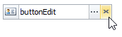
The text editor that supports built-in buttons in the edit box.
| ||
The editor to display and edit hyperlinks and navigate to their targets.
| ||
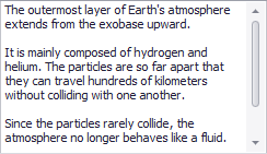
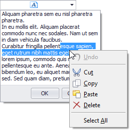
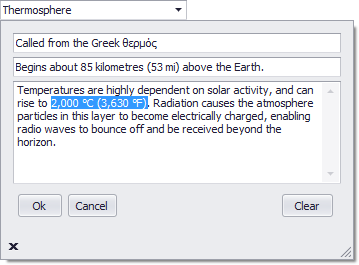
Allows you to display and edit multi-line text.
| ||
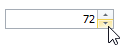
The editor to edit numeric values using spin buttons.
| ||
The single-line text editor.
| ||
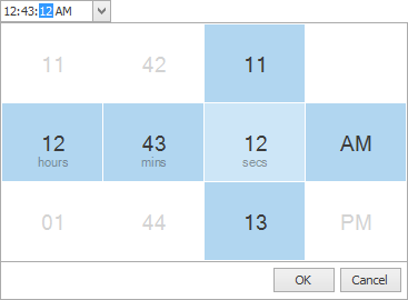
The editor to edit time values using spin buttons or dropdown calendar.
| ||
EDITORS WITHOUT A TEXT BOX | ||
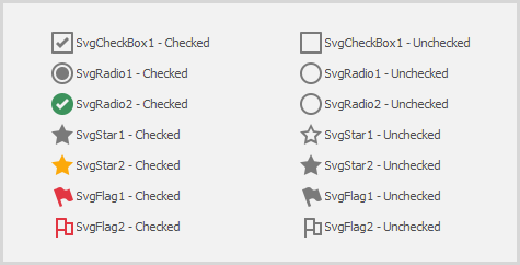
Allows an end-user to select between the unchecked, checked and (optionally) indeterminate state. Multiple check boxes can be combined into a radio group.
| ||
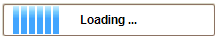
Indicates that an operation is going on by continuously scrolling a block from left to right.
| ||
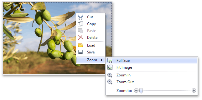
The editor that displays images stored in bitmap, metafile, icon, JPEG, GIF, PNG or SVG format.
| ||
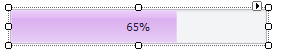
The control that indicates the progress of lengthy operations.
| ||
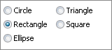
Combines multiple options (radio buttons) into a group that supports selecting one of several options.
| ||
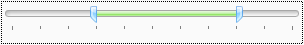
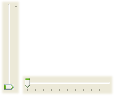
The track bar with two sliders that allow a user to select a range of values.
| ||
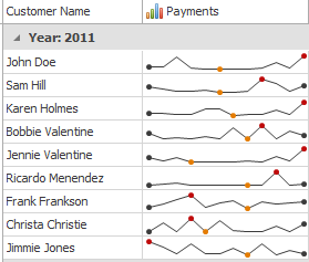
Visualizes data in a highly condensed way, allowing end-users to quickly understand and compare values from different sources.
| ||
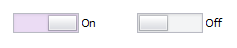
The check editor to edit Boolean values using a movable bar.
| ||
The control that allows end-users to select a value by dragging a small thumb along a scale.
| ||
The control that helps your end-users perform zooming by sliding a thumb.
| ||
The control to rate a specific content.
| ||
EDITORS WITH POPUP WINDOWS | ||
The MS Windows Explorer-inspired navigation bar that allows end-users to navigate through a hierarchical tree of nodes.
| ||
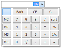
Allows you to edit numeric values using a dropdown calculator.
| ||
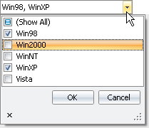
Allows you to display and edit a set of Boolean options and bit fields in a popup window.
| ||
The editor that allows you to select a color from a dropdown window.
| ||
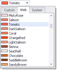
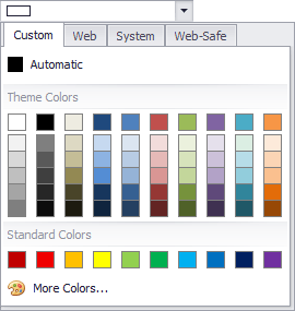
An advanced dropdown color picker that supports multiple palettes (a predefined color palette, Web, Web-Safe and System) to choose colors from.
| ||
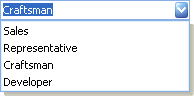
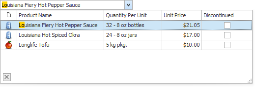
The text editor that allows you to select predefined items from a dropdown list. List items are typically represented by strings.
| ||
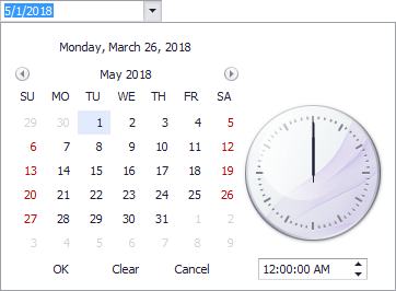
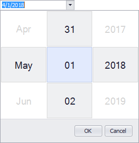
The editor to edit date/time values using a dropdown calendar.
| ||
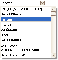
The editor to select a font from a dropdown list.
| ||
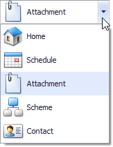
The combo box editor whose items can display custom images. The control also allows values from an enumeration to be displayed.
| ||
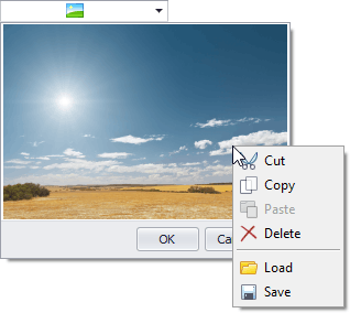
The editor that displays images in a popup window.
| ||
The editor to edit multi-line text in a popup window.
| ||
The text editor that allows you to type a value or choose one of most recently used (MRU) values from a dropdown list.
| ||
The editor that allows you to display any controls within its popup window.
| ||
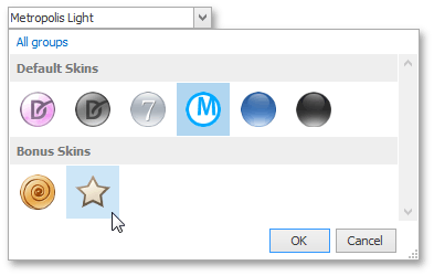
The editor that displays a dropdown gallery of items categorized into groups.
| ||
The editor to edit time values using spin buttons or dropdown calendar.
| ||
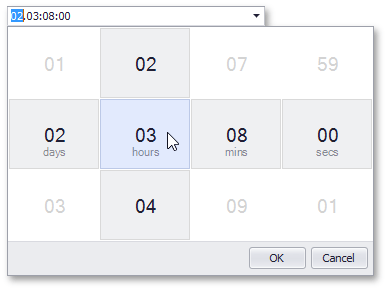
The editor to display and edit time intervals.
| ||
The text editor that applies custom validation to the entered text and transforms text blocks which passed this validation to tokens. See Token Edit Control.
| ||
LOOKUP EDITORS | ||
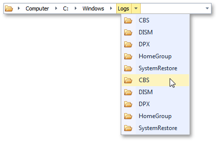
The editor that provides lookup functionality using a dropdown feature-rich Data Grid (GridControl). You can display lookup records in a tabular format, banded tabular format, or as tiles (which can be arranged in one or multiple columns/rows, rendered as a list or a Kanban board).
| ||
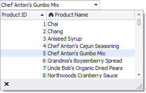
The editor that provides lookup functionality using a lightweight dropdown grid.
| ||
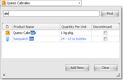
The editor that provides lookup functionality using a dropdown feature-rich data grid (GridControl), and contains the built-in Find Panel, allowing end-users to quickly filter and locate dropdown records. You can display lookup records in a tabular format, banded tabular format, or as tiles (which can be arranged in one or multiple columns/rows, rendered as a list or a Kanban board).
| ||
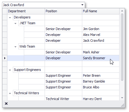
The editor that provides lookup functionality using a dropdown TreeList control.
| ||
SPECIAL | ||
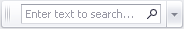
The control that provides the search and filter functionality for the attached object.
|