Property Grid
- 10 minutes to read
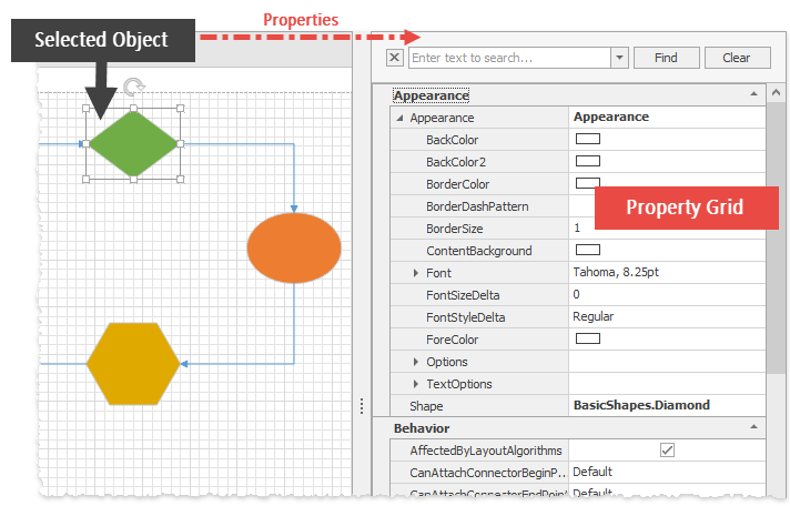
The PropertyGridControl reveals object properties and allows you to modify them while an application is running.
- Select an Inspected Object
- Inspect Multiple Objects
- Filter Retrieved Rows
- Customize Auto-Generated Rows
- Manually Add Rows
- Nested Rows
- Populate Manually Created Rows
- Multi-Editor Rows
- Category Rows
- Fixed Rows
- Find Panel
- Office View
- Context Menu
Select an Inspected Object
To inspect and modify object settings, assign that object to the PropertyGridControl.SelectedObject property.
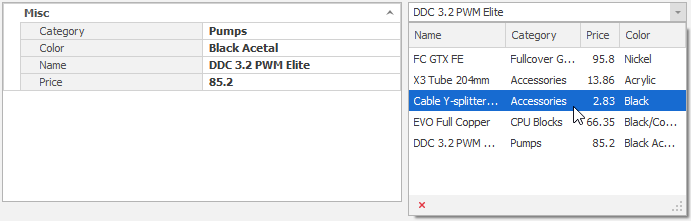
At runtime, you can specify the SelectedObject in code to browse and modify any business object’s settings. In the figure below, the LookUpEdit is bound to a list that contains records. Selecting a record fires the RepositoryItem.EditValueChanged event, which allows you to browse the selected Product.
//binding the lookup
lookUpEdit1.Properties.DataSource = initSampleData();
lookUpEdit1.Properties.DisplayMember = "Name";
lookUpEdit1.Properties.EditValueChanged += Properties_EditValueChanged;

//showing records in the Property Grid
private void Properties_EditValueChanged(object sender, EventArgs e) {
    propertyGridControl1.SelectedObject = (Product)lookUpEdit1.EditValue;
}

//lookup data
public List<Product> initSampleData() {
    List<Product> result = new List<Product>();
    result.Add(new Product("FC GTX FE", "Fullcover GPU Blocks", 95.80f, "Nickel"));
    //. . .
    return result;
}

//data records
public class Product {
    public Product(string name, string category, float price, string color) {
        Name = name; Category = category; Price = price; Color = color;
    }
    public string Name { get; set; }
    public string Category { get; set; }
    public float Price { get; set; }
    public string Color { get; set; }
}
Inspect Multiple Objects
You can use the PropertyGridControl.SelectedObject property to choose a single object whose properties you want to inspect, and the PropertyGridControl.SelectedObjects collection to access an array of inspected objects. In this case, the Property Grid control displays only those properties that apply to all objects in this array.
Filter Retrieved Rows
If you need to hide specific Property Grid rows, handle the PropertyGridControl.CustomPropertyDescriptors event. The following code illustrates how to hide a row generated for the “Price” data source field.
private void PropertyGridControl1_CustomPropertyDescriptors(object sender, DevExpress.XtraVerticalGrid.Events.CustomPropertyDescriptorsEventArgs e) {
     e.Properties = new PropertyDescriptorCollection(
        e.Properties.OfType<PropertyDescriptor>()
            .Where(p => p.Name != "Price").ToArray());
 }
See also: How to: Filter an object’s properties using the CustomPropertyDescriptors event | How to: Sort properties using the CustomPropertyDescriptors event
Customize Auto-Generated Rows
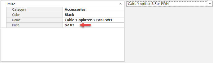
In the example above, all Property Grid rows are generated automatically based on the selected object type and properties. You can also create and modify rows manually. Rows are stored in the VGridControlBase.Rows collection and can be retrieved either from this collection by row indexes, or by calling the VGridControlBase.GetRowByFieldName method in code. The code below applies currency formatting to auto-generated “Price” rows.
private void Properties_EditValueChanged(object sender, EventArgs e) {
    propertyGridControl1.SelectedObject = (Product)lookUpEdit1.EditValue;
}

//Changing cell display format
private void PropertyGridControl1_DataSourceChanged(object sender, EventArgs e) {
    propertyGridControl1.GetRowByFieldName("Price").Properties.Format.FormatType = DevExpress.Utils.FormatType.Numeric;
    propertyGridControl1.GetRowByFieldName("Price").Properties.Format.FormatString = "C2";
}
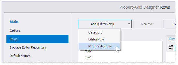
Manually Add Rows
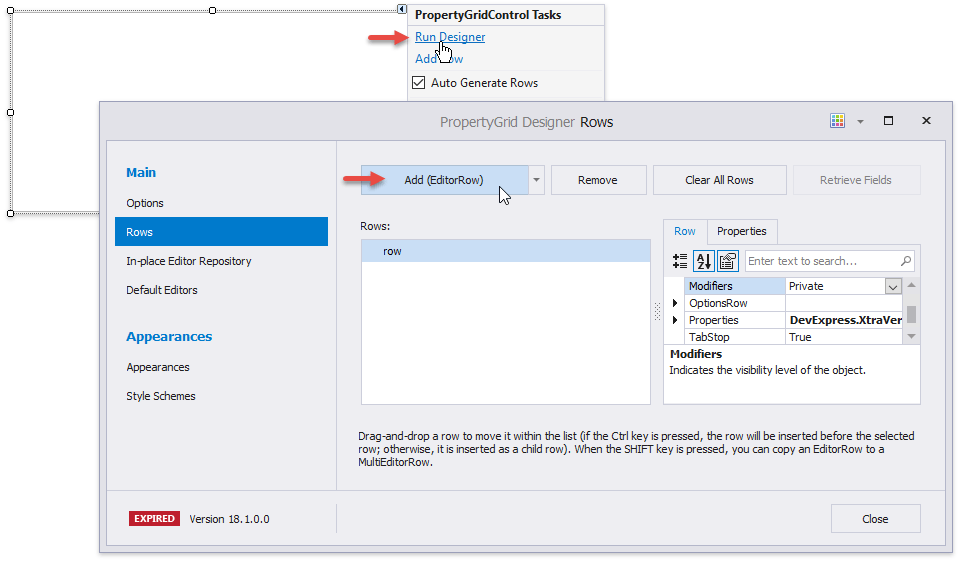
Invoke the Property Grid smart tag and click “Run Designer”. Switch to the Designer’s “Rows” tab and click the “Add (EditorRow)” button to manually add a row.
These regular data rows are EditorRow class objects.
Important
A control does not automatically create additional rows if a Property Grid contains at least one manually created data row.
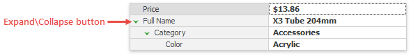
Nested Rows
In the Designer “Row” tab, drag one row to another to create a row hierarchy.
Note
Related API * BaseRow.Expanded - gets or sets whether this parent row is expanded.
- BaseRow.ChildRows, BaseRow.ParentRow - allow you to build row parent-child relationships in code.
- BaseOptionsView.LevelIndent - an integer value that specifies the row’s horizontal offset. To remove a root level rows’ offset, disable the BaseOptionsView.ShowRootLevelIndent setting.
To drag a child row from its parent back to the top level, drag-and-drop it while holding down the “Ctrl” key.
Populate Manually Created Rows
Rows you add manually display nothing at runtime. You can populate such rows in two different ways.
- When you need rows with values not associated with SelectedObject properties, create unbound rows that derive from the System.ComponentModel.PropertyDescriptor class and handle the PropertyGridControl.CustomPropertyDescriptors event. See this example to learn more.
If manually added rows should display SelectedObject property values, assign these property names to row RowProperties.FieldName properties.
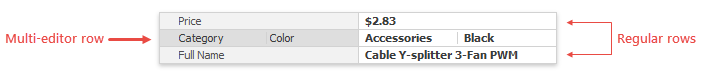
Multi-Editor Rows
Multi-editor rows (MultiEditorRow objects) combine multiple simple data rows into one row.
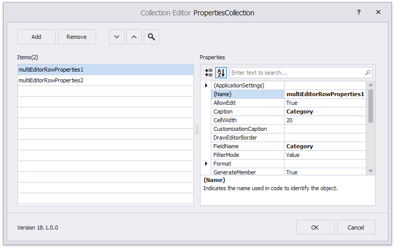
At design time, you can create multi-editor rows in the Property Grid Designer.
To populate a multi-editor row, modify the MultiEditorRow.PropertiesCollection. Each collection item represents a regular EditorRow with standard row settings - Caption, FieldName, etc.
The following sample illustrates how to add a multi-editor row in code.
MultiEditorRow meRow = new MultiEditorRow();
meRow.PropertiesCollection.Add(new MultiEditorRowProperties() { FieldName = "Name", Caption = "Full Name" });
meRow.PropertiesCollection.Add(new MultiEditorRowProperties() { FieldName = "Category", Caption = "Product Category" });
meRow.PropertiesCollection.Add(new MultiEditorRowProperties() { FieldName = "Color", Caption = "Color" });
propertyGridControl1.Rows.Add(meRow);
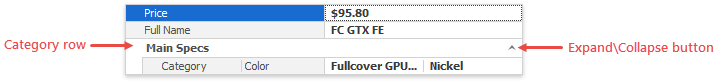
Category Rows
Category rows allow you to organize multiple data rows into a group and provide a caption for it.
To add categories at design time, go to the Designer “Rows” tab and use the “Add” button’s drop-down menu. Then, drag-and-drop regular data rows onto this category to populate it.
Note
Related API * BaseRow.Expanded - allows you to manually expand and collapse categories.
- BaseOptionsView.CategoryLevelIndentStyle - specifies whether categories have a vertical indent that visually delimits them from regular data rows.
- VGridControlBase.TreeButtonStyle - specifies the expand\collapse buttons’ style and alignment.
In code, the CategoryRow class instances represent categories. The following sample illustrates how to add a category.
CategoryRow cRow = new CategoryRow();
cRow.Properties.Caption = "Main Specs";
cRow.ChildRows.AddRange(new BaseRow[] { row1, row2, row3 });
cRow.Expanded = false;
propertyGridControl1.Rows.Insert(cRow, propertyGridControl1.Rows.Count - 1);
Fixed Rows
If a Property Grid control is too small to display all rows at once, it shows a vertical scrollbar. Rows can anchor to the control’s top or bottom edge, and remain visible as users scroll through records. To fix a row, specify its BaseRow.Fixed property. In the following animation, the “Appearance” category is anchored to the control’s top.
Important
The BaseRow.Fixed property is in effect only for top-tier rows. If a row is another row’s child or belongs to a category, it cannot be anchored. Alternatively, specify the parent row’s Fixed property.
You can use the VGridControlBase.FixedTopRows and VGridControlBase.FixedBottomRows collections to retrieve fixed rows.
Find Panel
A Property Grid can display the Find Panel to help end-users locate the required settings by their names. To invoke this tool, press “Ctrl+F” at runtime.
Note
Related API * VGridControlBase.FindPanelVisible - specifies whether the find panel is initially shown.
- VGridControlBase.OptionsFind - provides advanced Find Panel options that allow you to hide specific buttons, change the auto-search delay, specify whether the results should be highlighted, etc.
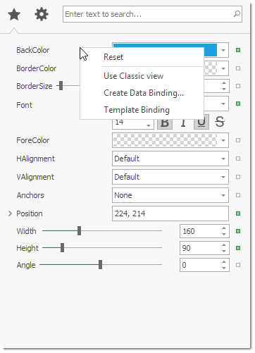
Context Menu
The property grid can display a context menu for properties. The menu contains the predefined Reset command that sets the property to its default value. You can also provide custom commands by handling dedicated events. To invoke the menu, users can right-click a property or click a brick button (Office view only).
Right-click
With a right-click, the menu is enabled by default. Use the PropertyGridControl.OptionsMenu.EnableContextMenu property to disable the menu (see VGridOptionsMenu.EnableContextMenu). To populate the menu with custom commands, handle the VGridControlBase.PopupMenuShowing event.
using DevExpress.Utils.Menu;

DXMenuItem createDataBindingItem;
protected DXMenuItem CreateDataBindingItem {
    get {
        if (createDataBindingItem == null) {
            DXMenuItem item = new DXMenuItem("Create Data Binding...");
            item.Click += (s, ee) => MessageBox.Show("'Create Data Binding...' is clicked.");
            createDataBindingItem = item;
        }
        return createDataBindingItem;
    }
}
private void Grid_PopupMenuShowing(object sender, Events.PopupMenuShowingEventArgs e) {
    if(e.Row.Properties.FieldName == "Appearance.BackColor")
        e.Menu.Items.Add(CreateDataBindingItem);
}
Note
Items added using the PopupMenuShowing event are also shown when the menu is invoked with a click on a brick button against a property (see below).
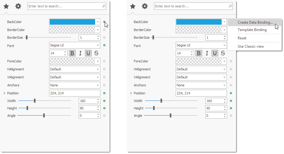
Click a brick button
Brick buttons are only available in the Office view (see PropertyGridControl.ActiveViewType). To show brick buttons, set the PropertyGridControl.OptionsView.ShowRowBrick property to True (see PGridOptionsView.ShowRowBrick). To populate the menu, handle the PropertyGridControl.RowBrickMenuShowing event.
using DevExpress.Utils.Menu;

DXMenuItem createDataBindingItem;
protected DXMenuItem CreateDataBindingItem {
    get {
        if (createDataBindingItem == null) {
            DXMenuItem item = new DXMenuItem("Create Data Binding...");
            item.Click += (s, ee) => MessageBox.Show("'Create Data Binding...' is clicked.");
            createDataBindingItem = item;
        }
        return createDataBindingItem;
    }
}
private void Grid_RowBrickMenuShowing(object sender, Events.PopupMenuShowingEventArgs e) {
    if(e.Row.Properties.FieldName == "Appearance.BackColor")
        e.Menu.Items.Add(CreateDataBindingItem);
}
Note
Items added using the RowBrickMenuShowing event are not shown when the menu is invoked with a right-click on a property.
Brick buttons can be customized by handling the PropertyGridControl.CustomDrawRowBrick event.
private void propertyGridControl1_CustomDrawRowBrick(object sender, DevExpress.XtraVerticalGrid.Events.CustomDrawRowBrickEventArgs e) {
    e.Handled = true;
    Size size = new Size(7, 7);
    Rectangle bounds = RectangleHelper.GetCenterBounds(e.RowBrickInfo.BrickArea, size);
    if (e.RowBrickInfo.State == DevExpress.Utils.Drawing.ObjectState.Normal)
        e.Cache.FillRectangle(Color.Transparent, bounds);
    if (e.RowBrickInfo.State == DevExpress.Utils.Drawing.ObjectState.Hot)
        e.Cache.FillRectangle(Color.LightGray, bounds);
    e.Cache.DrawRectangle(bounds, Color.DarkGray, e.RowBrickInfo.BorderThickness);
}