ImageComboBoxEdit Class
The combo box editor whose items can display custom images. The control also allows values from an enumeration to be displayed.
Namespace: DevExpress.XtraEditors
Assembly: DevExpress.XtraEditors.v18.2.dll
Declaration
[SmartTagAction(typeof(ImageComboBoxEditActions), "EditItems", "Edit items", SmartTagActionType.CloseAfterExecute)]
[SmartTagFilter(typeof(ImageComboBoxEditFilter))]
[ToolboxBitmap(typeof(ToolboxIconsRootNS), "ImageComboBoxEdit")]
public class ImageComboBoxEdit :
ComboBoxEditRemarks
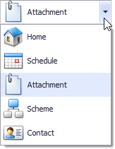
Unlike the ComboBoxEdit control, the descendant ImageComboBoxEdit control allows you to display images for each item within the dropdown list. The image below shows a sample ImageComboBoxEdit.
The editor’s ImageComboBoxEdit.Properties property returns a RepositoryItemImageComboBox object that allows you to customize the editor’s appearance and behavior. For example, use the RepositoryItemImageComboBox.Items property to customize the collection of items displayed within the dropdown list.
Image combo box items are ImageComboBoxItem objects. Such objects provide properties to specify the item’s value (the ComboBoxItem.Value inherited property), text (ImageComboBoxItem.Description) and image (ImageComboBoxItem.ImageIndex). When an item is selected, its value is assigned to the control’s ImageComboBoxEdit.EditValue property, and its text and image are displayed in the edit box.
Note
To ensure that an ImageComboBoxEdit control works correctly, item values must be unique within the item collection. The default value of any ImageComboBoxItem object is null. You need to set values for items when you create ImageComboBoxItem objects at design time or in code. Otherwise, an end-user will not be able to select items via the ImageComboBoxEdit.
The currently selected item can be specified by the corresponding item object via the ImageComboBoxEdit.SelectedItem property or by its index within the collection using the ComboBoxEdit.SelectedIndex property. You can also select items using the ImageComboBoxEdit.EditValue property. The property can be set either to an object from the RepositoryItemImageComboBox.Items collection or to an item’s value (the desired item’s ComboBoxItem.Value property).
Image combo box editors support two image lists. The RepositoryItemImageComboBox.LargeImages and RepositoryItemImageComboBox.SmallImages properties are introduced for this purpose. An item’s ImageComboBoxItem.ImageIndex property should be used to specify images that will be used to represent the item. If both the RepositoryItemImageComboBox.LargeImages and RepositoryItemImageComboBox.SmallImages properties specify image lists, the editor uses small images in the edit box and large images in the dropdown. If only one of these properties is assigned, the editor uses images from a corresponding list to display items in both the edit box and dropdown. If none of the properties are assigned, items are represented only by their captions.
When no item is selected, you can display custom text within the editor’s edit box. To do this, assign the required string to the RepositoryItem.NullText property.
The ImageComboBoxEdit control also allows values from any enumeration to be displayed. See ImageComboBoxItemCollection.AddEnum, for more information and an example.
Example
The following code shows how to create an ImageComboBoxEdit control at runtime. In the custom AddItems method, several items are added using the ImageComboBoxItemCollection.Add method. For each item, we specify the caption, value and image index. The ImageCollection that stores images for items is created and populated at design time. It is assigned to the RepositoryItemImageComboBox.SmallImages property, providing images for items.
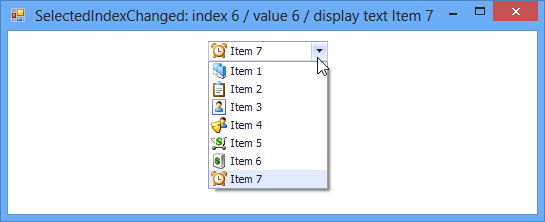
The ComboBoxEdit.SelectedIndexChanged event is used to display information on the selected item. The event handler displays the caption, value and index of the selected item in the form’s title.
The following image shows the form when the last item is selected.
using DevExpress.Utils;
using DevExpress.XtraEditors;
using DevExpress.XtraEditors.Controls;

//ImageCollection storing images for items
private DevExpress.Utils.ImageCollection imageCollection1;

//image combo box editor created at runtime
DevExpress.XtraEditors.ImageComboBoxEdit rtImageComboBox;

private void Form1_Load(object sender, EventArgs e) {
    rtImageComboBox = CreateImageComboBoxEdit(new Rectangle(220, 10, 120, 20), this);
    AddItems(rtImageComboBox, imageCollection1);
    //select the last item
    rtImageComboBox.SelectedIndex = rtImageComboBox.Properties.Items.Count - 1;
}

//create the editor
private ImageComboBoxEdit CreateImageComboBoxEdit(Rectangle bounds, Control container) {
    ImageComboBoxEdit editor = new ImageComboBoxEdit();
    editor.Bounds = bounds;
    container.Controls.Add(editor);
    editor.SelectedIndexChanged += new EventHandler(imageComboBoxEdit_SelectedIndexChanged);
    return editor;
}

//add items
private void AddItems(ImageComboBoxEdit editor, ImageCollection imgList) {
    for (int i = 0; i < 7; i++)
        editor.Properties.Items.Add(new ImageComboBoxItem("Item " + (i + 1).ToString(), i, i));
    editor.Properties.SmallImages = imgList;
}

//display information on the selected item
void imageComboBoxEdit_SelectedIndexChanged(object sender, EventArgs e) {
    ImageComboBoxEdit editor = sender as ImageComboBoxEdit;
    this.Text = "SelectedIndexChanged: index " + editor.SelectedIndex.ToString() +
        " / value " + editor.EditValue.ToString() + " / display text " + editor.Text;
}