Templated ListBox Items
- 4 minutes to read
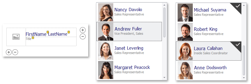
The Item Templates feature enables you to display multiple text and image elements in ListBox controls’ items (ListBoxControl, CheckedListBoxControl, and ImageListBoxControl). This is accomplished by creating an item template that defines the pattern used to render Listbox control items.
You can access bound data source fields and set up a template by arranging the fields using the Item Template Designer if the Listbox control is bound to a data source.
Item Template Capabilities
- The item template can consist of any number of text and image elements. You can display images in all Listbox controls.
- The dedicated Item Template Designer provides the capability to set up the item template at design time.
- Dynamic templated item customization at runtime with the BaseListBoxControl.CustomizeItem event.
- Create multiple item templates and substitute them at runtime with the BaseListBoxControl.CustomItemTemplate event.
- Bound and unbound elements in the item template. Unbound elements display static text and images; bound elements display data from underlying data source fields.
- Multiple alignment options for template elements, including alignment relative to other elements, and specifying absolute or relative element sizes.
- Customize certain elements’ appearance (font attributes and colors) using corresponding properties.
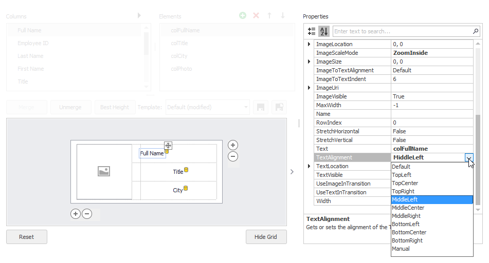
Invoke Item Template Designer
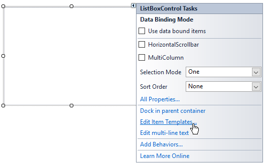
Click the Listbox control’s smart tag and select the Edit Item Templates command.
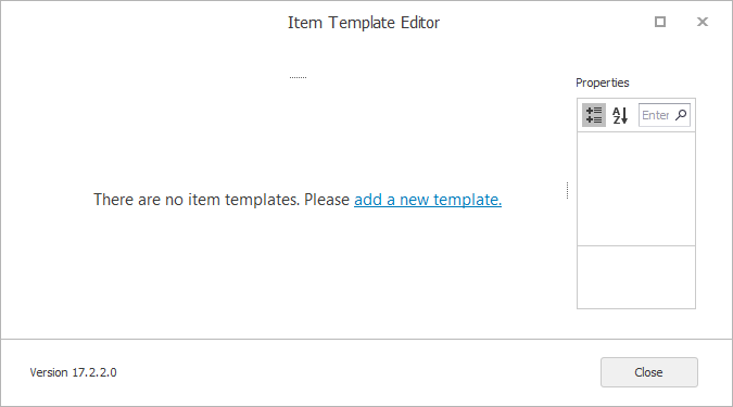
This opens the Item Template Designer. The designer prompts you to create a new template if there are no existing ones.
Once you provide a name for the new template, the Item Template Designer shows the template design surface.
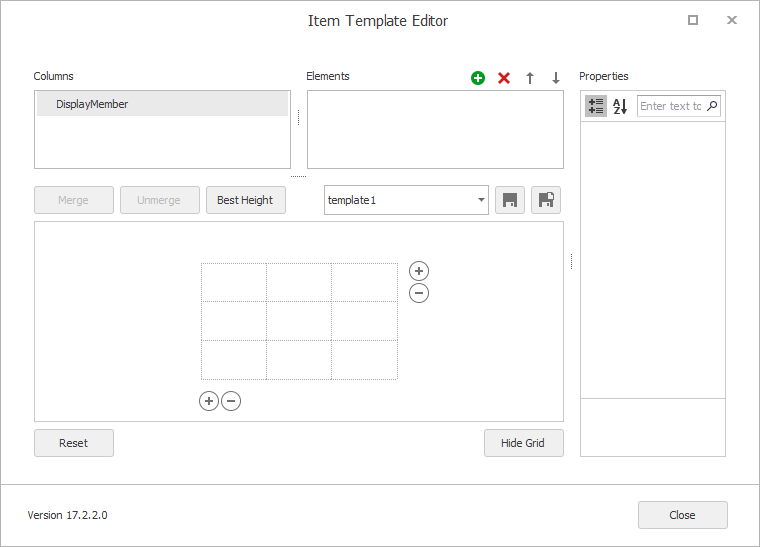
If the control was bound to a data source at design time, the Columns list provides access to the available data source fields.
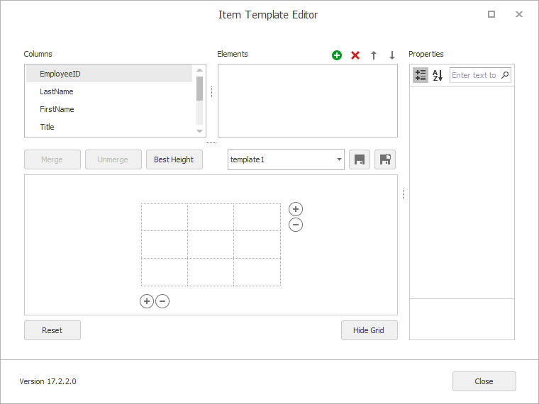
- Columns list - Displays fields from the data source bound to the ListBox control. If the ListBox control is not currently bound, the Columns list only displays the DisplayMember item (this identifies a listbox item’s default text content).
- Elements list - Displays existing template elements. You can add and delete elements using the buttons at the top of the list. You can also add elements by dragging fields from the Columns list onto the design surface.
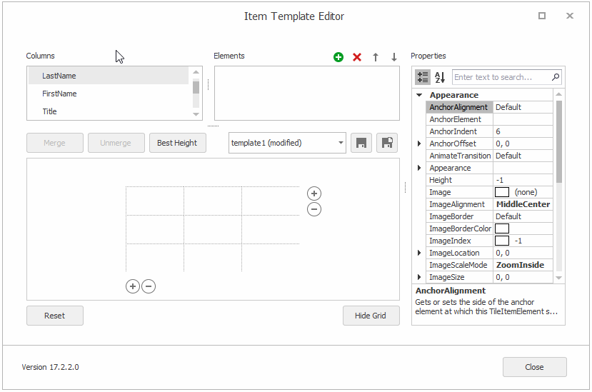
- Properties grid - Allows you to modify the selected element’s settings.
Set Up Item Template
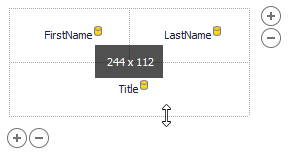
The item template is based on the common Table Layout concept in which the design surface is divided into logical columns and rows, and the contents are placed in corresponding cells (which can be merged if required).
The supported template customization actions include:
Drag-and-drop fields from the Columns list onto table cells.
When you drop a field onto a cell, it automatically creates a bound template element.
- Drag-and-drop created elements between cells.
- Placing multiple elements in the same cell and providing different alignment options for these elements to prevent overlapping (see the Anchor… properties).
- Merging cells by selecting them with the mouse and then clicking the Merge button.
- Unmerging previously merged cells using the Unmerge button.
- Resizing cells using the mouse
- Resizing the item template with the mouse by dragging its edges.
Adding/removing columns and rows using the
 buttons and context menu.
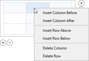
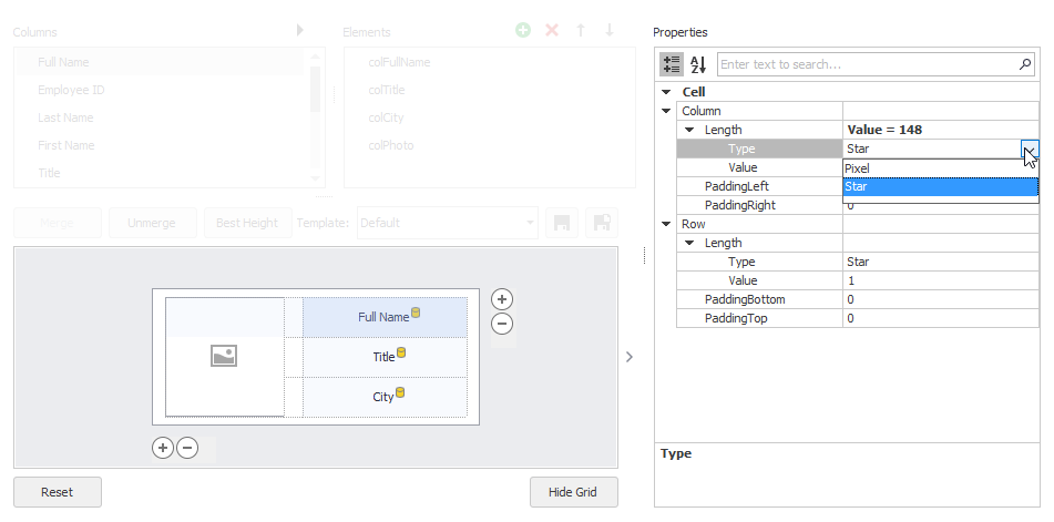
Selecting a cell (by clicking it) and customizing the cell’s size, size type (absolute or relative) and padding in the Property Grid.
Accessing a dropped element (by clicking it) and customizing its settings in the Property Grid.
- Manipulating the element collection via the Elements list, for instance, by adding unbound elements. When an element is created, it is automatically added to the template.
- Support for multiple templates.
Multiple Item Templates
A template created in the designer is added to the BaseListBoxControl.Templates collection. The first template in this collection becomes active, and it is used to render all items (by default).
You can create more templates and apply them to different items or in different cases. For instance, you can create two item templates-“compact” providing less information, and “detailed” providing more details, and switch between them depending on the control’s width.
To create multiple item templates, use the Save As button ( ), which saves a copy of the current template with a different name. You can then modify the new template and save the changes.
To dynamically provide templates for items, handle the BaseListBoxControl.CustomItemTemplate event.
Item Height
When you resize an item template vertically, you change the item’s height in the BaseListBoxControl.ItemHeight property. All item templates share this setting.
All items in the ListBox control have the same item height by default (BaseListBoxControl.ItemHeight). If you need to provide different heights for different items, handle the BaseListBoxControl.MeasureItem event.