Token Edit Control
- 10 minutes to read
The WinForms Token Edit Control is an editor inspired by address field controls seen in modern mail clients (services) such as Microsoft Outlook or Google’s Gmail. Visually the Token Edit Control is a simple text edit, where end-users may enter textual data. The editor validates the entered text and converts valid text blocks into tokens - separate visual elements that can display a text string, an icon, can be clicked and hovered. In the default mode (TokenList mode), text validation is disabled and end-users are only allowed to select from the range of predefined tokens. This topic contains the following sections:
In this topic, you will get to know the main features of the Token Edit Control and learn how to use this editor in your application. |
What are tokens?
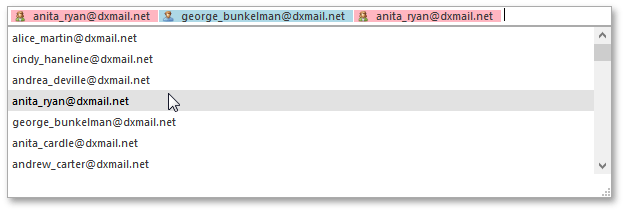
A token is the TokenEditToken class instance to which a valid text block is transformed. The following figure illustrates an example of the Token Edit Control with two validated text blocks, already transformed into tokens, and a text still being entered to the editor.
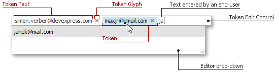
As opposed to plain text strings, tokens are non-editable objects and treated by an editor as a solid element. This means once the text is converted into token, you cannot modify its text. Pressing the Backspace key will remove the entire token from the editor.
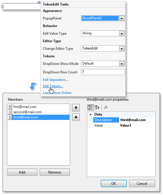
To populate the editor with tokens, use the Edit Tokens… link within the control’s smart tag menu at design-time (see the image below), or add TokenEditToken objects to the RepositoryItemTokenEdit.Tokens collection in code. Note that if you populate token editor in code, wrap your code in BeginUpdate/EndUpdate method calls to improve the performance.
tokenEdit1.Properties.BeginUpdate();
tokenEdit1.Properties.Tokens.AddToken("Description string", "value");
// ... add more tokens
tokenEdit1.Properties.EndUpdate();
Technically, each token contains only text and value. At runtime however, each token can display a glyph.
Token Text and Token Value
Token text and value are managed by the TokenEditToken.Description and TokenEditToken.Value properties respectively. The Description property specifies the token text that will be visible to end-users at runtime. Token Values are, in turn, used internally and never shown to end-users.
Important
Token values are used by the BaseEdit.EditValue property, which reflects currently selected (visible within the editor’s text box) tokens within this Token Edit Control. Depending on the RepositoryItemTokenEdit.EditValueType property value, the EditValue property returns a string, BindingList structure or enumeration. This edit value is built from token values, not their descriptions. This leads to three conditions that must be fulfilled for the Token Edit to work properly:
- Each token requires a value. When creating tokens at design-time, each token receives an auto-generated value (Value1, Value2, Value3 etc). If you populate the RepositoryItemTokenEdit.Tokens collection manually in code, remember to assign a value for each token added.
- Token values must be unique. Otherwise, the exception will be raised.
- Since the Token Edit identifies its tokens by their values’ ToString() method, it must return unique values for each individual token. By default, this method returns the value object’s type name. If you face such a situation, you can either override the ToString() method of an object that serves as a token value so it will return the unique value (for instance, the customer ID or the index of a token), or pass this unique value to the token itself as its value (see this example to learn more).
To manually modify the token text shown on-screen without changing the Description property, handle the RepositoryItemTokenEdit.CustomDrawTokenText event, as shown below.
private void tokenEdit1_Properties_CustomDrawTokenText(object sender, DevExpress.XtraEditors.TokenEditCustomDrawTokenTextEventArgs e) {
    if (. . .) e.Info.PaintAppearance.DrawString(e.Cache, "My Text", e.Info.DescriptionBounds, e.Info.PaintAppearance.Font, Brushes.Black, e.Info.PaintAppearance.GetStringFormat());
    e.Handled = true;
}
Token Glyphs
The TokenEditToken class objects do not contain any properties that store token icons. However, each token can display a glyph, when selected.
Glyph functionality
By default, clicking a token glyph removes the related token from the editor’s edit box. To disable this behavior, set the RepositoryItemTokenEdit.DeleteTokenOnGlyphClick property to DefaultBoolean.False.
Disabling glyphs
Default token glyphs are small cross icons, which maintains the line with the default RepositoryItemTokenEdit.DeleteTokenOnGlyphClick property value. To completely hide these glyphs set the RepositoryItemTokenEdit.ShowTokenGlyph property to false.
Custom glyphs
To show a custom glyph instead of the default ‘remove’ glyph, handle the RepositoryItemTokenEdit.CustomDrawTokenGlyph event as shown below.
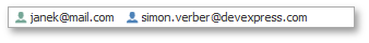
private void tokenEdit1_Properties_CustomDrawTokenGlyph(object sender, DevExpress.XtraEditors.TokenEditCustomDrawTokenGlyphEventArgs e) { if(. . .) { e.Graphics.DrawImage(DevExpress.Images.ImageResourceCache.Default.GetImage("images/actions/add_16x16.png"), e.GlyphBounds); e.Handled = true; } }The following figure illustrates tokens with customly drawn glyphs.
Glyph alignment
The editor draws token glyphs before the token description by default. To place token glyphs after descriptions, use the RepositoryItemTokenEdit.TokenGlyphLocation property.
Separators
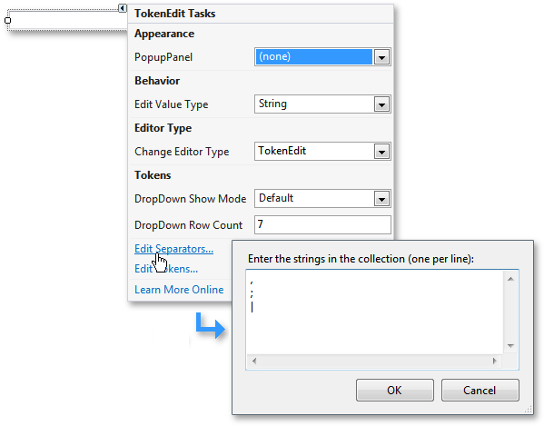
Separator characters tell the Token Edit Control that the following text, entered to the control’s text edit, is the beginning of a new block that should be validated separately. In other words, separators are characters that delimit tokens. You can set multiple separator characters for a single Token Editor. To do so, modify the RepositoryItemTokenEdit.Separators collection in code, or invoke the control’s smart-tag menu and click Edit Separators…, as shown below.
The separator character used to delimit token values for the EditValue object is specified by RepositoryItemTokenEdit.EditValueSeparatorChar property and can differ from separators that end-users have to enter. The default edit value separator (comma character) is stored within the RepositoryItemTokenEdit.DefaultEditValueSeparatorChar field.
Edit Modes
The Token Edit Control can run in two modes - TokenList and Manual. Depending on the editor mode, the editor either allows end-users to add unknown tokens or not. To switch the token edit mode use the RepositoryItemTokenEdit.EditMode property.
TokenList Mode
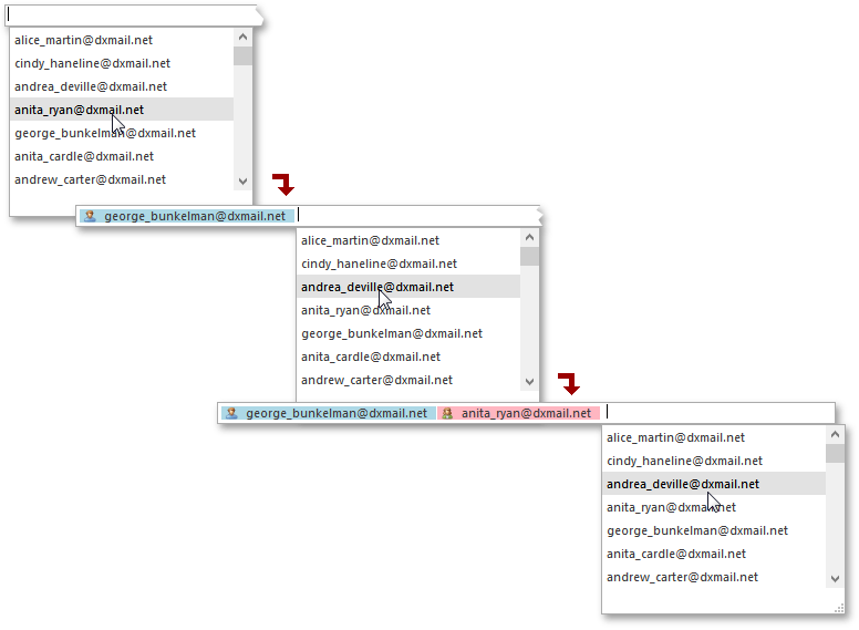
This is the default Token Edit Control mode in which end-users are allowed to add only predefined tokens (tokens that were previously added to the RepositoryItemTokenEdit.Tokens collection). End-users are free to enter any string data to the editor, but if it does not match any existing token, it will remain as plain text and will be removed when the editor loses focus. To assist end-users, each time a character is entered to the editor, a drop-down menu is shown. This drop-down displays tokens that match the entered text or (if none were found) all predefined tokens that have not been added yet. The following animation illustrates an example.
Show animation

Manual Mode
In this mode end-users are allowed to enter any desired text to the editor, so predefined tokens can be mixed with new tokens. Not any entered text is converted into tokens, but only those text blocks that pass validation (see the ‘Validation’ section below). The following animation shows the Token Edit Control running in this mode.
Show animation
Validation
In order to transform text into a token, the text block must pass custom validation. Validation is performed during the RepositoryItemTokenEdit.ValidateToken event. For example, the following code transforms the entered text into a token if the text is an email address.
Regex MailRegex = new Regex(@"^[-a-z0-9!#$%&'*+/=?^_`{|}~]+(?:\.[-a-z0-9!#$%&'*+/=?^_`{|}~]+)*@(?:[a-z0-9]([-a-z0-9]{0,61}[a-z0-9])?\.)*(?:aero|arpa|asia|biz|cat|com|coop|edu|gov|info|int|jobs|mil|mobi|museum|name|net|org|pro|tel|travel|[a-z][a-z])$",
        RegexOptions.Compiled);

private void tokenEdit1_ValidateToken(object sender, DevExpress.XtraEditors.TokenEditValidateTokenEventArgs e) {
    e.IsValid = MailRegex.IsMatch(e.Description);
}
The main scenarios in which the ValidateToken event occurs are as follows:
- the editor has lost focus;
- an end-user has entered a separator character;
To disable the specific validation scenario, use the RepositoryItemTokenEdit.ValidationRules property.
Tip
Event arguments also provide the capability to read and modify token values and descriptions. To do so, use the e.Value and e.Description properties. Thus, by handling this event you can also manually process all tokens and modify them as required.
Note
The ValidateToken event is not fired when the editor is in Token List mode (see the ‘Drop-Down List and Edit Mode’ section below), since in this mode, end-users are only allowed to select existing tokens from the drop-down list, which do not require validation.
Drop-Down Menu
The Token Edit Control’s drop-down menu displays tokens, contained within the RepositoryItemTokenEdit.Tokens collection and appropriate for selecting at the moment. The animation below illustrates this drop-down menu and its runtime features, available to end-users.
Show animation
The following properties allow you to customize drop-down menu’s appearance and behavior.
the RepositoryItemTokenEdit.ShowDropDown property - gets or sets whether or not the drop-down should be enabled at runtime.
Important
Do not set the RepositoryItemTokenEdit.ShowDropDown property to false if your editor runs in TokenList mode.
- the RepositoryItemTokenEdit.DropDownRowCount property - stores the amount of tokens that can be simultaneously shown within the drop-down menu (7 by default, this value is stored in the RepositoryItemTokenEdit.DefaultDropDownRowCount field).
the RepositoryItemTokenEdit.DropDownShowMode property - specifies whether the drop-down menu is displayed in Regular or Outlook mode. When in Regular (or Default) mode, the drop-down list is always displayed starting from the editor’s left edge and occupies the width equal to the editor’s width. See the figure below for an example.
In Outlook mode, the drop-down list starts from the cursor position and occupies the width according to the longest token caption available. As an end-user keeps adding tokens, the drop-down follows the cursor further and further to the editor’s right edge. The figure below illustrates this drop-down show mode.
- the RepositoryItemTokenEdit.CustomDropDownControl property - allows you to replace the default drop-down menu with your own custom panel. See the TokenEdit with Custom Drop-Down Control article for an example.
- the TokenEdit.ShowPopup method - explicitly opens the drop-down menu. This method is in effect regardless of the RepositoryItemTokenEdit.ShowDropDown property value.
the RepositoryItemTokenEdit.TokenPopulateMode property - gets or sets whether or not the RepositoryItemTokenEdit.Tokens collection can be populated at runtime with end-user tokens that pass validation. As a result, end-users become able to use the drop-down menu to select these tokens when needed instead of having to manually re-enter them manually.
Note
This setting has no effect when the editor runs in TokenList mode, since this mode restricts end-users to add not existing tokens.
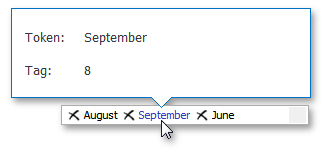
Peek Panel
By default, each token can display a peek panel on hover. This feature allows you to peek into a specific token for some additional information associated with this token (see the image below). The pop-up peek panel is a FlyoutPanel assigned to the editor’s RepositoryItemTokenEdit.PopupPanel property and its options are stored in the RepositoryItemTokenEdit.PopupPanelOptions properties section.
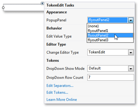
To implement this feature, drop the FlyoutPanel component onto the form and assign it to the Token Editor via the editor’s smart-tag menu, as illustrated in the figure below.
Specify the PopupPanelOptions.ShowPopupPanel and PopupPanelOptions.Location properties to specify whether or not the assigned panel should be displayed, and if so, whether it should be displayed above or below the token. To populate this panel, handle the RepositoryItemTokenEdit.BeforeShowPopupPanel event and use its e.Description and e.Value parameters to get the display text and the tag of the associated token element.