Controls
- 4 minutes to read
Some XtraEditors controls can only be used as standalone controls, i.e. they cannot be used for in-place editing in container controls. These include: several types of list boxes, data navigator controls, scrollbars and a button control.
The controls are all BaseStyleControl descendants and thus support the skinning, look and feel, style and tooltip mechanisms common to all DevExpress controls.
Buttons and Labels
Editor | Description |
|---|---|
The button that can be associated with a popup control or a context menu. It is possible to prevent the button from receiving focus on a click.
| |
The button that supports two states - elevated and depressed. It is possible to prevent the button from receiving focus on a click. Multiple buttons can be combined into a radio group, in which only a single button is checked simultaneously.
| |
The label that supports formatted text, images, multi-line text strings and HTML formatting.
| |
The label that supports displaying text or its portion as a hyperlink. Allows you to use HTML tags to format text.
| |
The button that can display text along with a custom image and can be clicked at runtime without receiving focus.
| |
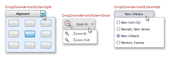
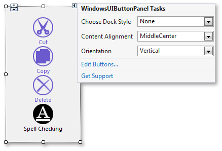
Allows you to create Windows UI flat buttons.
|
Data Controls
Editor | Description |
|---|---|
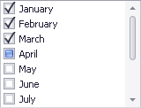
The checked list box control, in which each item can be checked, unchecked or set to the grayed state. The control can be populated with items from a data source.
| |
Provides a graphical interface for navigating data-aware controls that implement the INavigatableControl interface (this interface is implemented by all DevExpress data-aware container controls).
| |
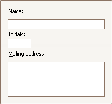
The control that enables navigation through records in a data source and provides common record operations.
| |
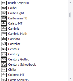
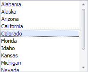
The list box control that displays a list of items that a user can select. Can be populated with items from a data source.
| |
The list box control that displays a list of items that a user can select. Can be populated with items from a data source.
|

Utility Controls
Editor | Description |
|---|---|
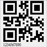
Displays a bar code.
| |
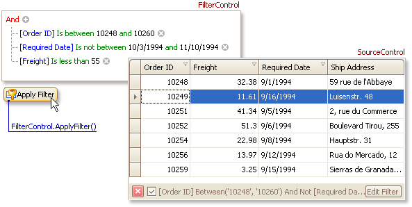
Allows end-users to construct filter criteria, and apply them to controls or to a data source.
| |
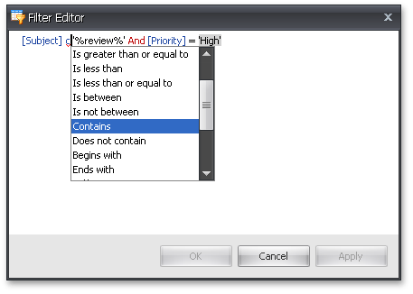
Allows you to edit filters in a tree-like and/or text-based form.
| |
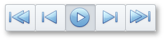
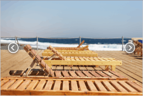
The control that allows your end-users to browse through a collection of images using two navigation buttons. Supports animation effects when navigating between images.
| |
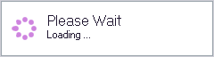
Represents a control showing an await message to a user.
| |
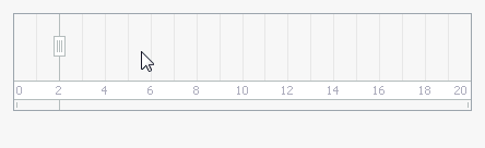
Supports range selection for any data.
| |
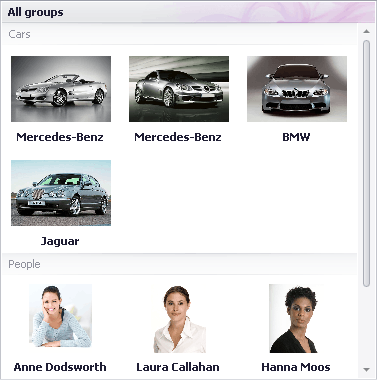
The control displaying an image gallery, with the capability to categorize items into groups.
| |
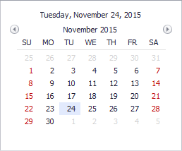
A monthly calendar that allows an end-user to select a date or date range(s).
|
Layout Controls
Editor | Description |
|---|---|
The panel with a title which can be aligned along the top, bottom, left or right edge.
| |
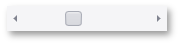
The horizontal scrollbar.
| |
The panel with or without a border.
| |
Allows end-users to resize controls that are docked to the splitter’s edges.
| |
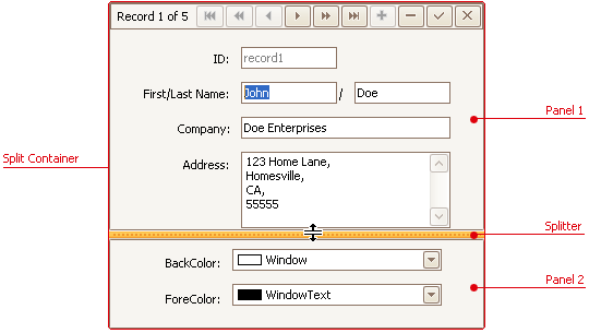
The control that consists of two panels separated by a splitter, which can be dragged by an end-user to resize the panels.
| |
The vertical scrollbar.
| |
The skinnable panel with built-in auto-scroll functionality.
| |
Displays tabbed pages where you can place your controls.
|

Forms and User Controls
Editor | Description |
|---|---|
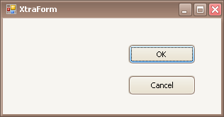
A form that supports title bar and border skinning. Provides centralized control over the look and feel settings of the DevExpress controls placed on it.
| |
The message box that supports title bar skinning. | |
The user control that supports look and feel and skinning technology. Provides centralized control over the look and feel settings of the DevExpress controls placed on it. | |
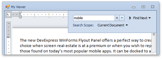
The floating panel that is displayed and hidden using an animation effect. See Flyout Panel.
|