GridLookUpEdit Class
The editor that provides lookup functionality using a dropdown feature-rich Data Grid (GridControl). You can display lookup records in a tabular format, banded tabular format, or as tiles (which can be arranged in one or multiple columns/rows, rendered as a list or a Kanban board).
Namespace: DevExpress.XtraEditors
Assembly: DevExpress.XtraGrid.v18.2.dll
Declaration
[ToolboxBitmap(typeof(ToolboxIconsRootNS), "GridLookUpEdit")]
public class GridLookUpEdit :
GridLookUpEditBaseRelated API Members
The following members return GridLookUpEdit objects:
Remarks
A lookup editor is an editor with an embedded dropdown window that displays lookup records (the records from which an end-user can select). When a lookup record is selected, the editor’s value (the BaseEdit.EditValue bindable property) and display text are modified accordingly.
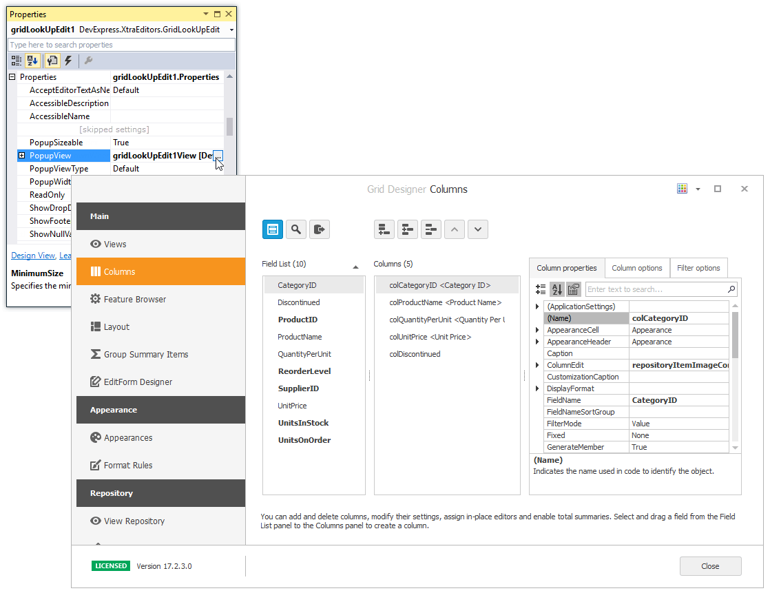
The GridLookUpEdit can display lookup records in the dropdown using multiple data presentation formats (Views), which you can choose with the RepositoryItemGridLookUpEditBase.PopupViewType property:
Grid View (default) - Displays data in a tabular form. The following features, and many more, can be employed for the Grid View embedded in the GridLookUpEdit: data sorting, grouping, filtering, summaries, hiding column headers, changing row height, etc. See Grid View to learn more.
Tile View - Displays records as read-only tiles, using one of the following layout modes: default (one or multiple columns/rows), list (without spaces between records) and Kanban. This View provides the advanced field positioning feature, which helps you arrange fields relative to other fields, specify absolute or relative field display bounds, etc. See Tile View.

Banded Grid View - Displays data in a tabular form and allows grouping of columns into bands. See Banded Grid Views.
Advanced Banded Grid View - Displays data in a tabular form, allows grouping columns into bands and supports complex data cell arrangements. See Banded Grid Views.
After you have set the RepositoryItemGridLookUpEditBase.PopupViewType property, the GridLookUpEdit control creates a corresponding View object. This View can now be accessed and customized from the RepositoryItemGridLookUpEditBase.PopupView property. At design time, you can customize the View with the Data Grid Designer, which you can open by clicking the ellipsis button for the PopupView property in Properties grid, or by invoking the Design View command (from the Properties window or the control’s smart tag).
To learn how to set up lookup editors in different binding modes, see the following topics:
- Standard Binding (to Simple Data Types)
- Advanced Binding (to Business Objects)
- Using a Dictionary Lookup Data Source
- Combobox Mode - Allow Entering New Values
You may want to filter the popup data source of one (secondary) lookup editor based on the value of another (primary) lookup editor. This scenario is covered in the following topic:
In case you need to access lookup grid columns before the editor has created them, call the RepositoryItemGridLookUpEditBase.PopulateViewColumns method to manually trigger column generation.
Additional Customization
The following list shows some of the members that help you perform additional customization of the GridLookUpEdit control.
- RepositoryItemGridLookUpEditBase.PopupViewType - Gets or sets the type of View used to represent data in the dropdown.
RepositoryItemGridLookUpEditBase.PopupView - Gets or sets the View used to represent data in the dropdown.
The View property provides settings to change the grid appearance, access columns, create unbound columns, apply data grouping, filtration and summaries, etc.
For instance, if you use one of ColumnView descendants (e.g., GridView), you can use the ColumnView.Columns property to customize the column collection. To set up columns at design time, use the GridControl’s designer, which can be invoked from the RepositoryItemGridLookUpEditBase.PopupView property in the Properties window.
- RepositoryItemLookUpEditBase.TextEditStyle property - Enables the text editing feature in the edit box.
- RepositoryItemGridLookUpEdit.AutoComplete - Gets or sets whether the automatic completion feature is enabled
- RepositoryItemLookUpEditBase.ProcessNewValue event - Enables you to add a new record to the lookup data source (RepositoryItemLookUpEditBase.DataSource) for new values entered in the edit box.
- RepositoryItemLookUpEditBase.BestFitMode - Gets or sets the “best-fit” mode for columns in the dropdown window.
- RepositoryItem.NullText - Gets or sets the text that presents the editor’s null value (null, System.DBNull.Value and RepositoryItemDateEdit.NullDate - for DateEdit).
To embed a GridLookUpEdit in a cell within a container control (XtraGrid, XtraTreeList, etc), use the RepositoryItemGridLookUpEdit component. See the Repositories and Repository Items topic, for more information.
Note
The GridLookUpEdit control does not support Instant Feedback Mode.
Note
The GridLookUpEdit and SearchLookUpEdit controls do not have a connection to their underlying data sources while their dropdown windows are closed.
So in this instance it is not possible to access the underlying data or a grid’s calculated data using methods provided by the embedded Grid Control and its View. You can use these methods only when the controls’ dropdown windows are open.
While the dropdown windows are closed, you can access the underlying data using methods provided by the underlying data source.
Note
The Find Panel is not supported for the GridLookUpEdit‘s dropdown GridControl. If you need to enable the Find Panel for a look up editor, use the SearchLookUpEdit control instead.
Example 1
The following example demonstrates how to create and customize a GridLookUpEdit control at runtime.
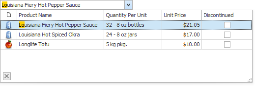
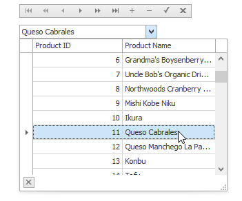
In the example, a lookup editor will be used to edit the values of the “ProductID” field in the “Order Details” table (NWind database). It must display a list of the available products in the dropdown, which are stored in the “Products” table in the NWind database. By selecting a row from the dropdown an end-user will change the current order’s product. Also a data navigator will be created that will assist an end-user to navigate through the “Order Details” table.
To implement the required functionality the following key properties of the lookup editor must be set:
- The editor’s BaseEdit.EditValue property is bound to the “ProductID” field in the “Order Details” table via the DataBindings property.
- The editor’s RepositoryItemLookUpEditBase.DataSource property is set to a DataView object which contains rows from the “Products” table in the NWind database.
- The editor’s RepositoryItemLookUpEditBase.ValueMember property is set to the “ProductID” field in the “Products” table. This field’s value must match the editor’s edit value, and so the “ProductID” field in the “Order Details” table.
- The editor’s RepositoryItemLookUpEditBase.DisplayMember property is set to the “ProductName” field in the “Products” table. This identifies the field in the DataSource whose values match the editor’s display text.
- Two columns are created within the underlying View via the ColumnView.Columns property. These will display values from the “ProductID” and “ProductName” fields in the dropdown data source.
The result of the example is shown in the following image:
using DevExpress.XtraEditors;
using DevExpress.XtraGrid.Columns;
using System.Data.OleDb;

// A lookup editor created at runtime.
GridLookUpEdit gridLookup;
// A navigator control to navigate the "Order Details" table.
DataNavigator dataNav;

// DataView for the "Order Details" table.
DataView dvMain;
// DataView for the "Products" table.
DataView dvDropDown;

//...


private void Form1_Load(object sender, System.EventArgs e) {
   gridLookup = new GridLookUpEdit();
   gridLookup.Bounds = new Rectangle(10, 40, 200, 20);
   this.Controls.Add(gridLookup);

   dataNav = new DataNavigator();
   dataNav.Bounds = new Rectangle(10, 10, 250, 20);
   this.Controls.Add(dataNav);

   InitData();
   InitLookUp();

   dataNav.DataSource = dvMain;
}

private void InitData() {
   // Dataset to provide data from the database
   DataSet ds = new DataSet();
   string connestionString =
     "Provider=Microsoft.Jet.OLEDB.4.0;Data Source=C:\\DB\\nwind.mdb";

   // Connect to the "Order Details" table
   System.Data.OleDb.OleDbDataAdapter dbAdapter =
     new OleDbDataAdapter("SELECT * FROM [Order Details]", connestionString);
   // Load data from the "Order Details" table to the dataset
   dbAdapter.Fill(ds, "Order Details");
   // Connect to the "Products" table
   dbAdapter = new OleDbDataAdapter("SELECT * FROM Products", connestionString);
   // Load data from the "Products" table into the dataset
   dbAdapter.Fill(ds, "Products");

   DataViewManager dvm = new DataViewManager(ds);
   dvMain = dvm.CreateDataView(ds.Tables["Order Details"]);
   dvDropDown = dvm.CreateDataView(ds.Tables["Products"]);
}


private void InitLookUp() {
   // Bind the edit value to the ProductID field of the "Order Details" table;
   // the edit value matches the value of the ValueMember field.
   gridLookup.DataBindings.Add("EditValue", dvMain, "ProductID");

   // Prevent columns from being automatically created when a data source is assigned.
   gridLookup.Properties.PopupView.OptionsBehavior.AutoPopulateColumns = false;
   // The data source for the dropdown rows
   gridLookup.Properties.DataSource = dvDropDown;
   // The field for the editor's display text.
   gridLookup.Properties.DisplayMember = "ProductName";
   // The field matching the edit value.
   gridLookup.Properties.ValueMember = "ProductID";

   // Add two columns in the dropdown:
   // A column to display the values of the ProductID field;
   GridColumn col1 = gridLookup.Properties.PopupView.Columns.AddField("ProductID");
   col1.VisibleIndex = 0;
   col1.Caption = "Product ID";
   // A column to display the values of the ProductName field.
   GridColumn col2 = gridLookup.Properties.PopupView.Columns.AddField("ProductName");
   col2.VisibleIndex = 1;
   col2.Caption = "Product Name";

   // Set column widths according to their contents.
   gridLookup.Properties.PopupView.BestFitColumns();
   // Specify the total dropdown width.
   gridLookup.Properties.PopupFormWidth = 300;
}
Example 2
Assume that a GridLookUpEdit control needs to be used in multiple places, and all editors must display data from one predefined data source and contain predefined columns. In this instance, you can create a custom GridLookUpEdit control.
This example shows how to create a custom GridLookUpEdit control, and initialize its properties as required. The structure of descendant classes is based on the code template shown in the Custom Editors.Editors Structure topic.
To customize the control’s settings, the OnLoaded method is overridden. In this method, the control’s DataSource, columns and some other options are initialized. Note that columns created in this method are not accessible at design time.
using System.Drawing;
using System.Reflection;
using System.ComponentModel;
using System.Windows.Forms;
using DevExpress.XtraEditors;
using DevExpress.XtraEditors.Repository;
using DevExpress.XtraEditors.Registrator;
using DevExpress.XtraEditors.Drawing;
using DevExpress.XtraEditors.ViewInfo;
using DevExpress.XtraGrid.Columns;
using DevExpress.XtraGrid.Views.Grid;
using System.Data;


namespace DevExpress.MyGridLookUpEditors {

    //The attribute that points to the registration method
    [UserRepositoryItem("RegisterMyGridLookUpEdit")]
    public class RepositoryItemMyGridLookUpEdit : RepositoryItemGridLookUpEdit {

        //The static constructor which calls the registration method
        static RepositoryItemMyGridLookUpEdit() { RegisterMyGridLookUpEdit(); }

        //Initialize new properties
        public RepositoryItemMyGridLookUpEdit() {
        }

        protected override void OnLoaded() {
            base.OnLoaded();
            if (IsDesignMode) return;
            // Create two columns
            GridColumn colId = new GridColumn();
            colId.FieldName = colId.Caption = "ID";
            colId.VisibleIndex = 0;
            GridColumn colName = new GridColumn();
            colName.FieldName = colName.Caption = "Name";
            colName.VisibleIndex = 1;
            GridView gView = this.View;
            gView.Columns.Clear();
            gView.Columns.Add(colId);
            gView.Columns.Add(colName);
            // Hide the group panel
            gView.OptionsView.ShowGroupPanel = true;
            // Initialize data source
            DisplayMember = "Name";
            ValueMember = "ID";
            DataSource = GetData();
        }

        private DataTable GetData() {
            DataTable table = new DataTable();
            table.Columns.Add(new DataColumn("ID", typeof(int)));
            table.Columns.Add(new DataColumn("Name", typeof(string)));
            table.Rows.Add(new object[] { 0, "A" });
            table.Rows.Add(new object[] { 1, "B" });
            table.Rows.Add(new object[] { 2, "C" });
            return table;
        }


        //The unique name for the custom editor
        public const string MyGridLookUpEditName = "MyGridLookUpEdit";

        //Return the unique name
        public override string EditorTypeName { get { return MyGridLookUpEditName; } }

        //Register the editor
        public static void RegisterMyGridLookUpEdit() {
            //Icon representing the editor within a container editor's Designer
            Image img = null;

            EditorRegistrationInfo.Default.Editors.Add(new EditorClassInfo(MyGridLookUpEditName,
              typeof(MyGridLookUpEdit), typeof(RepositoryItemMyGridLookUpEdit),
              typeof(GridLookUpEditBaseViewInfo), new ButtonEditPainter(), true, img));
        }


        //Override the Assign method
        public override void Assign(RepositoryItem item) {
            BeginUpdate();
            try {
                base.Assign(item);
                RepositoryItemMyGridLookUpEdit source =
                    item as RepositoryItemMyGridLookUpEdit;
                if (source == null) return;
            }
            finally {
                EndUpdate();
            }
        }
    }


    public class MyGridLookUpEdit : GridLookUpEdit {

        //The static constructor which calls the registration method
        static MyGridLookUpEdit() {
            RepositoryItemMyGridLookUpEdit.RegisterMyGridLookUpEdit(); }

        //Initialize the new instance
        public MyGridLookUpEdit() {
            //...
        }

        //Return the unique name
        public override string EditorTypeName { get { return
            RepositoryItemMyGridLookUpEdit.MyGridLookUpEditName; } }

        //Override the Properties property
        //Simply type-cast the object to the custom repository item type
        [DesignerSerializationVisibility(DesignerSerializationVisibility.Content)]
        public new RepositoryItemMyGridLookUpEdit Properties {
            get { return base.Properties as RepositoryItemMyGridLookUpEdit; }
        }

    }
}