RatingControl Class
The control to rate a specific content.
Namespace: DevExpress.XtraEditors
Assembly: DevExpress.XtraEditors.v18.2.dll
Declaration
[ToolboxBitmap(typeof(ToolboxIconsRootNS), "RatingControl")]
public class RatingControl :
BaseEditRemarks
The RatingControl control displays images with three possible states - normal, hovered and checked. End-users can click an image to check all images starting from the first, up to the clicked image. By default, the RatingControl displays five stars that allow your end-user to rate something based on a standard mark of five grades.

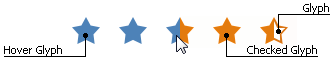
You can use your own custom icons assigned to the RepositoryItemRatingControl.Glyph, RepositoryItemRatingControl.HoverGlyph and RepositoryItemRatingControl.CheckedGlyph properties. The figure below illustrates a RatingControl with custom images.
The RepositoryItemRatingControl.FillPrecision property allows you to specify whether partly checked glyphs are enabled. By default, this property equals Full, which means clicking anywhere within an icon will check this entire icon. The Half value specifies that icons can be half-checked. Finally, the Exact value allows your end-users to check an item exactly up to the place where it was clicked. For instance, the following figure illustrates a RatingControl that displays a 3.68 mark.

To set the number of icons within the RatingControl, use the RepositoryItemRatingControl.ItemCount property. The number of icons checked initially can be set by using the RatingControl.Rating property (or setting the editor’s edit value using the BaseEdit.EditValue property). These properties can take fractional values if the RepositoryItemRatingControl.FillPrecision property allows this behavior.
You can also use the RepositoryItemRatingControl.ShowText property to display text assigned to the RatingControl.Text property. To arrange this text, use the RepositoryItemRatingControl.TextToRatingIndent and RepositoryItemRatingControl.RatingAlignment properties.
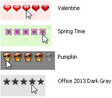
The figure below illustrates a RatingControl in different Skins, including bonus skins.