Application Skins
- 13 minutes to read
This topic explains how to:
- Apply DevExpress Themes/Skins to your application
- Allow users to switch between themes at runtime
- Customize existing skins or create your own, and much more.
The DevExpress WinForms Subscription includes counterparts to many basic controls: buttons, check boxes, Forms, message boxes, dialogs, and others. A major reason why we implemented all these controls is to support our themes. With DevExpress, you get a variety of appearances and a comprehensive control library that guarantees visual consistency throughout your entire application.
To review available Themes/Skins, run any WinForms Demo application.
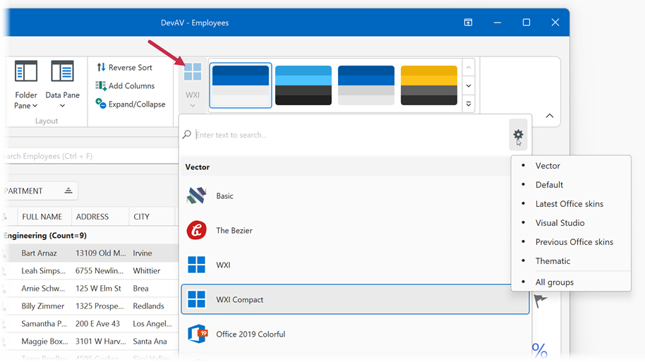
How to Apply a Skin
Select the Application Skin at Design Time
Open the DevExpress Project Settings and choose the application skin:

Apply the Application Skin at Runtime (in code)
Call the UserLookAndFeel.SetSkinStyle method:
Note
A vector palette applies to the entire Windows Forms application. You cannot apply different palettes to different forms in your application.
How to Enable Bonus or Custom Skins
DevExpress skins are grouped into two main categories: modern skins recommended by DevExpress, and bonus skins (outdated/thematic) stored in a separate library/package.
- Modern Skins
- Modern skins are instantly available when you create a project with the Template Kit for WinForms or Template Gallery, or drop any control onto a Form. If you start a blank project, you need to add the
DevExpress.Utilslibrary (or install theDevExpress.UtilsNuGet package). For blank projects that target .NET 8+, install theDevExpress.Win.DesignNuGet package. - Bonus Skins
- Bonus skins are stored in a separate assembly/package:
- .NET Framework:
DevExpress.BonusSkins.25.2.dll - .NET 8+:
DevExpress.Win.BonusSkins.25.2.nupkg
- .NET Framework:
Bonus skins must be registered before you can apply them. To register bonus skins, check the corresponding setting on the Project Settings Page, or call the Register method on application startup:
namespace WindowsFormsApplication1 {
    static class Program {
        [STAThread]
        static void Main() {
            DevExpress.UserSkins.BonusSkins.Register();

            Application.EnableVisualStyles();
            Application.SetCompatibleTextRenderingDefault(false);
            Application.Run(new Form1());
        }
    }
}
After bonus skins are registered, you can apply them in the same manner you apply modern skins.
Custom skins from libraries produced by the Skin Editor tool must also be registered.
See also:
How to Let Users Select Skins at Runtime
The DevExpress WinForms Subscription includes multiple ready-to-use Bar Items that allow your users to switch between skins and skin palettes. You can add these items to toolbars, the Ribbon, and title bars of the Toolbar Form and Fluent Design Form.
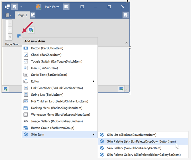
The code below adds the Skin Gallery selector to the "ribbonPageGroup2" group.
using DevExpress.XtraBars;
// ...
SkinRibbonGalleryBarItem skinGallery = new SkinRibbonGalleryBarItem();
ribbonPageGroup2.ItemLinks.Add(skinGallery);
If you create the SkinDropDownButtonItem selector in code, you need to call the InitDropDownSkinGallery method to initialize the selector’s drop-down list:
using DevExpress.XtraBars;
using DevExpress.XtraBars.Helpers;
// Add the selector next to the standard "Close", "Maximize", and "Minimize"
// buttons of the Toolbar Form
SkinDropDownButtonItem skinSelector = new SkinDropDownButtonItem();
SkinHelper.InitDropDownSkinGallery(skinSelector);
skinSelector.Alignment = BarItemLinkAlignment.Right;
this.toolbarFormControl1.TitleItemLinks.Add(skinSelector);
To rename and/or change icons for items of these standard skin selectors, handle the SkinHelper.CreateGalleryItem event:
using DevExpress.XtraBars;
using DevExpress.XtraBars.Helpers;

SkinHelper.CreateGalleryItem += (s, e) => {
    if (e.ItemName.Equals("DevExpress Style")) {
        e.GalleryItem.Image = e.UseLargeIcons ? MyCustomLargeIcon : MyCustomSmallIcon;
        e.GalleryItem.HoverImage = MyCustomLargeIcon;
        e.GalleryItem.Caption = "Moonlight";
    }
};
See also:
- How to: Add and Customize Toolbar Skin Selectors
- How to: Add and Customize the Ribbon Skin List and Skin Gallery
- How to: Build a Custom End-User Skin Selector
- How to: Localize Bar and Ribbon Skin Items
Note
Skin elements can have different settings (for example, padding, margins, etc.) in different skins. Some skins contain skin elements that are not available in other skins.
In some instances, switching from one skin to another may break the layout of forms (for example, UI controls may be shorter or thinner, content may be clipped). We advise against creating pixel-perfect layouts to avoid UI issues when changing skins.
Skin Palettes
DevExpress WinForms skins can draw either raster or vector images on top of UI elements. Raster skins have only one default appearance, whereas each vector skin ships with a selection of palettes (swatches). Users can select palettes to modify the color scheme of the current skin. The following image illustrates “The Bezier” palettes:
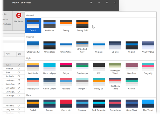
You can apply a palette in the same way as you specify a skin: open the Project Settings Page or call the SetSkinStyle(SkinSvgPalette) overload.
using DevExpress.LookAndFeel;
// ...
UserLookAndFeel.Default.SetSkinStyle(SkinSvgPalette.Bezier.Tokyo);
Generate Skin Palettes with AI
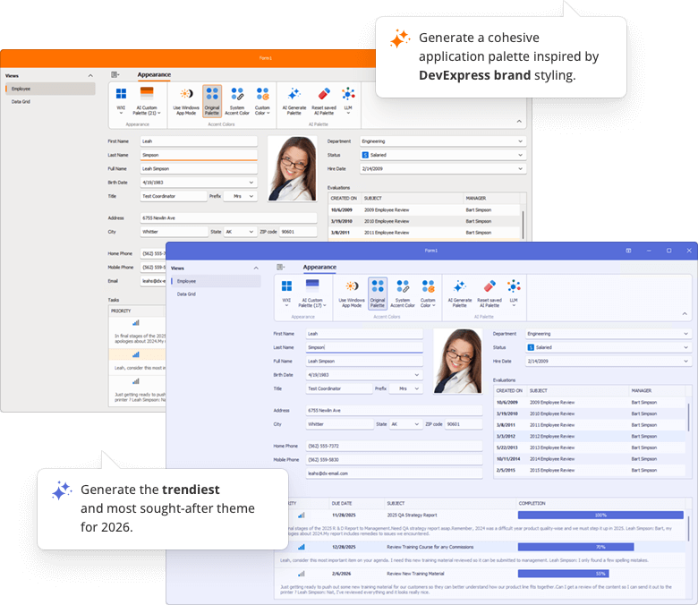
Our demo application leverages AI to create custom skin palettes to personalize an application’s appearance on the fly. Users can generate, save, and delete AI-created palettes between application sessions.
Default App Mode (Light/Dark)
Use the WindowsFormsSettings.TrackWindowsAppMode setting to specify whether your application tracks the Default App Mode setting in Windows OS and displays only light or dark color palettes in a Skin gallery.
The following example enables the TrackWindowsAppMode setting:
static void Main() {
    Application.EnableVisualStyles();
    Application.SetCompatibleTextRenderingDefault(false);
    WindowsFormsSettings.TrackWindowsAppMode = DevExpress.Utils.DefaultBoolean.True;
    Application.Run(new Form1());
}

Important
The WindowsFormsSettings.TrackWindowsAppMode setting works only in “WXI”, “Basic”, and “The Bezier” skins.
Use System or Custom Accent Colors
System Accent Color
Enable the WindowsFormsSettings.TrackWindowsAccentColor option to use the Accent Color setting in Windows OS and apply it to all color palettes of vector skins except the High Contrast skin.
using DevExpress.XtraEditors;

static void Main() {
    Application.EnableVisualStyles();
    Application.SetCompatibleTextRenderingDefault(false);
    WindowsFormsSettings.TrackWindowsAccentColor = DevExpress.Utils.DefaultBoolean.True;
    Application.Run(new Form1());
}

Custom Accent Colors
Use the SetAccentColor method to specify a custom accent color (that takes priority over the system accent color).

Note
“The Bezier” skin supports the second accent color. Other skins do not support the second accent color.
Use the SetAccentColor2 method to specify the second accent color.
Reset Accent Colors
The following example resets primary and secondary accent colors:
DevExpress.XtraEditors.WindowsFormsSettings.SetAccentColor(System.Drawing.Color.Empty);
DevExpress.XtraEditors.WindowsFormsSettings.SetAccentColor2(System.Drawing.Color.Empty);
The accent color is not automatically reset when you disable the WindowsFormsSettings.TrackWindowsAccentColor setting. You should call the SetAccentColor(System.Drawing.Color.Empty) method to reset the accent color.
WindowsFormsSettings.TrackWindowsAccentColor = DefaultBoolean.False;
WindowsFormsSettings.SetAccentColor(Color.Empty);
WindowsFormsSettings.SetAccentColor2(Color.Empty);
Tip
Read the following topic for information on how to display pre-designed Ribbon UI commands that correspond to advanced skin settings: Add and Customize the Ribbon Skin List and Skin Gallery.

Highlight Individual Controls
You can set up custom background, border, and foreground colors for individual DevExpress controls (for instance, SimpleButtons). To do this, use settings from the Control.Appearance group.
It is recommended that you use Skin Colors instead of system colors. Skin colors are retrieved from DevExpress Skins, and are automatically updated when users change the application skin at runtime.
Important
When using DX Skin Colors, you should only specify colors for the ‘normal’ state of the control or UI element. Colors for other states (such as hover, disabled, press) are automatically calculated based on the active/current skin and palette.
The following example sets BackColor and ForeColor settings to DevExpress Skin colors:

// Use DXSkinColors.FillColors for background colors
btnEnable.Appearance.BackColor = DXSkinColors.FillColors.Success;
// Use DXSkinColors.ForeColors for text colors
btnEnable.Appearance.ForeColor = DXSkinColors.ForeColors.WindowText;
Read the following topic for additional information about DevExpress skin colors: Application Appearance and Skin Colors.
High Contrast Skins
The “High Contrast” vector skin is an accessibility theme for users with a low vision impairment.
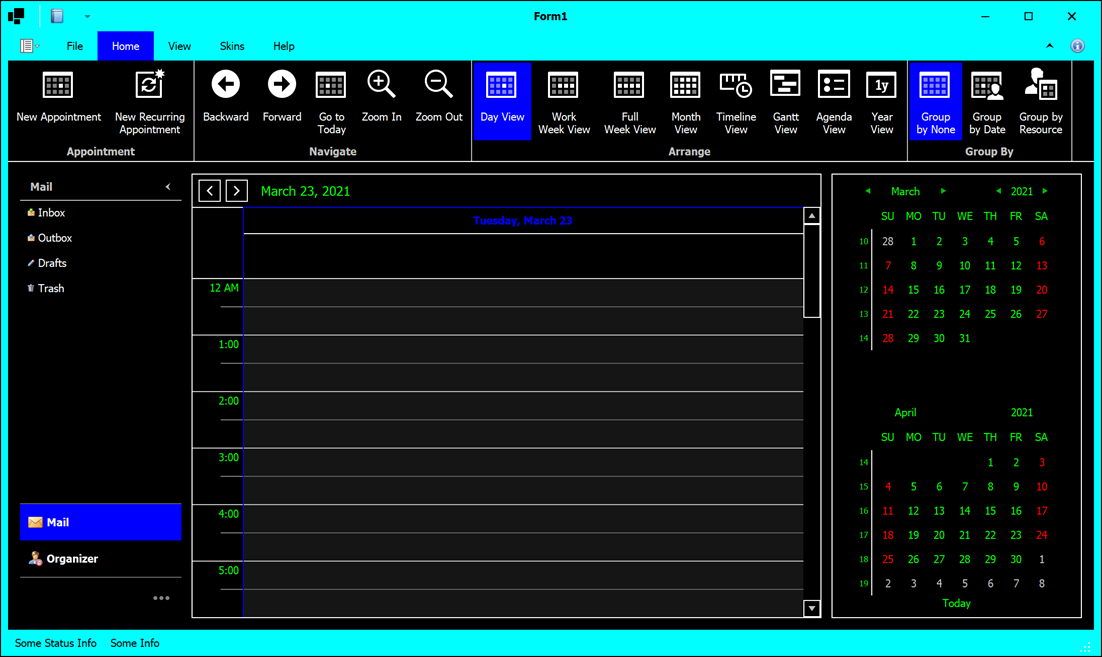
The appearance and availability of this theme depend on user settings (the “Personalize | High contrast settings” menu in Windows).
- If Windows high contrast mode is off, users can select the “High Contrast” skin like any other DevExpress theme. Skin palette selectors are also available.
- If Windows high contrast mode is on, all UI selectors that allow users to change skins and palettes are disabled, and the vector “High Contrast” skin with the “Default” palette becomes active. The “Default” palette uses the same colors a user sets in the Windows “High contrast settings” screen.
You can disable the static WindowsFormsSettings.TrackSystemHighContrastMode property to prevent your application from tracking the actual state of Windows high contrast mode. In this case applications do not switch the “High Contrast” skin on or off, and users can select any skin.
Enable Skins for MDI Forms
Call the EnableMdiFormSkins() method within Program.Main().

using System;
using System.Windows.Forms;
using DevExpress.XtraEditors;

namespace DXApplication14 {
    internal static class Program {
        [STAThread]
        static void Main() {
            Application.EnableVisualStyles();
            Application.SetCompatibleTextRenderingDefault(false);
            WindowsFormsSettings.EnableMdiFormSkins();
            Application.Run(new Form1());
        }
    }
}
Thickened Form Borders
In modern flat skins like “Office 2019 Colorful”, DevExpress Forms display thin borders. This may be inconvenient for users because they must aim for those thin borders with a mouse pointer when they try to resize a Form. To improve the user experience, the resize area of DevExpress Forms includes both borders and a Form shadow/glow skin element. A user to resize a Form when the mouse pointer hovers over the Form’s shadow.
Forms cannot display shadows in the following cases:
- If you manually disable the XtraForm.FormBorderEffect property.
- If Forms are child MDI forms.
- If a user accesses the application through a Remote Desktop connection.
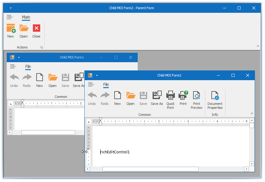
In these cases, you can increase form border width to broaden the resize area.
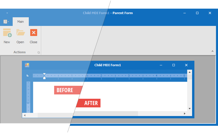
To increase the border width, enable either the WindowsFormsSettings.FormThickBorder or WindowsFormsSettings.MdiFormThickBorder property depending on whether you want to increase border size for all DevExpress Forms, or only those that serve as child MDI Forms.
Use the WindowsFormsSettings.ThickBorderWidth property to change the width of thick Form borders.
Tip
Forms switch to thick borders when you enable Remote Connection Optimization mode. Disable the FormThickBorder property to retain skin-based borders when this mode is on.
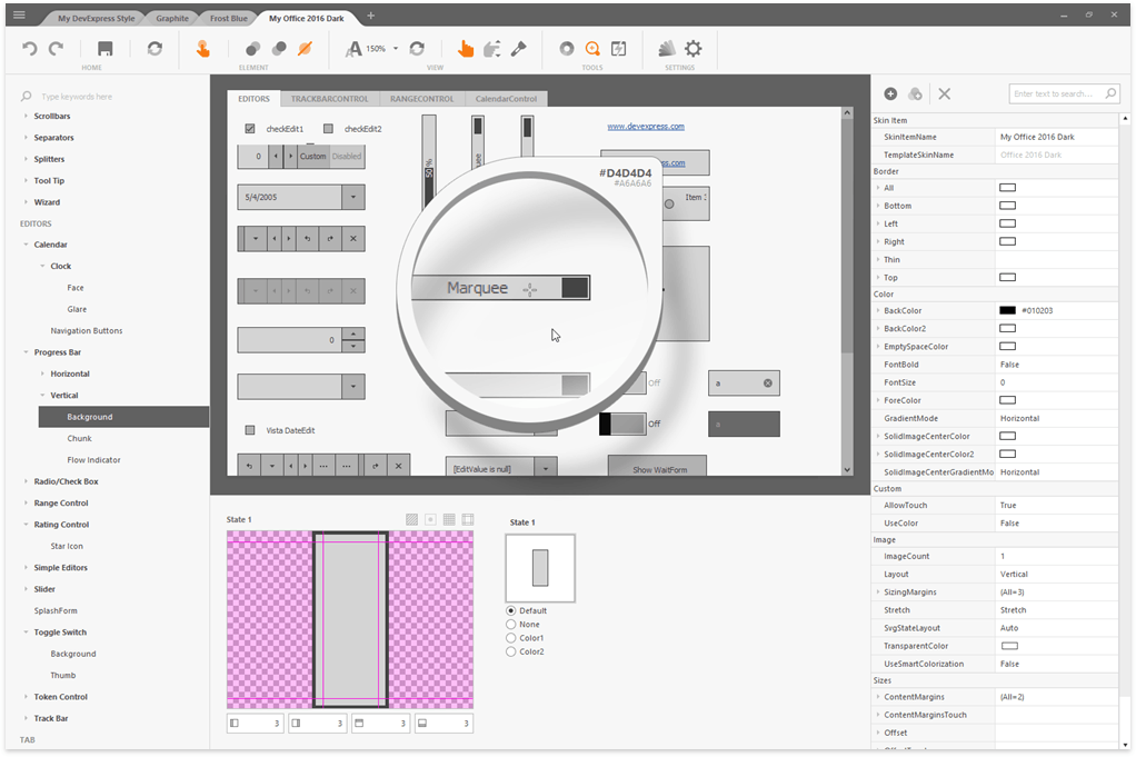
Skin Editor
The DevExpress WinForms installation ships with a tool that allows you to create, edit, and distribute themes: Skin Editor.
See also:
Cheats Sheets & Troubleshooting
Examples and Best Practices
How to Obtain Names of the Currently Active Skin and Palette
Read values of the ActiveSkinName and ActiveSvgPaletteName properties.
var skinName = UserLookAndFeel.Default.ActiveSkinName;
var paletteName = UserLookAndFeel.Default.ActiveSvgPaletteName;
How to Identify a Skin or Palette was Changed at Runtime
Handle the static UserLookAndFeel.StyleChanged event. This event raises every time a user applies a different skin or skin palette.
How to Obtain a Color from the Vector Skin Palette
Use the following code to retrieve values of palette colors:
var commonSkin = CommonSkins.GetSkin(UserLookAndFeel.Default);
SvgPalette svgPalette = commonSkin.SvgPalettes[Skin.DefaultSkinPaletteName] as SvgPalette;
Color keyPaintColor = svgPalette["Key Paint"].Value;
How to Re-Apply the Last Active Skin When an Application Restarts
The Windows Forms Application Settings feature allows you to create, store, and maintain custom application and user preferences on client computers. You can use this feature to save and restore active skins and palettes when your application restarts.
Open the App.config file and add the following application properties:
| Application Property Name | Type | Value | Note |
|---|---|---|---|
SkinName |
String | Default | |
Palette |
String | Default | |
CompactMode |
Boolean | False | In v22.1+, specifies whether a regular or compact version of the WXI skin should be applied. |
<?xml version='1.0' encoding='utf-8'?>
<configuration>
  <configSections>
    ...
  </configSections>
  <applicationSettings>
    ...
  </applicationSettings>
  <startup>
    ...
  </startup>
  <userSettings>
    <DXWinApplication.Properties.Settings>
      <setting name="SkinName" serializeAs="String">
        <value>Default</value>
      </setting>
      <setting name="Palette" serializeAs="String">
        <value>Default</value>
      </setting>
      <setting name="CompactMode" serializeAs="String">
        <value>False</value>
      </setting>
    </DXWinApplication.Properties.Settings>
  </userSettings>
</configuration>
When an Windows Forms application is about to close, save UserLookAndFeel.Default.SkinName and UserLookAndFeel.Default.ActiveSvgPaletteName property values to Application Settings. When an application starts, read and pass saved values to the UserLookAndFeel.SetSkinStyle method.
using DevExpress.LookAndFeel;

private void Form1_FormClosing(object sender, FormClosingEventArgs e) {
    var settings = Properties.Settings.Default;
    settings.SkinName = UserLookAndFeel.Default.SkinName;
    settings.Palette = UserLookAndFeel.Default.ActiveSvgPaletteName;
    settings.CompactMode = UserLookAndFeel.Default.CompactUIModeForced;
    settings.Save();
}

protected override void OnShown(EventArgs e) {
    base.OnShown(e);
    var settings = Properties.Settings.Default;
    if (!string.IsNullOrEmpty(settings.SkinName)) {
        if (settings.CompactMode)
            UserLookAndFeel.ForceCompactUIMode(true, false);
        if (!string.IsNullOrEmpty(settings.Palette))
            UserLookAndFeel.Default.SetSkinStyle(settings.SkinName, settings.Palette);
        else UserLookAndFeel.Default.SetSkinStyle(settings.SkinName, "DefaultSkinPalette");
    }
}
How to Modify Skin Palettes in Code
See this article for the code sample: How To: Create New and Modify Existing Vector Skin Palettes.
How to Identify Whether the Regular or Compact Version of the WXI Skin is Active
Read the UserLookAndFeel.Default.CompactUIModeForced property value.
See also: Windows 11 UI
How to Distinguish Light from Dark Skins in Code
All DevExpress skins and palettes fall into two categories: dark and light. To identify an active theme category, call the DevExpress.Utils.Frames.FrameHelper.IsDarkSkin method.
using DevExpress.Utils.Frames;
//...
if (FrameHelper.IsDarkSkin(this.GetActiveLookAndFeel())) {
    // Current skin/palette is dark
}
else {
    // Current skin/palette is light
}
Note that the IsDarkSkin method identifies whether a skin is light or dark based on the value of the “Paint High” palette color. For this reason, the return value of this method can be the opposite of the overall skin appearance. For example, “Office 2019 Dark Gray” identifies as a light skin because of its light “Paint High” color value, although this skin is primarily dark.
You can implement your own method that “fixes” return values for cases you find confusing.
bool IsDarkSkinEx() {
    var res = FrameHelper.IsDarkSkin(this.GetActiveLookAndFeel());
    return res || UserLookAndFeel.Default.SkinName == "Office 2019 Dark Gray";
}
How to Apply Skins to Forms without Title Bars
To hide a Form’s title bar, disable its ControlBox and icon, and remove the Form’s caption.
Such Forms are not skinned, unless you override their GetAllowSkin methods.


