DateEdit
- 2 minutes to read
Overview
The DateEdit control is a drop-down editor that allows end users to select DateTime values. The DateEdit control supports multiple operation modes.
The DateEdit control offers the following features.
Multiple operation modes
The DateEdit control supports the following operation modes.
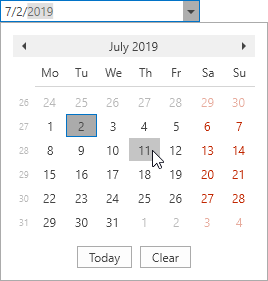
- Calendar date picker (DateEditCalendarStyleSettings)
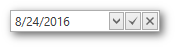
- Date picker (DateEditPickerStyleSettings)
- Outlook-inspired Calendar date picker DateEditNavigatorStyleSettings
- Time editor DateEditTimePickerStyleSettings
- Date and time editor DateEditNavigatorWithTimePickerStyleSettings
Additional buttons
Use the DateEdit‘s Buttons collection to display custom buttons within the editor’s text box.
Each button can be individually customized. To specify the desired button glyph, use the ButtonInfo.GlyphKind property. To left-align a nested button, set the ButtonInfoBase.IsLeft property to true.
The following sample demonstrates a DateEdit control with two additional buttons.
<dxe:DateEdit>
    <dxe:DateEdit.Buttons>
        <dxe:ButtonInfo GlyphKind="Apply" Click="dateApply"/>
        <dxe:ButtonInfo GlyphKind="Cancel" Click="dateCancel"/>
    </dxe:DateEdit.Buttons>
</dxe:DateEdit>
Common editor features
Like other DevExpress WPF data editors, the DateEdit control supports masked user input and the data validation mechanism. When the editor’s mask type is set to DateTimeAdvancingCaret, the DateEdit control functions in auto-complete mode.
Optimized for in-place editing
DateEdit can be used standalone or as an in-place editor nested in a container control. The DateEditSettings class implements the in-place editing functionality. See In-place Editors to learn more.
Standalone DateEdit
To add a standalone DateEdit to a Window, drag it from the Toolbox.
The following sample demonstrates how to create a DateEdit using XAML markup.
<dxe:DateEdit>
    <dxe:DateEdit.StyleSettings>
        <dxe:DateEditPickerStyleSettings/>
    </dxe:DateEdit.StyleSettings>
</dxe:DateEdit>
In-place DateEdit
To embed a DateEdit into a container control, use the DateEditSettings class.
The following sample demonstrates how to embed a DateEdit into a GridControl column.
<dxg:GridControl Name="grid">
    <dxg:GridControl.Columns>
        <dxg:GridColumn FieldName="Birthday">
        <dxg:GridColumn.EditSettings>
            <dxe:DateEditSettings/>
        </dxg:GridColumn.EditSettings>
    </dxg:GridColumn>
</dxg:GridControl.Columns>
</dxg:GridControl>