PopupBrushEdit
- 2 minutes to read
Overview
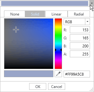
The PopupBrushEdit control is a popup variation of the BrushEdit control. It allows end-users to edit color data.
The PopupBrushEdit control offers the following features.
Multiple brush types
The PopupBrushEdit control allows end-users to edit the following brush types.
- SolidColorBrush
- LinearGradientBrush
- RadialGradientBrush
Multiple color models
End-users can specify the desired color by entering the precise values. The PopupBrushEdit control supports the following color models.
- RGB
- CMYK
- HLS
- HSB
Additionally, an Alpha value can be specified in each of the listed color modes.
Visual color selection
End-users can edit a brush visually using the color field and the color slider. The Color Selector
 tool makes it possible to select any color on the screen.
Empty brush
End-users can select the null value from the PopupBrushEdit‘s None tab.
Optimized for in-place editing
PopupBrushEdit can be used standalone or as an in-place editor nested in a container control. The PopupBrushEditSettings class implements the in-place editing functionality. See In-place Editors to learn more.
Standalone PopupBrushEdit
The following sample demonstrates how to create a PopupBrushEdit using XAML markup.
<Window ...
 xmlns:dxprg="http://schemas.devexpress.com/winfx/2008/xaml/propertygrid">
 ...
 <dxprg:PopupBrushEdit/>
 ...
In-place PopupBrushEdit
To embed a PopupBrushEdit into a container control, use the PopupBrushEditSettings class.
The following sample demonstrates how to embed a PopupBrushEdit into a GridControl column.
<Window ...
xmlns:dxg="http://schemas.devexpress.com/winfx/2008/xaml/grid"
xmlns:dxprg="http://schemas.devexpress.com/winfx/2008/xaml/propertygrid">
...
<dxg:GridControl>
    <dxg:GridColumn FieldName="BackgroundBrush">
        <dxg:GridColumn.EditSettings>
            <dxprg:PopupBrushEditSettings/>
        </dxg:GridColumn.EditSettings>
    </dxg:GridColumn>
    <dxg:GridControl.View>
    <dxg:TableView AllowPerPixelScrolling="True" ShowTotalSummary="True"/>
    </dxg:GridControl.View>
</dxg:GridControl>
...