v25.2 Release Notes
- 12 minutes to read
Tip
Visit our website to explore new features/capabilities available across the entire DevExpress product line: What’s New in our Latest Version.
.NET 10 and Visual Studio 2026 Support
DevExpress WPF component libraries now support .NET 10 and Visual Studio 2026.
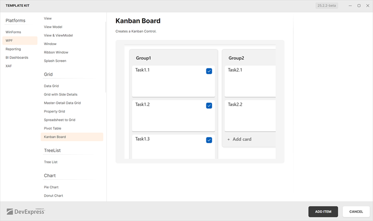
DevExpress Template Kit
New Item Templates
The DevExpress Template Kit v25.2 includes over 40 item templates for WPF projects, which include:
- Kanban View
- Interactive Charts
- Master-detail Data Grid Presentations
- Pre-designed Edit Forms
- Infrastructure for MVVM and Dependency Injection (DI)
- Pre-configured BI Dashboards
- Document Processing (Mail Merge, Import to Excel, Word to PDF Conversion, and more…)
Project Templates for JetBrains Rider
The DevExpress Template Kit is fully integrated into JetBrains Rider. You can create new projects using the same rich set of DevExpress templates available in Visual Studio and VS Code.
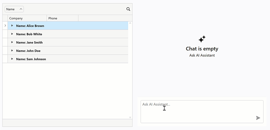
AI Chat Control Enhancements
Resources
Our WPF AI Chat Control can now access external data sources (such as MCP (Model Context Protocol) servers) or dynamically generated content through resources. After you assign resources the AI Chat Control displays the “Attach Context” (+) button. Users can select one or more resources to include in the chat request (plain text, PDF, image). A built-in search box helps users quickly locate desired items when the resource list is long.
You can also customize resource appearance. Use the AIChatControl.ResourceItemTemplate property to supply a Razor-based template for resource items displayed in the chat’s “Attach Context” dropdown.
using DevExpress.AIIntegration.Blazor.Chat;
using Microsoft.AspNetCore.Components;

//...
RenderFragment<AIChatResource> ResourceTemplate;

public MainWindow() {
    InitializeComponent();
    aiChatControl.ChatResources = Resources;

    ResourceTemplate = resource => builder => {
        builder.OpenComponent<Resource>(0);
        builder.AddAttribute(1, "resource", resource);
        builder.CloseComponent();
    };

    // Assign a Razor-based template.
    aiChatControl.ResourceItemTemplate = ResourceTemplate;
}
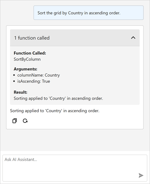
Tool Calling API
AI Tool Calling API connects your WPF application logic with natural language input. The WPF AI Chat Control can invoke methods annotated with metadata that describes purpose, input parameters, and optional target objects.
Attach the AIToolsBehavior to a target control to enable AI tools defined in the specified type. The AIToolsBehavior automatically manages the lifecycle of the tool context:
- Creates and registers the context when the control is initialized.
- Disposes the context when the control is unloaded.
<dxg:GridControl x:Name="gridControl">
    <dxmvvm:Interaction.Behaviors>
        <dxai:AIToolsBehavior
            ToolType="{x:Type local:GridTools}"
            TargetDescription="The grid control that displays contact information." />
    </dxmvvm:Interaction.Behaviors>
</dxg:GridControl>
A tool method must meet the following conditions to be discoverable:
- The method must have the
AIIntegrationToolattribute with a unique identifier. - The method must be public and static.
Display Tool Information
You can display information about invoked tools in chat responses. Enable the AI Chat Control’s IncludeFunctionCallInfo option to include metadata about invoked tools/functions (function names and arguments) in response messages.
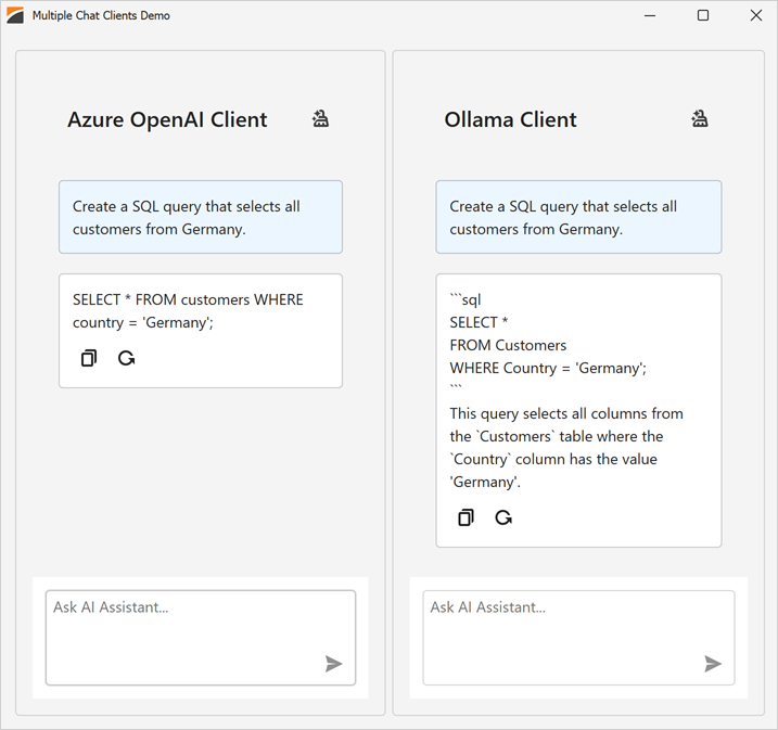
Manage Multiple Chat Clients
The DevExpress WPF AI Chat Control supports use of multiple AI services within a single application. You can place multiple AI Chat Controls on the same form (for example, to test model quality or host specialized agents) or use a single AI Chat Control and switch between AI providers at runtime.
<dx:ThemedWindow
    x:Class="DXWPFMultipleChatClients.MainWindow"
    xmlns="http://schemas.microsoft.com/winfx/2006/xaml/presentation"
    xmlns:x="http://schemas.microsoft.com/winfx/2006/xaml"
    xmlns:dx="http://schemas.devexpress.com/winfx/2008/xaml/core"
    xmlns:dxaichat="http://schemas.devexpress.com/winfx/2008/xaml/aichat"
    Title="MainWindow" Height="800" Width="1000">
    <Grid>
        <Grid.ColumnDefinitions>
            <ColumnDefinition Width="*"/>
            <ColumnDefinition Width="*"/>
        </Grid.ColumnDefinitions>
        <dxaichat:AIChatControl
            x:Name="azureChat"
            ChatClientServiceKey="azureOpenAIClient"
            HorizontalAlignment="Stretch"
            VerticalAlignment="Stretch"
            Margin="10"/>

        <dxaichat:AIChatControl
            x:Name="ollamaChat"
            ChatClientServiceKey="ollamaClient"
            HorizontalAlignment="Stretch"
            VerticalAlignment="Stretch"
            Margin="10"
            Grid.Column="1"/>
    </Grid>
</dx:ThemedWindow>
To switch a single AI Chat Control between AI providers at runtime, update its ChatClientServiceKey property.
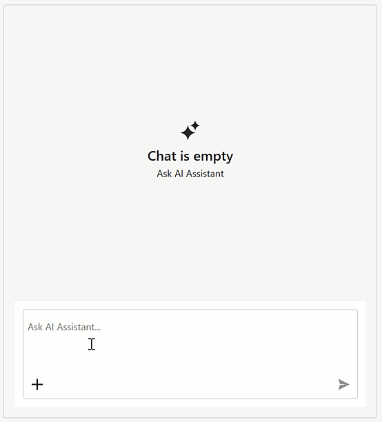
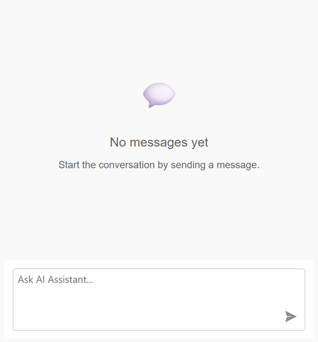
Message Templates
You can create Razor-based templates for messages and the empty chat area to customize the chat UI:
AIChatControl.MessageTemplateAIChatControl.MessageContentTemplateAIChatControl.EmptyStateTemplate
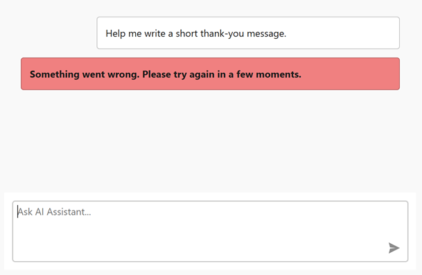
Error Message Background
Use the new AIChatControl.ErrorMessageBackground property to specify the background color of error messages:
<dxaichat:AIChatControl x:Name="aiChatControl"
                ErrorMessageBackground="LightCoral"
                InputEnabled="True"
                Margin="10">
</dxaichat:AIChatControl>
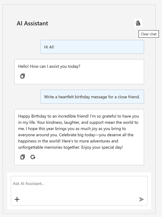
Header and Clear History Button
Our WPF AI Chat Control can display a header. The header contains a customizable chat title and a “Clear Chat” button (removes all messages from the conversation history except system messages).
To display the chat header, enable the AIChatControl.ShowHeader option. The AIChatControl.HeaderText property specifies the chat title.
Resizable Prompt Box
Enable the new AIChatControl.AllowResizeInput option to allow users resize the input area. Users can drag the top edge to enlarge the input area or down to display a more detailed chat history.
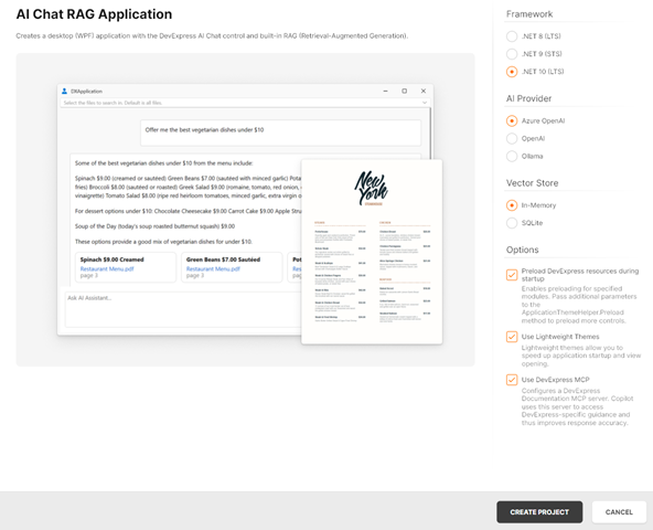
Chat Project Templates — DevExpress Template Kit
The DevExpress Template Kit includes new chat-based project templates for apps targeting .NET 8+.
Supported AI providers:
- Azure OpenAI
- OpenAI
- Ollama
- AI Chat Application
- Creates a WPF chat app that integrates the AI Chat Control. Optionally integrates the DevExpress MCP Server for DevExpress-specific technical guidance (adds an mcp.json configuration file to the application).
- AI Chat (RAG) Application
Creates a desktop WPF application with the AI Chat Control and built-in Retrieval-Augmented Generation (RAG) for document-grounded conversations:
- Uses local document data for context-aware answers.
- Scans the user’s Documents folder and indexes PDF, DOCX, TXT, RTF, and HTML files.
- Extracts, embeds, and semantically searches document text.
- Stores vectors in In-Memory (rebuilds each run) or SQLite (persistent database).
- Merges retrieved content with user prompts to improve accuracy.
- Optionally integrates the DevExpress MCP Server for DevExpress-specific technical guidance.
AI-powered Extensions
SmartPaste - AI-powered Image Processing
v25.2 extends the SmartPaste extension to process clipboard images. Enable the ProcessClipboardImage option to extract structured data from images.
Prompt Augmentation
DevExpress AI Assistant and SmartPaste extensions support Prompt Augmentation. Use the AI-powered behavior’s PromptAugmentation property to supply additional instructions that modify the default prompt (for example, always translate results into English):
<dxe:TextEdit TextWrapping="Wrap" AcceptsReturn="True" VerticalContentAlignment="Top">
    <dxmvvm:Interaction.Behaviors>
        <dxai:ChangeStyleBehavior x:Name="ChangeStyle"
                        PromptAugmentation="Always translate the result into English."/>
    </dxmvvm:Interaction.Behaviors>
</dxe:TextEdit>
Accessibility Enhancements
Keyboard Navigation
Filter Editor and Filter Panel
Core WPF Data Grid functionality (including filtering, sorting, and column management) is now fully accessible using the keyboard. Users can navigate, modify, and delete filter nodes in the Grid’s Filter Panel and Filter Editor. When a filter node is focused, the screen reader announces its value and state.
| Property Name | Description |
|---|---|
| AllowFilterPanelNavigation | When activated, users can navigate between the Grid’s View and the Filter Panel using the keyboard. |
Step Progress Bar
Users can now navigate between StepProgressBar items and activate them using the keyboard.
| Keyboard Shortcut | Action |
|---|---|
| Tab | Moves focus between views on a page. |
| ← → ↑ ↓ | Navigates between StepProgressBar items. |
| Space or Enter | Activates the focused item. |
Color Editor
Users can now navigate ColorEdit UI elements and select colors using the keyboard.
Cycle Through Nested Ribbons
With this updated, WPF Ribbon Controls nested within document panels are fully accessible using the keyboard. Pressing the Alt key cycles focus through all Ribbon controls in the View.
Ribbon Gallery
Users can now navigate to the Ribbon Gallery and open it using the Enter key. Screen readers accurately announce gallery item information and state.
Row and Cell Narrator Text Customization
Our WPF Data Grid, TreeList, and TreeView controls allow you to customize narrator text for rows, cells, and nodes. You can specify the information screen readers announce when users navigate through data elements.
You can handle the new AutomationRequested attached event to override default narrator text for focused rows or cells. This event is useful when default automation text may not fully reflect displayed content (for example, when row-based navigation is enabled or when custom row or detail templates are used).
<dxg:GridControl ItemsSource="{Binding Items}">
    <dxg:GridControl.View>
        <dxg:TableView
            x:Name="tableView"
            NavigationStyle="Row"
            dxg:GridAutomationHelper.AutomationRequested="OnAutomationRequested"/>
    </dxg:GridControl.View>
</dxg:GridControl>
using DevExpress.Xpf.Grid;
using DevExpress.Xpf.Grid.Automation;

void OnAutomationRequested(object sender, AutomationEventArgs e) {
    if (e is RowAutomationEventArgs rowArgs) {
        var grid = rowArgs.DataControl as GridControl;
        var view = grid?.View as TableView;
        if (view == null)
            return;

        // Skip 'special' rows.
        if (rowArgs.RowHandle == DataControlBase.NewItemRowHandle ||
            rowArgs.RowHandle == DataControlBase.InvalidRowHandle)
            return;

        // "Header1 Value1, Header2 Value2, ..."
        var parts = view.VisibleColumns.Select(c => {
            var header = c.HeaderCaption ?? c.FieldName;
            var value  = view.GetCellValue(rowArgs.RowHandle, c);
            return $"{header} {value}";
        });

        e.AutomationValue = string.Join(", ", parts);
    }
}
Rich Text Edit — Accessibility Enhancements
- Screen Reader Support for Word Documents
- Rich Text Editor documents are now accessible to screen readers (Narrator, NVDA). You can navigate through document paragraphs, lines, words, and characters. Readers can pronounce all document sections — main text, headers, footers, text boxes, image alt text.
- Accessible Dialogs
- We improved screen reader support and keyboard navigation in Rich Text Editor dialogs. Screen readers now announce all labels and editor values in major dialogs, and users can navigate between dialog controls using the keyboard.
TreeList — Level Announcement
The WPF TreeList can announce the hierarchical level of the currently focused node. This enhancement allows screen reader users to better perceive the structure of hierarchical data and navigate the tree more efficiently (ensures full compliance with WCAG 2.2 Success Criterion 1.3.1).
Data Grid Enhancements
Print Width for Export and Print
A new PrintWidth property allows you to specify column width (in pixels) for print and export operations. Use this property to ensure consistent column alignment across PDF, XLSX, and DOCX outputs.
<dxg:GridControl>
    <dxg:GridControl.Columns>
        <dxg:GridColumn FieldName="Email" Header="Email Address" PrintWidth="300"/>
        <dxg:GridColumn FieldName="Name" Header="Full Name" PrintWidth="200"/>
    </dxg:GridControl.Columns>
</dxg:GridControl>
Checkbox Selector Column Positioning
New API allows you to change the position of the checkbox selector column:
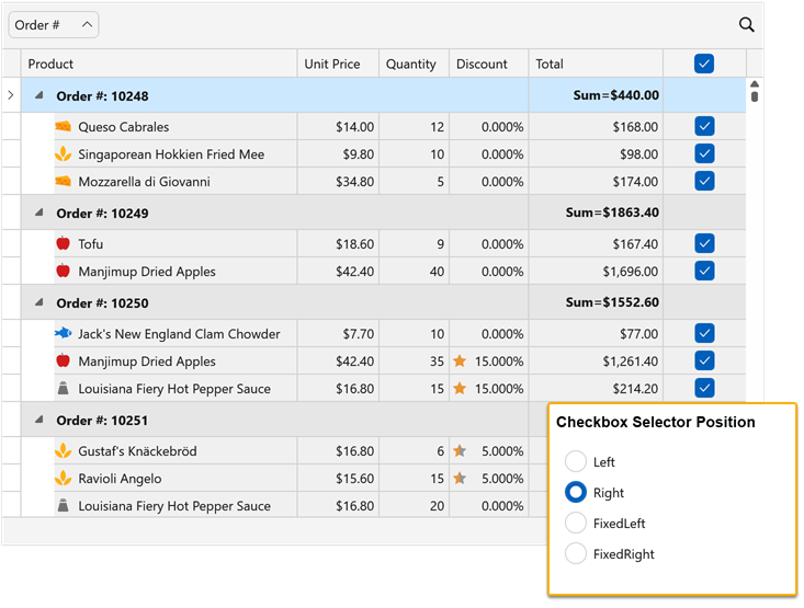
Use the following properties to configure selector column position:
| Property Name | Description |
|---|---|
| CheckBoxSelectorColumnPosition | Specifies the general position of the checkbox selector column. |
| CheckBoxSelectorColumnVisibleIndex | Specifies the position index of the selector column within the column header area. |
<dxg:GridControl ...
                    SelectionMode="MultipleRow">
    <dxg:GridControl.View>
        <dxg:TableView ShowCheckBoxSelectorColumn="True"
                        ShowCheckBoxSelectorInGroupRow="False"
                        CheckBoxSelectorColumnPosition="None"
                        CheckBoxSelectorColumnVisibleIndex="5"/>
    </dxg:GridControl.View>
</dxg:GridControl>
Available Options
| Value | Description |
|---|---|
None |
Checkbox selector column position is based on the CheckBoxSelectorColumnVisibleIndex property. |
Left |
The Checkbox selector column occupies the leftmost position within the scrollable content area. The CheckBoxSelectorColumnVisibleIndex property is ignored. |
Right |
The Checkbox selector column occupies the rightmost position within the scrollable content area. The CheckBoxSelectorColumnVisibleIndex property is ignored. |
FixedLeft |
The Checkbox selector column is fixed to the left border of the grid view. The CheckBoxSelectorColumnVisibleIndex property specifies the position index within the fixed group. |
FixedRight |
The Checkbox selector column is fixed to the right border of the grid view. The CheckBoxSelectorColumnVisibleIndex property specifies the position index within the fixed group. |
Note
Users cannot change the position of the selector column via drag & drop.
Prevent User Changes in Cell Editor
The WPF Data Grid ships with a new CellEditorValueChanging event and allows you to intercept and cancel cell value modifications before they are applied to the UI.
In previous versions, when users edited a cell (for example, by toggling a checkbox), the UI would immediately reflect changes, even if underlying data posting was subsequently canceled in the CellValueChanging event handler. With this update, you can prevent the cell editor value from being changed in the UI itself.
This feature is useful for confirmation dialogs in Boolean columns. For example, you can prompt the user before changing a cell’s value, and if the action is canceled, the cell remains unchanged:
void OnIsActiveCellEditorChanging(object sender, CellEditorValueChangingEventArgs e) {
    if (e.Column.FieldName == "IsActive") {
        var result = MessageBox.Show(
            "Would you like to change the Active status?",
            "Warning",
            MessageBoxButton.OKCancel,
            MessageBoxImage.Question,
            MessageBoxResult.OK
        );
        e.Cancel = (result == MessageBoxResult.Cancel);
    }
}
Tip
The CellEditorValueChanging event is also available in the WPF TreeList control.
Ribbon Control Enhancements
Outlook-inspired Page Header Button
Our WPF Ribbon Control can display the Page Header Button within the page header area. This button can be used to expand or collapse a navigation control, similar to behaviors found in recent versions of Microsoft Outlook.
To enable the Page Header Button:
- Set the RibbonControl.ShowPageHeaderButton property to
true. - Use the PageHeaderButtonCommand property to assign the associated action.
The Page Header Button is available with the following Ribbon styles:
- Office2019
- OfficeSlim
- TabletOffice
Rich Text Editor
Mail Merge Enhancements — Merge Data with Detail Regions
The mail merge engine used within the DevExpress WPF Rich Text Editor supports nested regions. You can merge data with any number of hierarchical levels (master–detail–subdetail and beyond) within a single template. Existing MailMerge methods work for both single-level and multi-level documents, no additional settings/toggles required.
Use TableStart:RegionName and TableEnd:RegionName merge fields to mark regions that contain data from a single record (master or detail). Merge regions can be defined within paragraphs or tables. Regions placed in tables automatically expand the table with source data during the merge.
Additional Mail Merge and Field API enhancements:
- Support for major data source types: IList, IList<T>, ArrayList, DataTable, DataSet.
- Added options to define and process custom region tags (instead of default TableStart / TableEnd).
- Added a new GetRegionHierarchy method to get document region hierarchy. Use it to determine parent and nested regions, obtain region names and ranges, retrieve region fields.
- Added the IsMergeField flag determining Merge Fields.
- Introduced the MergeField interface to obtain merge field name and settings.
- Enhanced mail merge-related events with region information arguments.
The following code snippet merges data and handles the MailMergeRecordStarted event to log the merge process:
// Read JSON data to a database object
string dataPath = Path.Combine(AppDomain.CurrentDomain.BaseDirectory, "nwind_data.json");
string json = File.ReadAllText(dataPath);
NWind? nwind;
nwind = JsonSerializer.Deserialize<NWind>(json);

// Load the template into the RichEditControl instance.
var templatePath = Path.Combine(AppDomain.CurrentDomain.BaseDirectory, "template.docx");
richEditControl.LoadDocument(templatePath);

// Create mail merge options.
MailMergeOptions myMergeOptions = richEditControl.Document.CreateMailMergeOptions();

// Assign the data source.
myMergeOptions.DataSource = nwind?.Customers;

// Register event handlers to customize merge behavior (progress output and dynamic variables).
richEditControl.MailMergeRecordStarted += RichEditControl_OnMailMergeRecordStarted;

// Execute the mail merge.
richEditControl.MailMerge(myMergeOptions, "result.docx", DocumentFormat.Docx);


// Event handler outputs diagnostic info for each mail merge region
// and its sub‑regions when a record merge starts.
void RichEditControl_OnMailMergeRecordStarted(object sender, MailMergeRecordStartedEventArgs e)
{
    var region = e.MailMergeRegionInfo;
    if (region != null)
    {
        Console.WriteLine($"Merging region: {region.Name}\r\n Merge Fields: {region.MergeFields.Count}");
        if (region.Regions != null && region.Regions.Count > 0)
        {

            foreach (var subRegion in region.Regions)
            {
                Console.WriteLine($" Sub-region: {subRegion.Name}\r\n Merge Fields: {subRegion.MergeFields.Count}");
            }
            Console.ReadKey();
        }
    }
}
Spreadsheet Control
Extended OLE Object Support
DevExpress WPF Spreadsheet Control library allows you to import/export linked and embedded OLE Objects in binary Excel formats (XLS and XLSB). You can create, edit, or remove OLE objects in Excel documents and save these document to binary formats without content loss.
Download 30-Day Trial
With numerous new products and dozens of high-impact features, DevExpress UI components allow you to build your best, without limits or compromise. Download our fully-functional 30-day trial today and experience the DevExpress difference today.
Tip
Your Feedback Matters! Take part in the survey on our website: WPF Survey.