Lightweight Themes
- 7 minutes to read
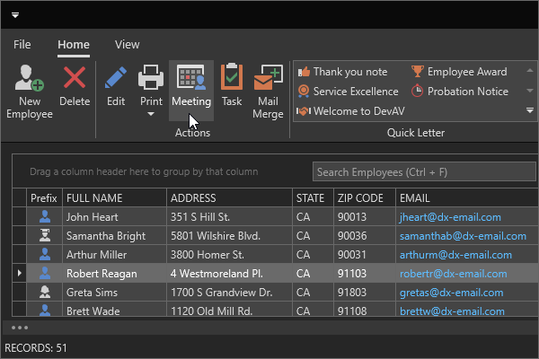
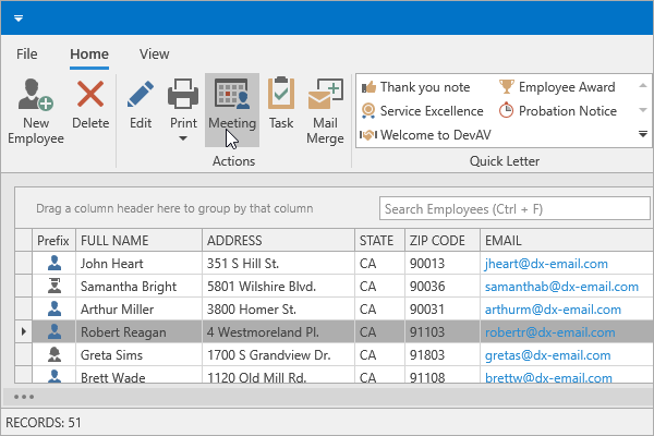
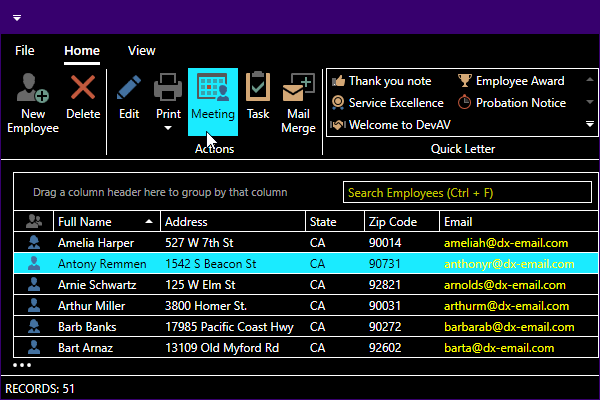
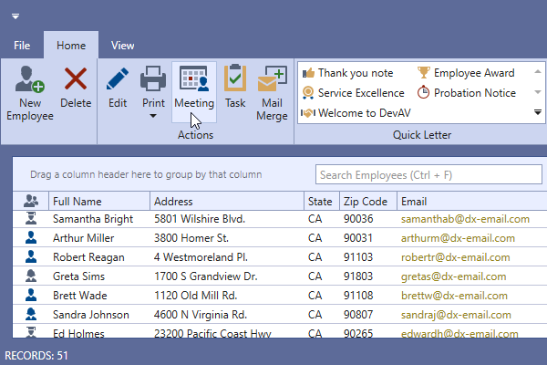
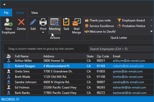
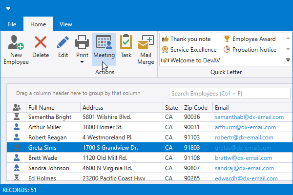
DevExpress lightweight themes visually replicate regular themes, but offer quicker startup times and consume less memory.
You can compare regular and lightweight theme performance on your machine. Run our specially-designed application available in the following repository:
Use Lightweight Themes
- Add the
DevExpress.Wpf.ThemesLWNuGet package to your project or reference theDevExpress.Xpf.ThemesLW.v23.2assembly. - Set the CompatibilitySettings.UseLightweightThemes property to
truein the application constructor. - Set the ApplicationThemeHelper.ApplicationThemeName property to a theme name at application startup. The LightweightTheme class contains available lightweight themes.
using DevExpress.Xpf.Core;
// ...
public partial class App : Application {
    static App() {
        CompatibilitySettings.UseLightweightThemes = true;
        ApplicationThemeHelper.ApplicationThemeName = LightweightTheme.Win11Dark.Name;
    }
}
Lightweight themes change the appearance of all controls within the application. If a standard control should keep its original appearance, set the attached dx:LightweightThemeManager.AllowStandardControlsTheming property to false.
Alternatively, you can use the static LightweightThemeManager.AllowStandardControlsTheming property to keep original appearance for all standard controls within the application:
public partial class App : Application {
    static App() {
        CompatibilitySettings.UseLightweightThemes = true;
        ApplicationThemeHelper.ApplicationThemeName = LightweightTheme.Win11Dark.Name;
        LightweightThemeManager.AllowStandardControlsTheming = false;
    }
}
Theme List
Windows 11 Themes
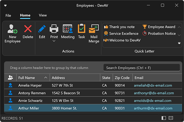
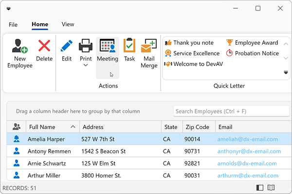
- Win11Dark
- Win11Light
- Win11System[1] (reads Windows app mode)
Windows 10 Themes
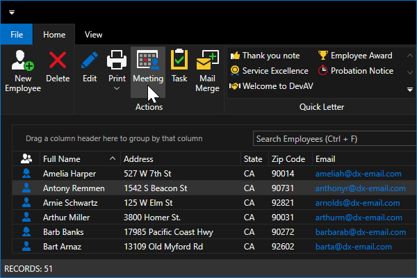
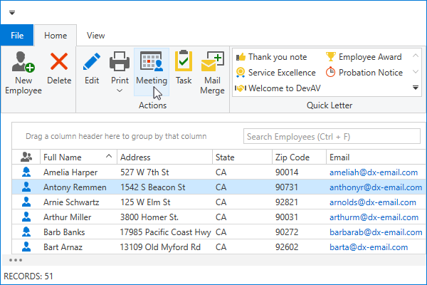
- Win10Dark
- Win10Light
- Win10System[1] (reads Windows app mode)
- Win10SystemColors[1] (reads Windows app mode and accent color)
Office 2019 Themes
- Office2019Black
- Office2019Colorful (default theme)
- Office2019HighContrast
- Office2019System[1] (reads Windows app mode)
- Also includes a set of predefined palettes for Black and Colorful themes.
Visual Studio 2019 Themes
- VS2019Blue
- VS2019Dark
- VS2019Light
- VS2019System[1] (reads Windows app mode)
- Also includes a set of predefined palettes for Blue, Dark, and Light themes.
Palettes
Palettes allow you to integrate colors (for example, corporate colors) into your application and customize colors used in themes. You can create a custom palette or use predefined palettes.
A Palette is a Dictionary of named colors. Each entry includes a ColorName and a Color value. You can use a ColorName to assign the corresponding Color to any number of UI elements.
Predefined Palettes
The LightweightTheme class contains predefined palette themes alongside classic themes. The following code sample applies the VS2019Dark theme with the DeepSea palette:
You can use the RibbonGalleryItemThemePaletteSelectorBehavior to allow users to apply palette themes at runtime.

Custom Palettes
You can create a new lightweight theme with custom palette colors:
Create a Dictionary with a palette color name and its new color.
To find a required color name, review lightweight theme resources available in the following folder:
C:\Program Files\DevExpress 23.2\Components\Sources\XPF\DevExpress.Xpf.Themes\ThemesLW\Common.Use the LightweightTheme.OverridePalette method to create a new theme.
Register the created theme in LightweightThemeManager.
Apply this theme to your application.
protected override void OnStartup(StartupEventArgs e) {
    var customPalette = new Dictionary<string, Color> {
        {"Foreground", (Color)ColorConverter.ConvertFromString("#FFFF7200")},
        {"SelectionBackground", Colors.Orange}
    };
    var customTheme = LightweightTheme.OverridePalette(
        basedOn: LightweightTheme.Win10Dark,
        name: "CustomTheme",
        isPaletteTheme: false,
        displayName: "Custom Theme",
        colors: customPalette
    );

    LightweightThemeManager.RegisterTheme(customTheme);
    ApplicationThemeHelper.ApplicationThemeName = customTheme.Name;

    base.OnStartup(e);
}
The LightweightTheme.OverridePalette method contains the isPaletteTheme parameter. Set this parameter to false to create a new theme displayed in the theme selector:

Alternatively, you can set the isPaletteTheme parameter to true to create a new palette theme displayed in the palette selector:

The following properties specify how to display themes in theme/palette selectors:
| Property | Description |
|---|---|
| ShowInThemeSelector | Specifies whether to display the theme in the theme/palette selector. |
| DisplayCategory | Specifies the theme category name. |
| DisplayName | Specifies the theme name in the theme selector. |
| PaletteName | Specifies the palette theme name in the palette selector. |
| SmallGlyph | Gets or sets the theme’s small icon. |
| LargeGlyph | Gets or sets the theme’s large icon. |
| SvgGlyph | Gets or sets the theme’s SVG icon. |
| SvgPalette | Gets or sets the color palette for the SvgGlyph. |
Obtain Palette Colors
You can obtain colors defined in your custom palette and assign them to a property. To do this, use one of the following techniques:
Find a resource that uses your custom color:
<Window ...
        xmlns:dxgt="http://schemas.devexpress.com/winfx/2008/xaml/grid/themekeys">
    <Button Background="{DynamicResource {dxgt:LWKey GridControl.Foreground}}"/>
Add your custom colors to the LightweightTheme.Palette resource dictionary:
public partial class App : Application { public App() { CompatibilitySettings.UseLightweightThemes = true; } protected override void OnStartup(StartupEventArgs e) { var customPalette = new Dictionary<string, Color> { {"Foreground", (Color)ColorConverter.ConvertFromString("#FFFF7200")}, {"SelectionBackground", Colors.Orange} }; var customTheme = LightweightTheme.OverridePalette(LightweightTheme.Win10Dark, "CustomTheme", "Custom Theme", customPalette); customTheme.Palette.Add(new PaletteBrushThemeKeyExtension() { ResourceKey = "myForegroundKey" }, new SolidColorBrush((Color)ColorConverter.ConvertFromString("#FFFF7200")) ); LightweightThemeManager.RegisterTheme(customTheme); ApplicationThemeHelper.ApplicationThemeName = customTheme.Name; base.OnStartup(e); } }<Window ... xmlns:dxt="http://schemas.devexpress.com/winfx/2008/xaml/core/themekeys"> <Button Background="{DynamicResource {dxt:PaletteBrushThemeKey ResourceKey=myForegroundKey}}"/>
Preload Lightweight Theme Resources
You can use ApplicationThemeHelper.Preload and ApplicationThemeHelper.PreloadAsync methods to preload lightweight theme resources and speed up the display time of subsequent windows. These methods preload theme resources for the specified DevExpress controls or the entire UserControl.
Refer to the following help topic for more information: Preload Theme Resources.
Modify Lightweight Theme Resources
Note
We do not recommend that you modify lightweight theme resources for tasks that can be achieved with the help of the control’s built-in API. Lightweight theme resources and keys can change in the future. As a result, an update to a newer DevExpress version can be more complicated.
You can customize a visual element’s theme resources (brushes, thicknesses, colors, styles, templates, and so on) as described in the following topic: Modify Theme Resources.
Lightweight themes are designed to use a set of specific theme keys. Each DevExpress WPF assembly contains the LWKeyExtension class. You can use it to modify lightweight theme resources defined in this control library:
<Window ...
        xmlns:dxrt="http://schemas.devexpress.com/winfx/2008/xaml/ribbon/themekeys"
        xmlns:dxgt="http://schemas.devexpress.com/winfx/2008/xaml/grid/themekeys">
    <Window.Resources>
        <!-- Overrides the 'GridColumnHeader.Background' theme resource in all themes: -->
        <SolidColorBrush x:Key="{dxgt:LWKey GridColumnHeader.Background}"
                         Color="Red"/>

        <!-- Overrides the 'Backstage.Foreground' theme resource to 'Red' in all themes except 'Office2019Colorful'.
        In this theme, the code sets the resource to 'Blue': -->
        <SolidColorBrush x:Key="{dxrt:LWKey Backstage.Foreground}"
                         Color="Red"/>
        <SolidColorBrush x:Key="{dxrt:LWKey Backstage.Foreground, ThemeName='Office2019Colorful'}"
                         Color="Blue"/>

        <!-- LWKeys are similar to regular keys in most cases: -->
        <!-- For example, the '{dxgt:LWKey GridColumnHeader.Background}' key is equal to -->
        <!-- '{dxgt:GridColumnHeaderThemeKey ResourceKey=Background}' -->
    </Window.Resources>
</Window>
In lightweight themes, you can use DynamicResource and StaticResource markup extensions without any restrictions. For example, the following code is valid in any place within your application:
<StackPanel ...
            xmlns:dxrt="http://schemas.devexpress.com/winfx/2008/xaml/ribbon/themekeys"
            xmlns:dxgt="http://schemas.devexpress.com/winfx/2008/xaml/grid/themekeys">
    <!-- The DynamicResource is updated each time the application theme is changed. -->
    <!-- The StaticResource is resolved only once at the application startup. -->
    <Button Background="{StaticResource {dxgt:LWKey GridControl.Foreground}}"/>
    <Button Background="{DynamicResource {dxrt:LWKey Backstage.Foreground}}"/>
</StackPanel>
Theme keys used to modify regular theme resources can also work in lightweight themes. The only difference is that regular theme keys in lightweight themes become theme independent (regardless of the ThemeName property value):
<Window ...
        xmlns:dxrt="http://schemas.devexpress.com/winfx/2008/xaml/ribbon/themekeys">
    <Window.Resources>
        <!-- The following code does not work because the ThemeName property (defined in regular theme keys)
        is omitted in lightweight themes: -->
        <SolidColorBrush x:Key="{dxrt:BackstageThemeKey ResourceKey=Foreground, ThemeName=Office2019Colorful}"
                         Color="Red"/>
        <SolidColorBrush x:Key="{dxrt:BackstageThemeKey ResourceKey=Foreground, ThemeName=Office2019Black}"
                         Color="Blue"/>
    </Window.Resources>
</Window>
Usage Notes
- WPF Theme Designer is not supported.
- Lightweight themes do not have touch versions.
- Lightweight themes are not applied at design time.
- You cannot apply a lightweight theme to a single control, only to an entire application.
