DevExpress Calendar for .NET MAUI
- 4 minutes to read
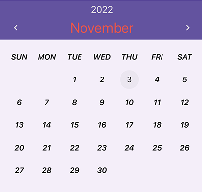
The DevExpress Mobile UI for .NET MAUI Suite contains the DXCalendar component that allows your users to select dates. This component also allows you to highlight holidays, observances, and other days of the year.
](/MAUI/images/editors/calendar.png)
Add a Calendar to a Page
Download and install the DevExpress.Maui.Editors package to obtain the DXCalendar component.
Refer to the following help topics for more information:
- Install Packages from NuGet.org: Visual Studio, VS Code, and JetBrains Rider
- Get Started with DevExpress Controls for .NET Multi-platform App UI (.NET MAUI)
The following example adds a DXCalendar instance to a ContentPage:
<ContentPage ...
             xmlns:dx="http://schemas.devexpress.com/maui">
    <dx:DXCalendar DisplayDate="{Binding DisplayDate}"
                   SelectedDate="{Binding SelectedDate}" />
</ContentPage>
For a step-by-step guide on how to create a .NET MAUI app with the DXCalendar control, refer to the following help topic: Get Started with DXCalendar.
Note
The default calendar does not display special days (such as holidays and observances). This functionality should be implemented manually.
Selected Date
The following list contains API members that allow you to obtain the selected date, specify the available date range, prevent specific dates from being selected, and respond to date changes:
- SelectedDate
- Gets or sets the date selected in the calendar. This is a bindable property.
- SelectedDateChanged
- Fires when the date selected in the calendar changes.
- SelectedDateChangedCommand
- Gets or sets the command executed when the date selected in the calendar changes. This is a bindable property.
- SelectedDateChangedCommandParameter
- Gets or sets the parameter passed to the SelectedDateChangedCommand. This is a bindable property.
- DisableDate
- Allows you to disable a specific date (prevent users from selecting it).
- MinDate
- Gets or sets the minimum date that users can select in the calendar. This is a bindable property.
- MaxDate
- Gets or sets the maximum date that users can select in the calendar. This is a bindable property.
Appearance Customization
You can customize the appearance of the following visual elements in the calendar: days, months, years, days of the week, and header. You can set a custom style for all such visual elements, as well as for specific days/months/years. A style allows you to specify background and foreground colors, and fonts. You can also replace the default data template used to render a visual element.

- Month View
- Year View
- Decade View
- Calendar Header
- Day of Week
- Day
- Trailing Day
- Month
- Year
The table below contains options that you can use to apply custom styles and templates to visual elements:
| Style for All Elements | Style for Specific Elements | Template | Description |
|---|---|---|---|
| DayCellAppearance | CustomDayCellAppearance | DayCellTemplate | Allow you to customize days. |
| DayOfWeekCellAppearance | CustomDayOfWeekCellAppearance | DayOfWeekCellTemplate | Allow you to customize days of the week. |
| MonthCellAppearance | CustomMonthCellAppearance | MonthCellTemplate | Allow you to customize months. |
| YearCellAppearance | CustomYearCellAppearance | YearCellTemplate | Allow you to customize years. |
| HeaderAppearance | — | HeaderTemplate | Allows you to customize the calendar’s header. |
To obtain or set the view in code, use the ActiveViewType property. You can also use the following options to specify the display of the calendar:
- CellMinSize
- Gets or sets the minimum size of cells in the calendar. This is a bindable property.
- FirstDayOfWeek
- Gets or sets the first day of the week. This is a bindable property.
- HorizontalCellSpacing
- Gets or sets the horizontal spacing between cells. This is a bindable property.
- VerticalCellSpacing
- Gets or sets the vertical spacing between cells. This is a bindable property.
- Padding
- Gets or sets the distance between the calendar edges and contents. This is a bindable property.
- ShowTrailingDays
- Gets or sets whether days related to the previous and next months are displayed. This is a bindable property.
Navigate in Calendar
You can call NavigateBackward and NavigateForward methods to navigate between calendar pages. To switch a calendar view (Month → Year → Decade), call the SwitchView method.
Examples
Example 1
The example below shows how to apply custom appearance settings to days, days of the week, and the calendar’s header.
<dx:DXCalendar>
    <dx:DXCalendar.HeaderAppearance>
        <dx:CalendarHeaderAppearance HeaderTitleTextColor="#F44848"/>
    </dx:DXCalendar.HeaderAppearance>
    <dx:DXCalendar.DayCellAppearance>
        <dx:CalendarDayCellAppearance FontAttributes="Bold,Italic"
                                      TextColor="Black"/>
    </dx:DXCalendar.DayCellAppearance>
    <dx:DXCalendar.DayOfWeekCellAppearance>
        <dx:CalendarDayOfWeekCellAppearance FontAttributes="Bold,Italic"
                                            TextColor="Black"/>
    </dx:DXCalendar.DayOfWeekCellAppearance>
</dx:DXCalendar>
Example 2
The example below shows how to apply a custom appearance to a specific day.
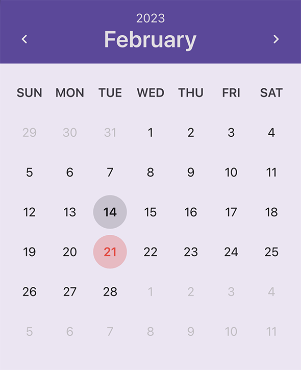
using DevExpress.Maui.Editors;

void CustomDayCellAppearance(object sender, CustomSelectableCellAppearanceEventArgs e) {
    if(e.Date.Month == 2 && e.Date.Day == 14) {
        e.FontAttributes = FontAttributes.Bold;
        e.EllipseBackgroundColor = Color.FromRgba(e.TextColor.Red, e.TextColor.Green, e.TextColor.Blue, 0.15);
    }

    if(e.Date.Month == 2 && e.Date.Day == 21) {
        e.FontAttributes = FontAttributes.Bold;
        Color textColor = Color.FromHex("F44848");
        e.EllipseBackgroundColor = Color.FromRgba(textColor.Red, textColor.Green, textColor.Blue, 0.25);
        e.TextColor = textColor;
    }
}
<dx:DXCalendar CustomDayCellAppearance="CustomDayCellAppearance"/>
Example 3
The example below shows how to apply a custom appearance to weekends (days in the calendar and days of the week).

using DevExpress.Maui.Editors;

void CustomDayCellAppearance(object sender, CustomSelectableCellAppearanceEventArgs e) {
    if (e.Date.DayOfWeek == DayOfWeek.Saturday || e.Date.DayOfWeek == DayOfWeek.Sunday) {
        e.TextColor = Color.FromHex("F44848");
        if(e.IsTrailing)
            e.TextColor = Color.FromRgba(e.TextColor.Red, e.TextColor.Green, e.TextColor.Blue, 0.5);
    }
}

private void CustomDayOfWeekCellAppearance(object sender, CustomDayOfWeekCellAppearanceEventArgs e) {
    if(e.DayOfWeek == DayOfWeek.Saturday || e.DayOfWeek == DayOfWeek.Sunday)
        e.TextColor = Color.FromHex("F44848");
}
<dx:DXCalendar CustomDayCellAppearance="CustomDayCellAppearance"
               CustomDayOfWeekCellAppearance="CustomDayOfWeekCellAppearance"/>