Layout
- 4 minutes to read
The DXToolbar control includes APIs that fix (freeze) toolbar items to a side and customize item layout. This topic describes how to change alignment of items, fix them, and display a view that overlaps the device keyboard to add an extra space for your elements.
Item Alignment
DXToolbar contains the ItemAlignment property that specifies the alignment of nested toolbar items. This property has the following values:
- Center
Items are centered.

- Fill
Items occupy all available space; original item size proportions are saved.

- FillUniform
Items occupy all available space; original item size proportions are kept.

- SpaceAround
Items are evenly distributed; the first and last items have a half-size space.

- SpaceBetween
Items are evenly distributed. The first item is positioned at the start and the last item at the end.

- SpaceEvenly
Items are evenly distributed; items have equal space around them.

- Start
Items are aligned at the start.

You can also use the ToolbarPage.ItemAlignment property to specify the alignment of nested toolbar items within a ToolbarPage.
Fix Items
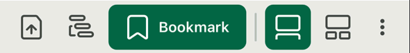
Set a toolbar item’s Placement property to FixedLeft or FixedRight to fix it to the specified side of DXToolbar. The following code sample fixes the goto and more toolbar items to the left and right side of the toolbar, respectively:
<dxc:DXToolbar>
    <dxc:ToolbarButton x:Name="GoTo" Icon="goto" Placement="FixedLeft" />
    <!-- other toolbar items -->
    <dxc:ToolbarToggleButton x:Name="More" Icon="more" Placement="FixedRight" />
</dxc:DXToolbar>
Customize Fixed Item Spacing and Indents
You can use the following properties to customize spacing and indent of toolbar items (within the toolbar or a page):
| Property | Description |
|---|---|
| DXToolbar.FixedLeftIndent | Gets or sets the right indent between toolstrip items and toolbar items that are fixed to the left side. This is a bindable property. |
| DXToolbar.FixedRightIndent | Gets or sets the left indent between toolstrip items and toolbar items that are fixed to the right side. This is a bindable property. |
| DXToolbar.FixedLeftItemSpacing | Gets or sets the indent between toolbar items that are fixed to the left side. This is a bindable property. |
| DXToolbar.FixedRightItemSpacing | Gets or sets the indent between toolbar items that are fixed to the right side. This is a bindable property. |
| ToolbarPage.FixedLeftIndent | Gets or sets the right indent within this page between toolstrip items and toolbar items that are fixed to the left side. This is a bindable property. |
| ToolbarPage.FixedRightIndent | Gets or sets the left indent within this page between toolstrip items and toolbar items that are fixed to the right side. This is a bindable property. |
| ToolbarPage.FixedLeftItemSpacing | Gets or sets the indent between toolbar items that are fixed to the left side of this page. This is a bindable property. |
| ToolbarPage.FixedRightItemSpacing | Gets or sets the indent between toolbar items that are fixed to the right side of this page. This is a bindable property. |
Keep Toolbar Control Visible when Keyboard is Opened
The SafeKeyboardAreaView container reduces the height of the content specified by the Content property when the keyboard is opened. This allows you to keep the content reachable.
<ContentPage ...
xmlns:dxc="clr-namespace:DevExpress.Maui.Controls;assembly=DevExpress.Maui.Controls">
<dxc:SafeKeyboardAreaView>
<dxc:DXDockLayout StretchLastItem="False">
<dxc:DXToolbar x:Name="toolbar" dxc:DXDockLayout.Dock="Bottom">
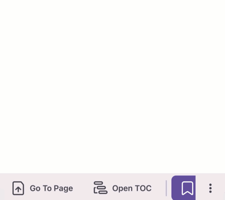
<dxc:ToolbarButton Icon="gotoimage" Content="Go To Page" Placement="FixedLeft" Clicked="OpenPanel" />
<!-- ... -->
</dxc:DXToolbar>
<dxc:TextEdit />
</dxc:DXDockLayout>
</dxc:SafeKeyboardAreaView>
</ContentPage>
Display a View in the Keyboard Area
The DevExpress .NET MAUI Controls include the SafeKeyboardAreaView container that allows you to display custom content in a device’s keyboard area. Follow the steps below to do it:
- Pass the content that you want to display in the keyboard area to the KeyboardAreaContent property.
- Set the IsOpened property to
trueto hide a device keyboard and display the specified content. - Set the IsOpened property to
falseto display a device keyboard and hide the keyboard area content.
<ContentPage ...
             xmlns:dxc="clr-namespace:DevExpress.Maui.Controls;assembly=DevExpress.Maui.Controls"
             xmlns:dxe="clr-namespace:DevExpress.Maui.Editors;assembly=DevExpress.Maui.Editors">
    <dxc:SafeKeyboardAreaView x:Name="panel">
        <dxc:DXDockLayout StretchLastItem="False">
            <dxc:DXToolbar x:Name="toolbar" dxc:DXDockLayout.Dock="Bottom">
                <dxc:ToolbarButton Icon="gotoimage" Content="Go To Page" Placement="FixedLeft" Clicked="OpenPanel"  />
            </dxc:DXToolbar>
            <dxe:TextEdit />
        </dxc:DXDockLayout>
        <dxc:SafeKeyboardAreaView.KeyboardAreaContent>
                <dxc:DXColorSelector/>
        </dxc:SafeKeyboardAreaView.KeyboardAreaContent>
    </dxc:SafeKeyboardAreaView>
</ContentPage>
void OpenPanel(Object sender, EventArgs e){
    panel.IsOpened = !panel.IsOpened;
}
Next Steps
- Customize Appearance and Animations
- Lists appearance and animation customization properties.