DevExpress Bottom Sheet for .NET MAUI
- 2 minutes to read
The BottomSheet control is a view that slides out from the bottom of the screen and shows an action list or other supplemental content.

Bottom Sheet Elements (Anatomy)
The following figure shows the basic elements of a bottom sheet:

Add a Bottom Sheet to the Page
Before you proceed, read the following topics:
- Get Started with DevExpress Controls for .NET Multi-platform App UI (.NET MAUI)
- Get Started with DevExpress Bottom Sheet for .NET MAUI
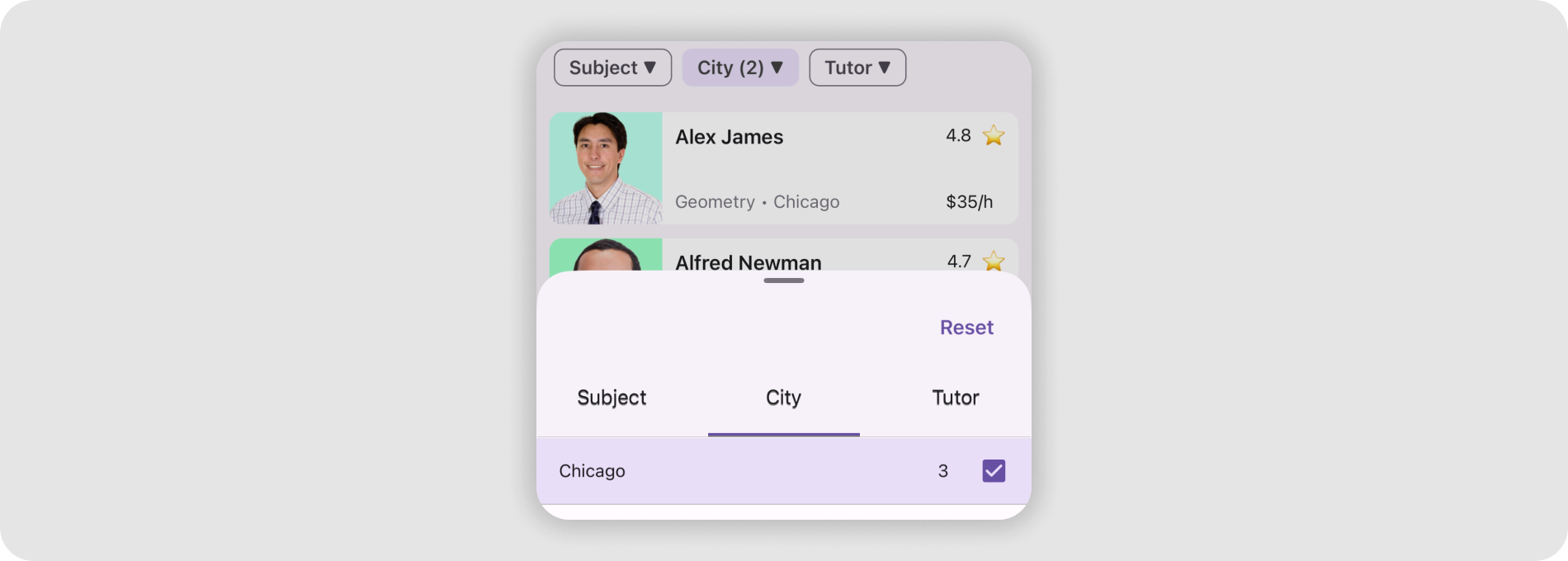
The following example shows an action sheet when a user swipes up the page:
<ContentPage xmlns="http://schemas.microsoft.com/dotnet/2021/maui"
             xmlns:x="http://schemas.microsoft.com/winfx/2009/xaml"
             xmlns:local="clr-namespace:BottomSheetSample"
             xmlns:dx="http://schemas.devexpress.com/maui"
             x:Class="BottomSheetSample.MainPage" Shell.TabBarIsVisible="False">
    <ContentPage.Resources>
        <Style TargetType="dx:DXButton" x:Key="buttonStyle">
            <Setter Property="BackgroundColor" Value="{x:Null}" />
            <Setter Property="IconColor" Value="Gray" />
            <Setter Property="TextColor" Value="Gray" />
            <Setter Property="HorizontalContentAlignment" Value="Start"/>
        </Style>
    </ContentPage.Resources>
    <VerticalStackLayout>
        <VerticalStackLayout.GestureRecognizers>
            <SwipeGestureRecognizer Direction="Up" Swiped="SwipeGestureRecognizer_Swiped"/>
        </VerticalStackLayout.GestureRecognizers>
        <dx:BottomSheet x:Name="bottomSheet"
                         CornerRadius="30"
                         BackgroundColor="White"
                         HalfExpandedRatio="0.3"
                         AllowDismiss="True"
                         ShowGrabber="True"
                         IsModal="True">
            <!--#region BottomSheetContent-->
            <VerticalStackLayout Padding="4,20,4,4">
                <dx:DXButton Content="Share" Icon="share" Style="{x:StaticResource buttonStyle}" Clicked="Button_Clicked"/>
                <dx:DXButton Content="Get link" Icon="hyperlink" Style="{x:StaticResource buttonStyle}" Clicked="Button_Clicked"/>
                <dx:DXButton Content="Edit name" Icon="pencil" Style="{x:StaticResource buttonStyle}" Clicked="Button_Clicked"/>
            </VerticalStackLayout>
            <!--#endregion-->
        </dx:BottomSheet>
    </VerticalStackLayout>
</ContentPage>
using DevExpress.Maui.Controls;
namespace BottomSheetSample;
public partial class MainPage : ContentPage {
    public MainPage() {
        InitializeComponent();
    }
    private void SwipeGestureRecognizer_Swiped(object sender, SwipedEventArgs e) {
        bottomSheet.State = BottomSheetState.HalfExpanded;
    }
    private void Button_Clicked(object sender, EventArgs e) {
        //...
    }
}
Next Steps
- Get Started
- This step-by-step tutorial guides you through creating an app with a BottomSheet.
- States and Modality
- Describes how to manage different states of the BottomSheet control.
- Custom Appearance
- Explains how to customize BottomSheet appearance.
- Examples
- Lists task-based solutions with the BottomSheet control.
Related Scenarios
Display Filtering UI Elements in a BottomSheet
Master-Detail View with BottomSheet Control

Google Maps-Inspired POI Details
