DevExpress Layouts for .NET MAUI
- 2 minutes to read
The DevExpress component library for .NET MAUI ships with the following layout controls you can use to arrange UI controls in your app:
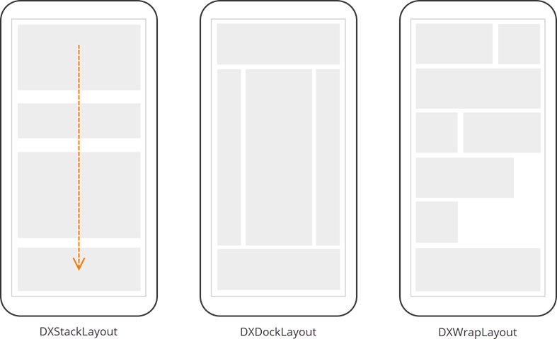
- DXStackLayout
- A layout that positions child elements in a single line vertically or horizontally.
- DXDockLayout
- A layout that allows you to dock its child controls to different sides.
- DXWrapLayout
- A layout that sequentially positions its nested child controls from left to right and adds “line breaks” where necessary.
Add a Layout Control to a Page
- Install the DevExpress.Maui.Core NuGet package. For more information, refer to the following help topic: Get Started.
- Declare the
DevExpress.Maui.Corenamespace in the page. - Add layout tags to the page. For example,
<dx:DXStackLayout>…</dx:DXStackLayout>. - Add other component to the layout’s Children collection. Since
Childrenis a content property, you can omitChildrentags in your markup.
<ContentPage ...
    xmlns:dx="clr-namespace:DevExpress.Maui.Core;assembly=DevExpress.Maui.Core">
    <dx:DXStackLayout>
        <!-- Child controls here. --->
    </dx:DXStackLayout>
</ContentPage>
You can also populate a layout with child items automatically:
- Bind the layout’s ItemsSource property to a collection of View Model objects.
- Specify the layout’s ItemTemplate property to define how created items should look. The
ItemTemplateproperty uses a ItemsSource’s ViewModel object as the binding context.
<ContentPage.BindingContext>
    <local:MainViewModel/>
</ContentPage.BindingContext>
<dx:DXWrapLayout ItemsSource="{Binding Items}"
                VerticalOptions="Start" ItemSpacing="20"
                LineSpacing="20" Margin="20" Wrap="Regular" >
    <dx:DXWrapLayout.ItemTemplate>
        <DataTemplate>
            <dx:DXBorder BorderThickness="2" BorderColor="DarkGray"
                         WidthRequest="{Binding Width}" HeightRequest="{Binding Height}"
                         Content="{Binding Text}"/>
        </DataTemplate>
    </dx:DXWrapLayout.ItemTemplate>
</dx:DXWrapLayout>
public class MainViewModel {
    public List<LayoutItemInfo> Items { get; set; }
    public MainViewModel() => Items = GenerateItems(20);
    public List<LayoutItemInfo> GenerateItems(int count) {
        List<LayoutItemInfo> items = new();
        for (int i = 1; i <= count; i++) {
            items.Add(new LayoutItemInfo() { Text = i.ToString(), Height = 50, Width = 50 });
        }
        return items;
    }
}
If you want to conditionally choose a template to apply, use the ItemTemplateSelector instead of ItemTemplate.
Common Layout Control Settings
All DevExpress layout controls for .NET MAUI support the following options:
- BorderColor
- Specifies the border color.
- BorderThickness
- Defines the border thickness.
- CornerRadius
- Specifies the border corner radius.
- Padding
Defines the amount of space around the layout control boundaries and its content.
<dx:DXStackLayout BorderColor="DarkGray" BorderThickness="2" CornerRadius="10" Padding="10"> <!--...--> </dx:DXStackLayout>- IsClippedToBounds
Specifies whether the layout control should clip child items to its bounds.

Display a View in the Keyboard Area
The DevExpress .NET MAUI Controls include the SafeKeyboardAreaView container that allows you to display custom content in the keyboard area to add more space for UI elements:

Refer to the following topic for more information: SafeKeyboardAreaView.