Access to Underlying Controls in the WinForms Dashboard Designer
- 7 minutes to read
The WinForms Designer uses DevExpress WinForms controls to visualize data within dashboard items. If necessary, you can access these controls and customize their settings to add specific capabilities.
The DashboardDesigner control exposes the following events that allow you to access these controls and customize their settings.
- DashboardDesigner.DashboardItemControlCreated
- Allows you to access underlying WinForms controls.
- DashboardDesigner.DashboardItemControlUpdated
- Allows you to access underlying WinForms controls.
- DashboardDesigner.DashboardItemBeforeControlDisposed
- Allows you to access underlying WinForms controls.
The DashboardItemControlEventArgs.DashboardItemName event parameter returns the component name of the dashboard item to be customized. Use the following properties to access the corresponding underlying controls.
Dashboard Item | Control | Property |
|---|---|---|
You can also access underlying controls with the following methods:
- DashboardDesigner.GetUnderlyingControl
- Gets the underlying control used to visualize data within the specified dashboard item.
- DashboardDesigner.GetUnderlyingControls
- Gets the underlying controls used to visualize data within the dashboard items.
Limitations
Note that changing specific control settings may lead to various issues. We do not recommend changing the following settings:
- data binding settings;
- basic data presentation settings (for instance, a set of grid columns, chart series or pivot grid fields).
Note
Note that printed or exported documents containing a dashboard/dashboard item do not reflect appearance settings applied using the events for accessing of underlying controls.
Example
The following code snippets shows how to customize the controls used to visualize data in the dashboard items at runtime.

The following options are changed:
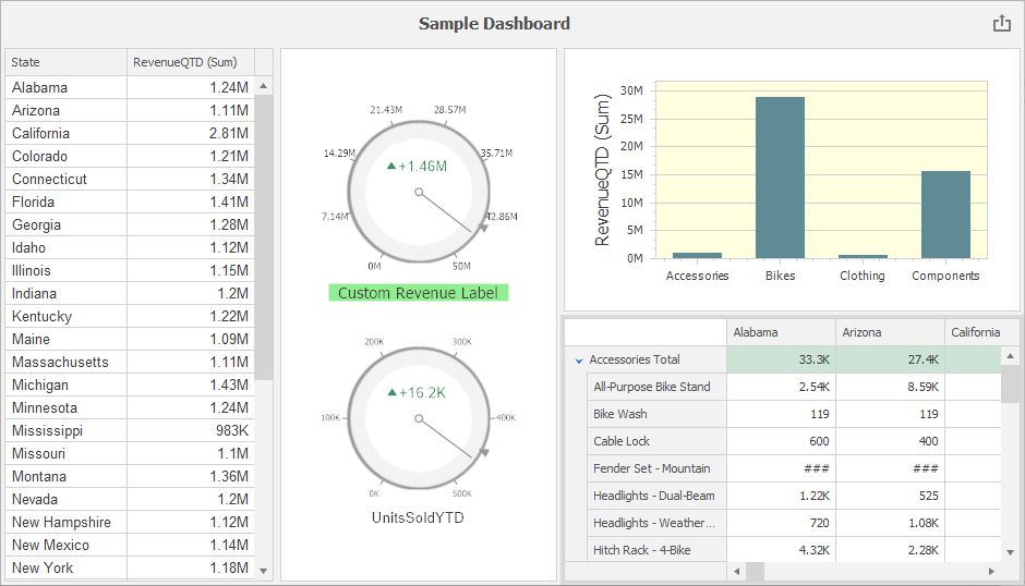
- Grid: The font is changed to “Arial, 10”. For this, handle the DashboardDesigner.DashboardItemControlUpdated event and access the control’s MainView.
- Chart: The background color of the chart pane is set to LightYellow. For this, handle the DashboardDesigner.DashboardItemControlUpdated event and access the control’s Diagram property.
- Pivot: Cell values related to “Mountain” products are hidden, ### is displayed instead. The PivotGridControl.CustomCellValue, DashboardDesigner.DashboardItemControlCreated and DashboardDesigner.DashboardItemBeforeControlDisposed events are handled to customize the cell values.
- Gauge: The background color of the first gauge’s label is set to “LightGreen”, a custom label is set and displayed in “Tahoma, 16” font. The number of major ticks is set to 8. For this, handle the DashboardDesigner.DashboardItemControlUpdated event and use the Gauges property to access the collection of gauges displayed in the control.
using DevExpress.XtraCharts;
using DevExpress.XtraGauges.Core.Drawing;
using DevExpress.XtraGauges.Win.Gauges.Circular;
using DevExpress.XtraGrid.Views.Grid;
using DevExpress.XtraPivotGrid;
using System.Drawing;

namespace DashboardDesigner_ControlAccess
{
    public partial class DesignerForm1: DevExpress.XtraBars.Ribbon.RibbonForm
    {
        public DesignerForm1() {
            InitializeComponent();
            dashboardDesigner.CreateRibbon();
            dashboardDesigner.LoadDashboard(@"..\..\Dashboards\dashboard1.xml");
        }

        private void dashboardDesigner_DashboardItemControlCreated(object sender, DevExpress.DashboardWin.DashboardItemControlEventArgs e) {
            // For all Pivot items in the dashboard:
            if (e.PivotGridControl != null) {
                PivotGridControl pivotGridControl = e.PivotGridControl;
                pivotGridControl.CustomCellValue += PivotGridControl_CustomCellValue; ;
            }
        }

        private void PivotGridControl_CustomCellValue(object sender, PivotCellValueEventArgs e) {
            if (e.RowField == null) return;
            if (e.GetFieldValue(e.RowField).ToString().Contains("Mountain"))
                e.Value = "###";
        }

        private void dashboardDesigner_DashboardItemControlUpdated(object sender, DevExpress.DashboardWin.DashboardItemControlEventArgs e) {
            // For all Grid items in the dashboard:
            if(e.GridControl!= null) {
                GridView gridView = e.GridControl.MainView as GridView;
                gridView.Appearance.Row.Font = new Font("Arial", 10);
            }
            // For a specific Chart item in the dashboard:
            if(e.DashboardItemName == "chartDashboardItem1") {
                ChartControl chartControl = e.ChartControl;
                ((XYDiagram)chartControl.Diagram).Panes[0].BackColor = Color.LightYellow;
            }
            // For a specific Gauge item in the dashboard:
            if (e.DashboardItemName == "gaugeDashboardItem1") {
                var gauge = e.GaugeControl.Gauges[0] as CircularGauge;
                gauge.Labels[0].AppearanceBackground.ContentBrush = new SolidBrushObject(Color.LightGreen);
                gauge.Labels[0].Text = "Custom Revenue Label";
                gauge.Labels[0].AppearanceText.Font = new Font("Tahoma", 16);
                gauge.Scales[0].MajorTickCount = 8;
            }
        }

        private void dashboardDesigner_DashboardItemBeforeControlDisposed(object sender, DevExpress.DashboardWin.DashboardItemControlEventArgs e) {
            if(e.PivotGridControl != null) {
                PivotGridControl pivotGridControl = e.PivotGridControl;
                pivotGridControl.CustomCellValue -= PivotGridControl_CustomCellValue;
            }
        }
    }
}
Custom Export
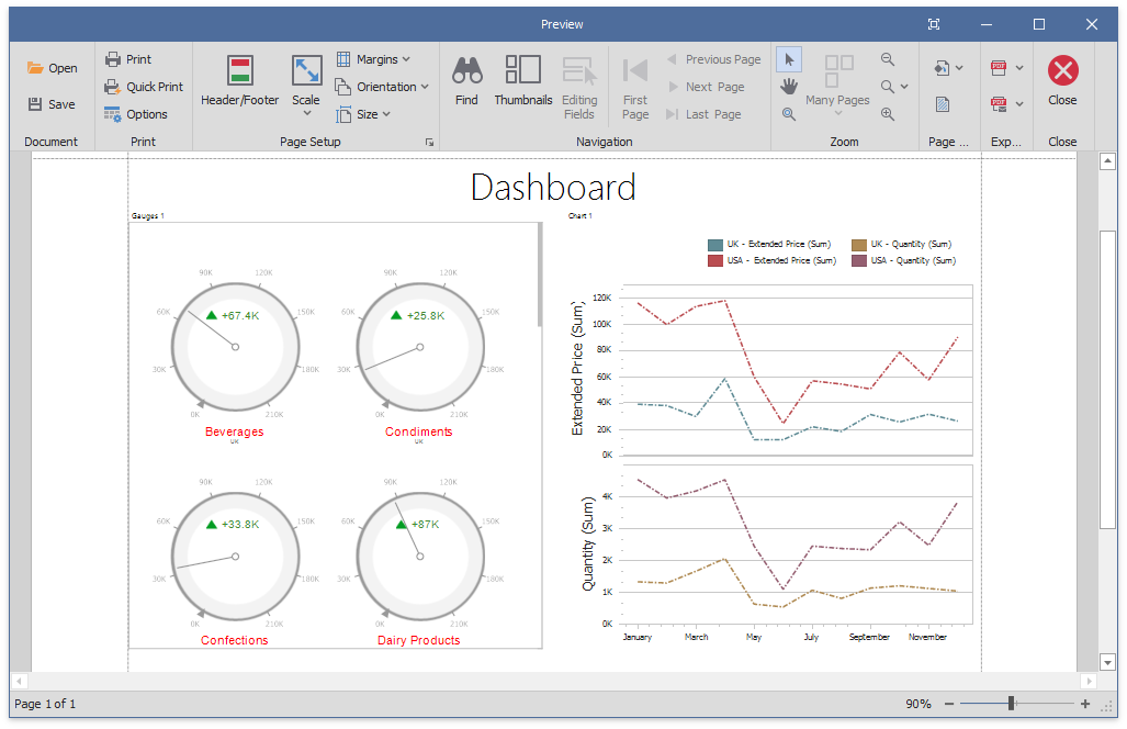
Although the export does not automatically applies custom settings, you can customize the exported document. For this, handle the DashboardViewer.CustomExport event.
How to Customize Dashboard Items in the Exported Document
The following example shows how to customize dashboard items in the exported document when you handle the DashboardDesigner.CustomExport / DashboardViewer.CustomExport / DashboardControl.CustomExport events. You can use the CustomExportEventArgs.GetPrintableControls method to obtain the printable controls.

using DevExpress.DashboardCommon;
using DevExpress.DashboardExport;
using DevExpress.DashboardWin;
using DevExpress.XtraCharts;
using DevExpress.XtraGauges.Core.Drawing;
using DevExpress.XtraGauges.Win.Base;
using DevExpress.XtraGauges.Win.Gauges.Circular;
using DevExpress.XtraReports.UI;

private void DashboardControl_CustomExport(object sender, CustomExportEventArgs e) {
    foreach(var printControl in e.GetPrintableControls()) {
        if(printControl.Value is XRGaugeDashboardItem) {
            var gaugeItemName = printControl.Key;
            DashboardDesigner designer = (DashboardDesigner)sender;
            var gaugeDashboardItem = designer.Dashboard.Items[gaugeItemName] as GaugeDashboardItem;
            foreach(var dashGaugeElement in gaugeDashboardItem.Gauges) {
                foreach(var gaugePanel in
                    e.GetGaugeContext(gaugeItemName).GetPrintableGauges(dashGaugeElement).Cast<XRDashboardGauge>()) {
                    if(gaugePanel != null) {
                        gaugePanel.MainSeriesLabel.ForeColor = Color.Red;
                    }
                }
            }
        }

        if(printControl.Value is XRChart) {
            var chartItemName = printControl.Key;
            DashboardDesigner designer = (DashboardDesigner)sender;
            var chartDashboardItem = designer.Dashboard.Items[chartItemName] as ChartDashboardItem;
            foreach(var pane in chartDashboardItem.Panes) {
                if(pane.Series.Count > 0) {
                    foreach(var dashSeries in pane.Series) {
                        if(dashSeries != null) {
                            var controlSeries = e.GetChartContext(chartItemName).GetControlSeries(dashSeries);
                            if(controlSeries != null) {
                                foreach(var ser in controlSeries) {
                                    LineSeriesView view = ser.View as LineSeriesView;
                                    if(view != null) {
                                        view.LineStyle.DashStyle = DashStyle.DashDot;
                                    }
                                }
                            }
                        }
                    }
                }
            }
        }
    }
}
How to Add Custom Information to the Exported Dashboard at Runtime
The following example shows how to use the DashboardViewer.CustomExport event to specify header and footer content of an exported dashboard. This event allows you to access the underlying report (XtraReport) of the exported document.
