Adaptivity
- 8 minutes to read
This article describes adaptivity features of DevExpress Blazor components.
Built-In Functionality
Form Layout
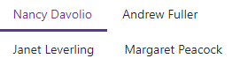
The Form Layout component automatically arranges data editors and their labels when you change the viewport size.
The component uses a responsive grid system based on the CSS flexible box layout to render items. Each layout item (group, tab, item) can occupy 1-12 columns. The following properties specify the item width for six different viewport sizes:
| Viewport Size | Viewport Width | Property |
|---|---|---|
| Extra Small | Any | ColSpanXs |
| Small | ≥576px | ColSpanSm |
| Medium | ≥768px | ColSpanMd |
| Large | ≥992px | ColSpanLg |
| Extra Large | ≥1200px | ColSpanXl |
| Extra Extra Large | ≥1400px | ColSpanXxl |
<DxFormLayout>
    @* If the viewport width is less then 768px (medium), the item occupies 12 columns *@
    @* If the viewport width is from 768px (medium) to 1200px (extra large), the item occupies 6 columns *@
    @* If the viewport width exceeds 1200px (extra large), the item occupies 4 columns *@
    <DxFormLayoutItem Caption="Name" ColSpanXl="4" ColSpanMd="6">
        <DxTextBox />
    </DxFormLayoutItem>
</DxFormLayout>
A layout item moves to the next row if the current row does not have enough space to render it. Enable an item’s BeginRow property to always place the item in a new row.
<DxFormLayout>
    @* ... *@
    <DxFormLayoutItem Caption="Postal/ZIP Code" BeginRow="true" />
</DxFormLayout>
If the Form Layout does not have enough space to display captions on the left (CaptionPosition is Horizontal), they move above the associated editor (Vertical position) regardless of the CaptionPosition property value.
Menu
The Menu component supports adaptive mode when items are arranged horizontally. The following properties specify how the menu behaves when the width of the browser window changes and it cannot fit all items:
- CollapseItemToIconMode
- Specifies whether the menu displays icons instead of captions in items. You can also specify the order in which menu hides its items (AdaptivePriority).
- CollapseItemsToHamburgerMenu
- Specifies whether menu items are collapsed into a hamburger menu. Use the HamburgerButtonPosition property to specify the hamburger button’s position.
<div class="card w-auto">
    <DxMenu Title="DevExpress"
            CollapseItemToIconMode="MenuCollapseItemToIconMode.Sequentially"
            CollapseItemsToHamburgerMenu="true">
        <Items>
            <DxMenuItem Text="Home" IconCssClass="menu-icon-home menu-icon">
                <Items>
                    <DxMenuItem Text="News">
                        <Items>
                            <DxMenuItem Text="Explore our newest features" />
                            <DxMenuItem Text="Website news" />
                        </Items>
                    </DxMenuItem>
                    <DxMenuItem Text="Our Mission" />
                    <DxMenuItem Text="Our Customers" />
                </Items>
            </DxMenuItem>
            <DxMenuItem Text="Components" IconCssClass="menu-icon-products menu-icon">
                <Items>
                    <DxMenuItem Text="Blazor" />
                    <DxMenuItem Text="ASP.NET MVC" />
                    <DxMenuItem Text="ASP.NET Web Forms" />
                    <DxMenuItem Text="ASP.NET Core" />
                    <DxMenuItem Text="Bootstrap Web Forms" />
                </Items>
            </DxMenuItem>
            <DxMenuItem Text="Support" IconCssClass="menu-icon-support menu-icon">
                <Items>
                    <DxMenuItem Text="Getting Started" />
                    <DxMenuItem Text="Documentation" />
                    <DxMenuItem Text="Support Center" />
                    <DxMenuItem Text="Code Examples" />
                    <DxMenuItem Text="Blogs" />
                </Items>
            </DxMenuItem>
            <DxMenuItem Text="Contacts" IconCssClass="menu-icon-contacts menu-icon" />
            <DxMenuItem Text="About" IconCssClass="menu-icon-about menu-icon" />
        </Items>
    </DxMenu>
</div>

You can also set the DisplayMode property to Auto to show the Menu as a desktop or mobile view based on the device type.
Tab Containers
Tabs and Tab Pages components allow you to specify how users navigate between tabs when they do not fit the container’s width. Use the ScrollMode property to specify one of the following options:
Auto (Default Value)
This scroll mode automatically adapts to the device type. Mobile and tablet devices use Swipe mode, while desktop devices use NavButtons mode.
NavButtons
The container displays tabs that fit the container’s width. Users can navigate to other tabs as follows:
- Click navigation buttons
- Hold the Shift key and roll the mouse wheel
- Swipe (mobile devices only)
Swipe
The container displays tabs that fit into the container by width. Users can navigate to other tabs as follows:
- Hold the Shift key and roll the mouse wheel
- Swipe (mobile devices only)
NoScroll
Users cannot scroll tabs. All tabs that do not fit into the container by width occupy a new line.
Example
The following code snippet activates the NavButtons mode:
<DxTabs ScrollMode="TabsScrollMode.NavButtons">
    <DxTabPage Text="Personal Information">
        @* ... *@
    </DxTabPage>
</DxTabs>
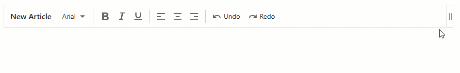
Toolbar
The following properties specify how the Toolbar component behaves when the container’s width changes:
- AdaptivityAutoCollapseItemsToIcons
- Specifies whether to hide captions in all items that contain icons.
- AdaptivityAutoHideRootItems
- Specifies whether the toolbar moves root items one by one to the root submenu until the root level reaches the minimum number of root items (AdaptivityMinRootItemCount). You can also use AdaptivePriority and AdaptiveText properties to specify the order in which the component hides its items and alternative item text for adaptive mode.
The following code snippet moves the align item group to the submenu first and then hides text strings of the last group:
<div class="card">
    <DxToolbar Title="New Article"
               ItemRenderStyleMode="ToolbarRenderStyleMode.Plain"
               AdaptivityMinRootItemCount="2"
               AdaptivityAutoHideRootItems="true"
               AdaptivityAutoCollapseItemsToIcons="true">
        <Items>
            <DxToolbarItem Name="FontFamily" Text="@currentFont.Name" BeginGroup="true" AdaptiveText="Font Family"
                        Tooltip="Font Family">
                <Items>
                    @foreach(var font in FontInfo.DefaultFonts) {
                        <DxToolbarItem Text="@font.Name"
                                       Click="(x) => { currentFont = font; }"
                                       Checked="currentFont == font"
                                       Style="@font.GetCssString()" />
                    }
                </Items>
            </DxToolbarItem>
            <DxToolbarItem AdaptivePriority="1" BeginGroup="true"
                           IconCssClass="tb-icon tb-icon-bold" AdaptiveText="Bold" />
            <DxToolbarItem AdaptivePriority="1" GroupName="font-italic"
                           IconCssClass="tb-icon tb-icon-italic" AdaptiveText="Italic" />
            <DxToolbarItem AdaptivePriority="1" GroupName="font-underline"
                           IconCssClass="tb-icon tb-icon-underline" AdaptiveText="Underline" />
            <DxToolbarItem AdaptivePriority="2" BeginGroup="true" GroupName="align"
                           IconCssClass="tb-icon tb-icon-align-left" AdaptiveText="Left" />
            <DxToolbarItem AdaptivePriority="2" GroupName="align" AdaptiveText="Center"
                           IconCssClass="tb-icon tb-icon-align-center" />
            <DxToolbarItem AdaptivePriority="2" GroupName="align" AdaptiveText="Right"
                           IconCssClass="tb-icon tb-icon-align-right"/>
            <DxToolbarItem BeginGroup="true" Text="Undo"
                           AdaptiveText="Undo" IconCssClass="tb-icon tb-icon-undo" />
            <DxToolbarItem Text="Redo" AdaptiveText="Redo"
                           IconCssClass="tb-icon tb-icon-redo" />
        </Items>
    </DxToolbar>
</div>
Toolbar in HTML Editor and Rich Text Editor
The toolbar (ribbon) in HTML Editor and Rich Text Editor hides grouped items in drop-down menus starting from the rightmost item when you resize the browser window. When the component width changes, the toolbar also hides group captions and displays icons instead.
You can use the AdaptivePriority property to specify an item’s hiding order.
@using DevExpress.Blazor.Office

<DxHtmlEditor Markup="@markup"
              CustomizeToolbar="OnCustomizeToolbar" />

@code {
    string markup = "";

    void OnCustomizeToolbar(IToolbar toolbar) {
        IBarGroup fontGroup = toolbar.Groups[HtmlEditorToolbarGroupNames.Font];
        IBarItem fontNameItem = fontGroup.Items[HtmlEditorToolbarItemNames.FontName];
        fontNameItem.AdaptivePriority = 2;
    }
}
Solutions Based on Layout Breakpoint
You can use the Layout Breakpoint component to adapt page layout to different screen sizes. The IsActive property activates a specific breakpoint that corresponds to DeviceSize, MinWidth, or MaxWidth. Refer to sections below for examples on how to implement adaptivity for components that do not have built-in adaptive functionality.
Drawer
The following code snippet changes the Drawer‘s Mode based on the screen size:
<DxLayoutBreakpoint DeviceSize="DeviceSize.XSmall" IsActive="isXSmallScreen" IsActiveChanged="IsActiveChanged" />
<DxButton Click="OnClick" IconCssClass="tb-icon icon-hamburger" />

<DxDrawer IsOpen="IsOpen" PanelWidth="180px">
    ...
</DxDrawer>
@code {
    bool isXSmallScreen;
    bool? isOpen;
    bool IsOpen {
        // Hide the Drawer on small screens initially and display it on large screens
        get => isOpen ?? !isXSmallScreen;
        set => isOpen = value;
    }
    // Apply Overlap and Shrink modes on small and large screens, respectively
    DrawerMode Mode => isXSmallScreen ? DrawerMode.Overlap : DrawerMode.Shrink;

    void IsActiveChanged(bool isActive) {
        isXSmallScreen = isActive;
        isOpen = null;
    }
    void OnClick() {
        IsOpen = !IsOpen;
    }
}
Grid and TreeList
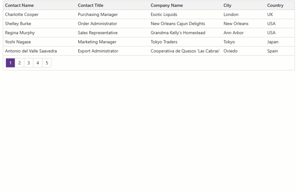
The following code snippet activates the breakpoint when the screen is extra small. The Grid component hides its Contact Title and City columns and displays their information in the detail row. All columns are available in the column chooser. You can use the same approach to manage TreeList columns with the Layout Breakpoint component.
<DxLayoutBreakpoint DeviceSize="DeviceSize.XSmall" @bind-IsActive="@isXSmallScreen" />

@if (isXSmallScreen) {
    <div class="align-self-start p-2">
        <DxButton Text="Column Chooser"
                  RenderStyle="ButtonRenderStyle.Secondary"
                  Click="ShowColumnChooser" />
    </div>
}

<DxGrid @ref="@Grid"
        Data="@Data"
        DetailRowDisplayMode="@GetGridDetailRowDisplayMode()"
        PageSize="5">
    <Columns>
        <DxGridDataColumn FieldName="ContactName" MinWidth="80" />
        <DxGridDataColumn FieldName="ContactTitle" MinWidth="100" Visible="@GetExtraColumnsVisible()" />
        <DxGridDataColumn FieldName="CompanyName" MinWidth="100" />
        <DxGridDataColumn FieldName="City" Width="15%" MinWidth="80" Visible="@GetExtraColumnsVisible()" />
        <DxGridDataColumn FieldName="Country" Width="10%" MinWidth="80" />
    </Columns>
    <DetailRowTemplate>
        @{
            var supplier = (Supplier)context.DataItem;
        }
        <b>Contact Title:</b> @supplier.ContactTitle <br />
        <b>City:</b> @supplier.City
    </DetailRowTemplate>
</DxGrid>

@code {
    bool isXSmallScreen;
    IGrid Grid { get; set; }
    IEnumerable<Supplier> Data { get; set; }
    bool GetExtraColumnsVisible() { return !isXSmallScreen; }
    GridDetailRowDisplayMode GetGridDetailRowDisplayMode() { return isXSmallScreen ? GridDetailRowDisplayMode.Always : GridDetailRowDisplayMode.Never; }

    void ShowColumnChooser() {
        Grid.ShowColumnChooser(new DialogDisplayOptions($".myGrid", HorizontalAlignment.Center, VerticalAlignment.Center));
    }
}
You can use the same approach to manage TreeList columns with the Layout Breakpoint component.
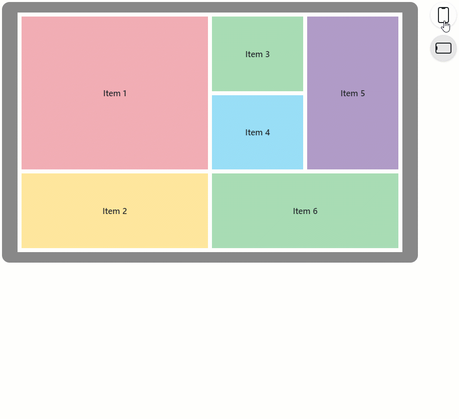
Grid Layout
The following example uses a layout breakpoint to create an adaptive DxGridLayout:
<DxLayoutBreakpoint DeviceSize="DeviceSize.XSmall" @bind-IsActive="@isXSmallScreen" />

<DxGridLayout CssClass="h-100" ColumnSpacing="8px" RowSpacing="8px">
    <Rows>
        @if(isXSmallScreen) {
            <DxGridLayoutRow Areas="item1" />
            <DxGridLayoutRow Areas="item2" />
            <DxGridLayoutRow Areas="item3" />
            <DxGridLayoutRow Areas="item4" />
            <DxGridLayoutRow Areas="item5" />
            <DxGridLayoutRow Areas="item6" />
        } else {
            <DxGridLayoutRow Areas="item1 item3 item5" />
            <DxGridLayoutRow Areas="item1 item4 item5"/>
            <DxGridLayoutRow Areas="item2 item6 item6"/>
        }
    </Rows>
    <Columns>
        <DxGridLayoutColumn Width="2fr" />
        @if(!isXSmallScreen) {
            <DxGridLayoutColumn />
            <DxGridLayoutColumn />
        }
    </Columns>
    <Items>
        <DxGridLayoutItem Area="item1">
            <Template>
                <div class="gridlayout-header gridlayout-item">
                    Item 1
                </div>
            </Template>
        </DxGridLayoutItem>
        <DxGridLayoutItem Area="item2">
            <Template>
                <div class="gridlayout-content gridlayout-item">
                    Item 2
                </div>
            </Template>
        </DxGridLayoutItem>
        <DxGridLayoutItem Area="item3">
            <Template>
                <div class="gridlayout-left-side-bar gridlayout-item">
                    Item 3
                </div>
            </Template>
        </DxGridLayoutItem>
        <DxGridLayoutItem Area="item4">
            <Template>
                <div class="gridlayout-right-side-bar gridlayout-item">
                    Item 4
                </div>
            </Template>
        </DxGridLayoutItem>
        <DxGridLayoutItem Area="item5">
            <Template>
                <div class="gridlayout-footer gridlayout-item">
                    Item 5
                </div>
            </Template>
        </DxGridLayoutItem>
        <DxGridLayoutItem Area="item6">
            <Template>
                <div class="gridlayout-left-side-bar gridlayout-item">
                    Item 6
                </div>
            </Template>
        </DxGridLayoutItem>
    </Items>
</DxGridLayout>

@code {
    bool isXSmallScreen;
}