Appointments
- 3 minutes to read
This topic describes the appointment as visual element and lists several properties that affect its visual appearance.
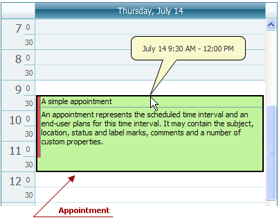
Generally, the Appointment is visually represented as a rectangle laying on the Time Cells of the scheduler area. The time cells it occupies correspond to its scheduled time interval. If an appointment is scheduled for a whole day (refer to the Appointment.AllDay property), or extends from one day to another, it is displayed in the All-Day Area of the ASPxScheduler control.
The basic appearance of the appointment is illustrated below:

The callout, which is shown in the picture, displays the start and end times of the appointment. It is invoked to indicate the changing interval when the appointment’s top or bottom border is dragged.
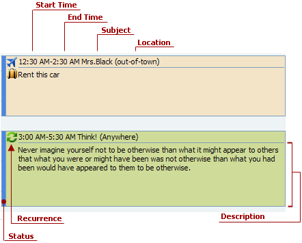
The appointment’s visual elements are shown in the following picture:

The visual elements of the appointment and the corresponding properties are listed in the table below:
| Visual Element | Property |
|---|---|
| Height | AppointmentDisplayOptions.AppointmentHeight. This property specifies the height of the rectange that represents an appointment, unless the AppointmentDisplayOptions.AppointmentAutoHeight property is set to true. For the Day View or Work-Week View view types the appointment height depends on its duration when an appointment does not occupy the whole day. So the AppointmentHeight and AppointmentAutoHeight property is applicable only to the Appointment.AllDay type appointments in those views. |
| Start time | Appointment.Start. The start of the scheduled time. If the Appointment.AllDay property is set to true, the start date of the appointment is the System.DateTime.Date of the Appointment.Start, and the start time of the appointment is 0:00. To hide the start time, use the AppointmentDisplayOptions.StartTimeVisibility property. The start and end time values can be displayed using a clock face instead of numbers - specify the AppointmentDisplayOptions.TimeDisplayType property as needed. |
| End time | Appointment.End. The end of the scheduled time. To hide the end time, use the AppointmentDisplayOptions.EndTimeVisibility property. The start and end time values can be displayed using a clock face instead of numbers - specify the AppointmentDisplayOptions.TimeDisplayType property as needed. |
| Subject | Appointment.Subject. A string that briefly characterizes the appointment. |
| Location | Appointment.Location. A string that identifies the place for the scheduled event. When displayed, it is automatically enclosed in parentheses. |
| Description | Appointment.Description. A block of text that provides the additional information about an appointment. |
| Recurrence | Appointment.IsRecurring. If this property’s value is true, then an appointment has an associated recurring pattern. (for more information refer to the Recurring Appointments and Exceptions topic). When the appointment’s start or end time has been arbitrarily changed, the appointment does not conform to its recurrence pattern and it is indicated by the crossed recurrence sign. To hide the sign use the AppointmentDisplayOptions.ShowRecurrence property. |
| Status | AppointmentDisplayOptions.StatusDisplayType. It may display the time status by its color, or the appointment’s duration by the span of the colorized part along the time ruler (available for the Week View and Work-Week View. The status element may also be hidden. |
| Custom text in appointment | Handle the ASPxScheduler.InitAppointmentDisplayText event to display custom text for the subject and description within the appointment. You can also display multiline subject text by inserting the “\r\n” escape sequences (Carriage Return + Line Feed). |
| Custom images in appointment | Handle the ASPxScheduler.InitAppointmentImages event to display custom images within the appointment. |