Image Slider Elements
- 3 minutes to read
This topic lists ASPxImageSlider elements that you can see on-screen. Each section contains a screenshot that outlines the specific element and a brief overview of the element’s function.

The following visual elements are available.
- Image Area
- Item Text Area
- Navigation Buttons
- Play and Pause Buttons
- Passe-partout
- Navigation Bar
- Dot
- Thumbnail
- Page Navigation Buttons
Image Area
The Image Area is the main part of the ASPxImageSlider that displays images.

The Image Area can display navigation buttons, play and pause buttons, and an item text area. You can also use a passe-partout to frame it.
The table below lists the main members that affect element appearance.
| Characteristics | Members |
|---|---|
| Settings | ASPxImageSlider.SettingsImageArea |
| Style | ImageSliderStyles.ImageArea |
| Size Mode | ImageSliderImageAreaSettings.ImageSizeMode |
| Size | ImageSliderImageAreaStyle.Height, ImageSliderImageAreaStyle.Width |
| Animation | ImageSliderImageAreaSettings.AnimationType |
| Navigation Direction | ImageSliderImageAreaSettings.NavigationDirection |
| Template | ImageSliderItem.Template, ASPxImageSlider.ItemTemplate |
| Visibility | ASPxImageSlider.ShowImageArea |
Play and Pause Buttons
The image area displays Play and Pause buttons. These buttons allow end users to play and pause a slide show.

The table below lists the main members that affect element appearance.
| Characteristics | Members |
|---|---|
| Visibility | ImageSliderSlideShowSettings.PlayPauseButtonVisibility |
| Image | ImageSliderImages.PlayButton, ImageSliderImages.PauseButton |
| Style | ImageSliderStyles.PlayPauseButton |
Item Text Area
The image area displays an Item Text Area, which allows you to display an image description.

The table below lists the main members that affect element appearance.
| Characteristics | Members |
|---|---|
| Visibility | ImageSliderImageAreaSettings.ItemTextVisibility |
| Style | ImageSliderStyles.ItemTextArea |
| Template | ImageSliderItem.TextTemplate, ASPxImageSlider.ItemTextTemplate |
Navigation Buttons
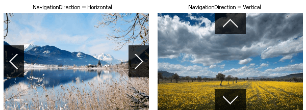
The image area can display Navigation Buttons, which allow users to navigate through images.

When an image slider navigates horizontally (the ImageSliderImageAreaSettings.NavigationDirection property is set to Horizontal), it displays horizontal navigation buttons; otherwise, they are vertical.

The table below lists the main members that affect element appearance.
Passe-partout
A Passe-partout is a frame placed around an Image Area. To specify its color, use the ImageSliderStyles.PassePartout property.

Navigation Bar
The Navigation Bar is displayed next to the image area at its left, right, bottom, or top. The Navigation Bar allows end-users to fast navigate among images. The bar can be represented by dots or thumbnails on the ImageSliderNavigationBarSettings.Mode property.

Additionally, the Navigation Bar can display page navigation buttons.
The table below lists the main members that affect element appearance.
| Characteristics | Members |
|---|---|
| Visibility | ASPxImageSlider.ShowNavigationBar |
| Position | ImageSliderNavigationBarSettings.Position |
| Mode | ImageSliderNavigationBarSettings.Mode |
| Settings | ASPxImageSlider.SettingsNavigationBar |
The Navigation Bar allows you to specify the particular style settings for each mode and position of bar. The table below lists available members.
Dot
The navigation bar displays Dots when you set the ImageSliderNavigationBarSettings.Mode property to Dots.

The table below lists the main members that affect element appearance.
| Characteristics | Members |
|---|---|
| Image | ImageSliderImages.Dot |
| Style | ImageSliderStyles.Dot |
Thumbnail
The navigation bar displays Thumbnail images when you set the ImageSliderNavigationBarSettings.Mode property to Thumbnails.

If you do not specify a thumbnail image explicitly, the ASPxImageSlider control automatically creates it.
The table below lists the main members that affect element appearance.
| Characteristics | Members |
|---|---|
| Style | ImageSliderStyles.Thumbnail |
| Template | ImageSliderItem.ThumbnailTemplate, ASPxImageSlider.ItemThumbnailTemplate |
Page Navigation Buttons
If you set the ImageSliderNavigationBarSettings.Mode property to Thumbnails, the navigation bar displays Page Navigation Buttons in thumbnail mode. This allows users to navigate through image pages.

When you set the ImageSliderNavigationBarSettings.Position property to Bottom or Top, the image slider displays horizontal page navigation buttons; otherwise, the buttons are vertical.
Navigation buttons can be displayed inside or outside thumbnails, based on the ImageSliderNavigationBarSettings.ThumbnailsNavigationButtonPosition property.
| Inside (ThumbnailsNavigationButtonPosition = Inside) | Outside (ThumbnailsNavigationButtonPosition = Outside) |
|---|---|
 |
 |
The table below lists the main members that affect element appearance.