Grid View Toolbars
- 6 minutes to read
The DevExpress ASPxGridView control enables you to group the most important or frequently used grid commands and display them in customizable toolbars for efficient user access.
See Online Demo: Toolbar
Note
The ASPxGridBase.KeyFieldName property should be specified when using the following grid features:
- Edit data
- Add new and delete existing data item
- Select data item
- Master-detail view
- Endless paging
Toolbar Object
The ASPxGridView stores toolbars in its ASPxGridView.Toolbars collection. Each toolbar is a GridViewToolbar class instance. You can add toolbars to and remove them from the collection, and change the following characteristics of individual toolbars:
| Toolbar Characteristic | Property | Description |
|---|---|---|
| Adaptive Behavior | GridToolbar.SettingsAdaptivity.Enabled | Specifies whether an adaptive behavior is enabled for the toolbar. |
| Availability | GridToolbar.Enabled | Gets or sets a value that indicates whether the toolbar is enabled, allowing the toolbar to respond to end-user interactions. |
| Item Alignment | GridToolbar.ItemAlign | Gets or sets the toolbar item alignment. |
| Name | GridToolbar.Name | Gets or sets the toolbar’s unique identifier name. |
| Position | GridToolbar.Position | Gets or sets the toolbar position. |
| Visibility | GridToolbar.Visible | Gets or sets a value specifying the visibility of the toolbar. |
To populate a toolbar with toolbar items and to have indexed access to them, use the toolbar’s GridViewToolbar.Items property.
Toolbar Item Object
Toolbar items are instances of the GridViewToolbarItem class. This class is a descendant of the MenuItem class, so it inherits the functionality that makes a toolbar item appear and behave as a menu item.
| Toolbar Item Characteristic | Property | Description |
|---|---|---|
| Group Separation | MenuItem.BeginGroup | Gets or sets a value that specifies whether the current menu item starts a group. |
| Group Name | MenuItem.GroupName | Gets or sets the name of a logical check group to which the menu item belongs. |
| Image | MenuItem.Image | Gets the settings of an image displayed within the menu item. |
| Name | MenuItem.Name | Gets or sets the unique identifier name for the current menu item. |
| Template | MenuItem.Template | Gets or sets a template used to display the content of the current menu item. |
| Text | MenuItem.Text | Gets or sets the text content of the current menu item. |
| Tooltip | MenuItem.ToolTip | Gets or sets the current menu item’s tooltip text. |
Additionally, you can use the following options explicitly implemented for toolbar items to properly customize their behavior and appearance.
| Toolbar Item Characteristic | Property | Description |
|---|---|---|
| Display Mode | GridToolbarItem.DisplayMode | Gets or sets the display mode of the current toolbar item within the toolbar. |
| Command to Execute | GridViewToolbarItem.Command | Gets or sets the name of a command executed when users click a toolbar item. |
| Child Items | GridViewToolbarItem.Items | Gets a collection that contains the toolbar items of the current toolbar item. Enables you to create hierarchies of nested toolbar items of unlimited depth. |
Depending on the GridViewToolbarItem.Command property setting, a toolbar item either triggers a standard grid command (data item editing, deletion, creation, etc.) or performs a custom action, if required. This action should be implemented programmatically.
Standard Toolbar Item
To make a toolbar item execute a standard command, set the item’s GridViewToolbarItem.Command property to the desired command name listed in the GridViewToolbarCommand enumeration. A standard toolbar item automatically displays the command-related text and image (optional). When users click a standard toolbar item, the grid executes the corresponding command.
Note
The GridToolbarItem.ClientEnabled and MenuItem.Enabled properties are not in effect for a standard toolbar item.
Example - How to create standard items
The code snippet below demonstrates how to create two standard toolbar items—for the New and Refresh commands—in the markup.
<dx:ASPxGridView runat="server" ID="Grid" ...>
        ...
        <Toolbars>
            <dx:GridViewToolbar ItemAlign="Right">
                <Items>
                    <dx:GridViewToolbarItem Command="New" />
                    ...
                    <dx:GridViewToolbarItem Command="Refresh" BeginGroup="true" />
                    ...
                </Items>
            </dx:GridViewToolbar>
        </Toolbars>
    </dx:ASPxGridView>
Custom Toolbar Item
If a toolbar item must perform a custom action, create a new GridViewToolbarItem object and use one of the following implementation options.
Use Toolbar-Related Grid API
Perform the following steps to identify the toolbar item and handle its clicks:
Set Command to Custom
Set the toolbar item’s GridViewToolbarItem.Command property to the GridViewToolbarCommand.Custom value (the default property setting).
Set Name
Use the toolbar item’s MenuItem.Name property to specify a custom command name.
Set Text or Image
Specify item characteristics (such as text, image, or both) using the item’s MenuItem.Text and MenuItem.Image properties together with the GridToolbarItem.DisplayMode property.
Handle Event(s)
Handle the client-side ASPxClientGridBase.ToolbarItemClick event or server-side ASPxGridView.ToolbarItemClick event (or both) to identify the triggered custom command by its name and execute the required action.
Note
Set the ASPxClientProcessingModeEventArgs.processOnServer property to
trueto process a custom toolbar item click on the server side (ASPxGridView.ToolbarItemClick). Otherwise, the custom toolbar item click is processed on the client side with the ASPxClientGridBase.ToolbarItemClick event handler.
Use a Template to Define Item
Create the toolbar item’s template with the MenuItem.Template property to define the item content and specify custom logic to implement the item behavior.
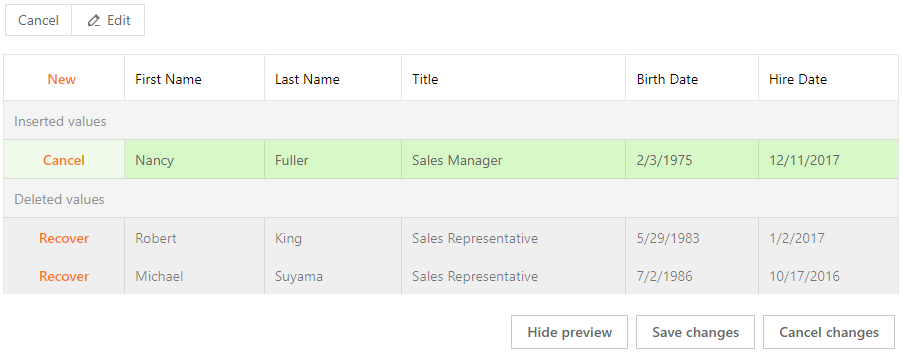
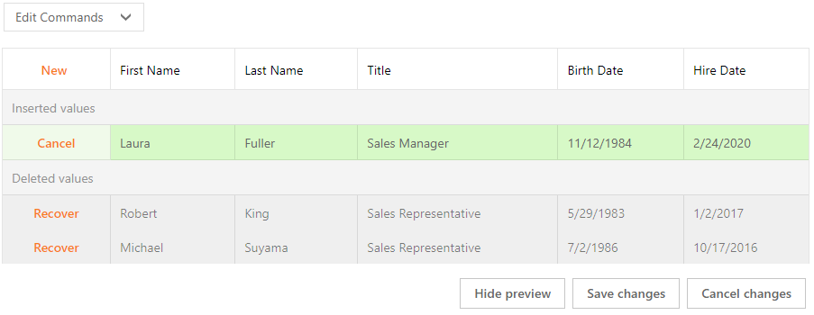
In Preview Changes mode, the grid displays the following default command items that allow you to edit data:
To display a custom toolbar item in this mode, set the item’s VisibleInBatchEditPreviewChanges property to true.
<dx:ASPxGridView runat="server" ID="Grid" ...>
    <Toolbars>
        <dx:GridViewToolbarItem
            Text="Edit Commands"
            Command="Custom"
            VisibleInBatchEditPreviewChanges="true" >
            <Items>
                <dx:GridViewToolbarItem Command="New" />
                <dx:GridViewToolbarItem Command="Edit" />
                <dx:GridViewToolbarItem Command="Delete" />
            </Items>
        </dx:GridViewToolbarItem>
    </Toolbars>
    ...
</dx:ASPxGridView>
Result:
Example - How to create custom items (by specifying their names, text and images)
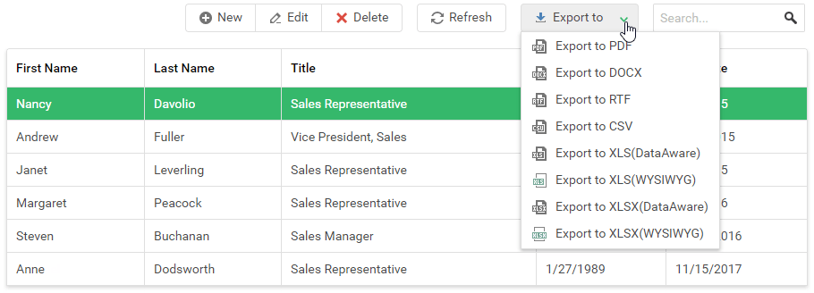
The code below creates a custom ‘Export to’ toolbar item with three sub-items to export the grid data to different formats (PDF, XLSX, and XLS).
<dx:ASPxGridView runat="server" ID="Grid" OnToolbarItemClick="Grid_ToolbarItemClick" ...>
        <Toolbars>
            <dx:GridViewToolbar ItemAlign="Right">
                <Items>
                    ...
                    <dx:GridViewToolbarItem Text="Export to" Image-IconID="actions_download_16x16office2013" BeginGroup="true">
                        <Items>
                            <dx:GridViewToolbarItem Name="CustomExportToPDF" Text="PDF" Image-IconID="export_exporttopdf_16x16office2013" />
                            <dx:GridViewToolbarItem Name="CustomExportToXLS" Text="XLS(DataAware)" Image-IconID="export_exporttoxls_16x16office2013" />
                            <dx:GridViewToolbarItem Name="CustomExportToXLSX" Text="XLSX(WYSIWYG)" Image-IconID="export_exporttoxlsx_16x16office2013" />
                        </Items>
                    </dx:GridViewToolbarItem>
                    ...
                </Items>
            </dx:GridViewToolbar>
        </Toolbars>
        ...
        <ClientSideEvents ToolbarItemClick="OnToolbarItemClick" />
    </dx:ASPxGridView>
Example - How to create a custom item (by defining its template)
The following code creates a custom toolbar item with the Template property to imitate the functionality of the grid search panel’s editor:
<dx:ASPxGridView runat="server" ID="Grid" ...>
        <Toolbars>
            <dx:GridViewToolbar ItemAlign="Right">
                <Items>
                    ...
                    <dx:GridViewToolbarItem BeginGroup="true">
                        <Template>
                            <dx:ASPxButtonEdit ID="tbToolbarSearch" runat="server" NullText="Search..." Height="100%">
                                <Buttons>
                                    <dx:SpinButtonExtended Image-IconID="find_find_16x16gray" />
                                </Buttons>
                            </dx:ASPxButtonEdit>
                        </Template>
                    </dx:GridViewToolbarItem>
                </Items>
            </dx:GridViewToolbar>
        </Toolbars>
        ...
        <SettingsSearchPanel CustomEditorID="tbToolbarSearch" />
        ...
    </dx:ASPxGridView>