Boolean Properties
- 2 minutes to read
In XAF, the following controls can display Boolean and Nullable Boolean properties:
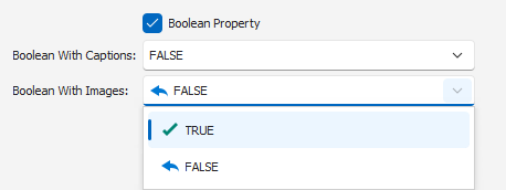
- A checkbox control (default).
- A drop-down control that displays Boolean values as custom text strings. You can use the IModelCommonMemberViewItem.CaptionForTrue and IModelCommonMemberViewItem.CaptionForFalse properties to specify these strings in the Application Model.
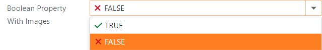
- A drop-down control can display Boolean values as custom text strings accompanied by images. You can define these strings in the same manner as for a drop-down control. Use the IModelCommonMemberViewItem.ImageForTrue and IModelCommonMemberViewItem.ImageForFalse properties to assign images for the
trueandfalsevalues.
Refer to the following topics for more ORM-specific information on Boolean properties:
ASP.NET Core Blazor
In ASP.NET Core Blazor, BlazorPropertyEditorBase.ComponentModel returns an IComponentModel descendant that wraps properties and events of a corresponding ASP.NET Core Blazor Editor.


The following table shows available Component Models for BooleanPropertyEditor:
IComponentContentHolder descendant | Component | Description |
|---|---|---|
| The default control. | |
| This component is used when one of the following property pairs is specified: |
WinForms
Each Windows Forms Property Editor is available in two forms:
- A standalone control (displays property value in a Detail View)
- A repository item (displays property value in a List Editor that supports in-place editing)
The following table shows available controls and repository items for BooleanPropertyEditor:
Control | Repository item | Description |
|---|---|---|
BooleanEdit (a CheckEdit descendant). | RepositoryItemBooleanEdit (a RepositoryItemCheckEdit descendant). | A CheckEdit control (default). |
BoolComboBoxEdit (an ImageComboBoxEdit descendant). | RepositoryItemBoolComboBoxEdit (a RepositoryItemImageComboBox descendant). | A drop-down control with custom text. An optional image is displayed next to the text when one of the following property pairs is specified: |