Numeric Properties
- 7 minutes to read
XAF supports Property Editors for numeric data types (byte, int, decimal, long, corresponding nullable types and so on) on all platforms. However, WinForms and ASP.NET Core Blazor UI applications use different formatting rules depending on the underlying property type.
Refer to the following topics for information on how to add Numeric properties to business classes in the supported ORM systems:
ASP.NET Core Blazor
In ASP.NET Core Blazor, BlazorPropertyEditorBase.ComponentModel returns an IComponentModel descendant that wraps properties and events of a corresponding ASP.NET Core Blazor Editor.
NumericPropertyEditor
Component Model: DevExpress.ExpressApp.Blazor.Components.Models.DxSpinEditModel<T>.
Component: the DxSpinEdit<T> editor shipped with the DevExpress ASP.NET Core Blazor Library.
Description:
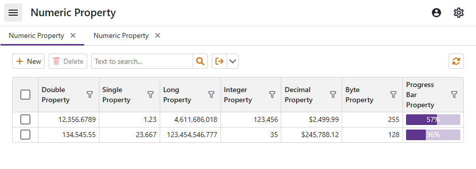
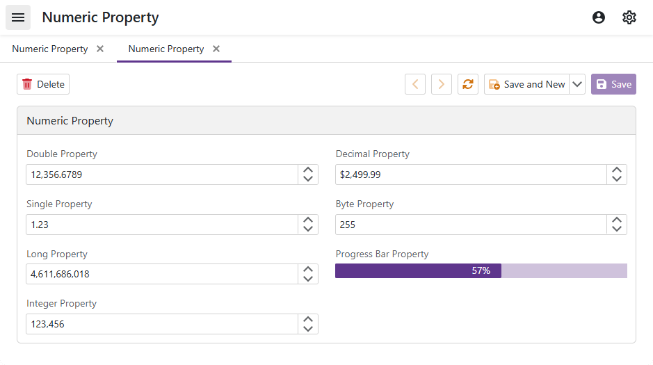
This is the default Property Editor for the following numeric property types: Int16, UInt16, Int32, UInt32, Int64, UInt64, float, double, Decimal, byte.
To access and customize UI controls in XAF applications, create a ViewController that accesses a NumericPropertyEditor object to modify the underlying DxSpinEdit<T> control. For more information, refer to the following topic: Access the Settings of a Property Editor in a Detail View.
Disable Mouse Wheel Functionality
Users can scroll the mouse wheel to change the NumericPropertyEditor‘s value. To disable this behavior, set the DxSpinEdit.AllowMouseWheel property to false.
using DevExpress.ExpressApp;
using DevExpress.ExpressApp.Blazor.Components.Models;
using DevExpress.ExpressApp.Blazor.Editors;
using DevExpress.ExpressApp.Blazor.Utils;

public class CustomizeNumericPropertyEditorController : ViewController {

    protected override void OnActivated() {
        base.OnActivated();
        View.CustomizeViewItemControl<NumericPropertyEditor>(this, editor => {
            editor.ComponentModel.AllowMouseWheel = false;
        });
    }
}
Hide Spin Buttons
A NumericPropertyEditor displays spin buttons that allow users to change the editor’s value. To hide these buttons, set the DxSpinEdit.ShowSpinButtons property to false.
using DevExpress.ExpressApp;
using DevExpress.ExpressApp.Blazor.Components.Models;
using DevExpress.ExpressApp.Blazor.Editors;
using DevExpress.ExpressApp.Blazor.Utils;

public class CustomizeNumericPropertyEditorController : ViewController {

    protected override void OnActivated() {
        base.OnActivated();
        View.CustomizeViewItemControl<NumericPropertyEditor>(this, editor => {
            editor.ComponentModel.ShowSpinButtons = false;
        });
    }
}
Apply Numeric Mask
To apply a mask to a NumericPropertyEditor, use the EditMask property and the Numeric mask type syntax.
To further customize the mask, access the NumericPropertyEditor.MaskProperties property.
For an example, refer to the following topic: Access EditMask In Code.
ProgressBarPropertyEditor
Component Model: DevExpress.ExpressApp.Blazor.Components.Models.DxProgressBar.
Component: the DxProgressBar editor shipped with the DevExpress ASP.NET Core Blazor Library.
Description:
ProgressBarPropertyEditor is a read-only Property Editor that displays the progress of an operation. XAF measures and displays the value of the bound property in percentages. It supports integer and floating-point data types: Int16, UInt16, Int32, UInt32, Int64, UInt64, float, double, Decimal.
To customize the Property Editor’s display format string, specify DisplayFormat and apply percent format specifier. For example, if DisplayFormat is {0:P2}, the value appears as percentage with two digits after the decimal point: 100.00%.
The Property Editor’s value ranges from 0 to 100 for integer data types, and 0 to 1 for floating-point data types by default. You can change the default MinValue and MaxValue in code.
Use the EditMask to specify a mask expression for the ProgressBarPropertyEditor‘s control.
To access and customize a ProgressBarPropertyEditor in XAF applications, create a ViewController that accesses a ProgressBarPropertyEditor object and modifies the underlying DxProgressBar control. For more information about Property Editor customization in Detail Views, refer to the following topic: Access the Settings of a Property Editor in a Detail View.
The following code snippet specifies a new MinValue and MaxValue for a ProgressBarPropertyEditor in a List View:
using DevExpress.ExpressApp.Blazor.Editors;
using DevExpress.ExpressApp;

namespace MySolution.Blazor.Server.Controllers;

public partial class NumericPropertyEditorController : ViewController<ListView> {
    protected override void OnActivated() {
        base.OnActivated();
        if (View.Editor is DxGridListEditor gridListEditor) {
            gridListEditor.CustomizeViewItemControl<ProgressBarPropertyEditor>(this, e => {
                e.ComponentModel.MinValue = 200;
                e.ComponentModel.MaxValue = 400;
            });
        }
    }
}
WinForms
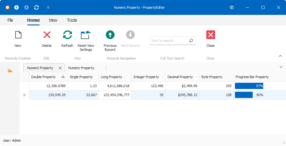
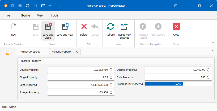
Each Windows Forms Property Editor is available in two forms:
- A standalone control (displays property value in a Detail View)
- A repository item (displays property value in a List Editor that supports in-place editing)
BytePropertyEditor
Control: IntegerEdit – a descendant of the SpinEdit editor shipped with the XtraEditors Library.
Repository Item: RepositoryItemIntegerEdit – a descendant of the XtraEditors Library’s RepositoryItemSpinEdit item.
Description:
This is the default Property Editor for byte properties.
The editor is a descendant of the IntegerPropertyEditor class. If the repository item’s MaxValue property is set to 0 or to a value that exceeds Byte.MaxValue, the property value is reset to Byte.MaxValue. If the repository item’s MinValue property is set to 0 or to a value that is less than Byte.MinValue, the property value is reset to Byte.MinValue.
DecimalPropertyEditor
Control: DecimalEdit – a descendant of the SingleEdit editor used by the FloatPropertyEditor.
Repository Item: RepositoryItemDecimalEdit – a RepositoryItemSingleEdit item descendant used by the FloatPropertyEditor.
Description:
This is the default Property Editor for decimal properties.
The RepositoryItemSingleEdit class helps to store and display values using the C Numeric edit mask when the Property Editor’s EditMask is not specified.
DoublePropertyEditor
Control: DoubleEdit – a SingleEdit editor descendant used by the FloatPropertyEditor.
Repository Item: RepositoryItemDoubleEdit – a RepositoryItemSingleEdit item descendant used by the FloatPropertyEditor.
Description:
This is the default Property Editor for double properties.
FloatPropertyEditor
Control: SingleEdit – an IntegerEdit editor descendant used by the IntegerPropertyEditor.
Repository Item: RepositoryItemSingleEdit – a RepositoryItemIntegerEdit item descendant used by the IntegerPropertyEditor.
Description:
This is the default Property Editor for float properties.
The RepositoryItemIntegerEdit class allows you to display float values.
IntegerPropertyEditor
Control: IntegerEdit – a descendant of the SpinEdit editor shipped with the XtraEditors Library.
Repository Item: RepositoryItemIntegerEdit – a descendant of the XtraEditors Library’s RepositoryItemSpinEdit item.
Description:
This is the default Property Editor for Int32 properties.
An IntegerPropertyEditor object has the EditMask property. This property’s default value is the Views | <DetailView> | Items | <PropertyEditor> node’s IModelCommonMemberViewItem.EditMask property value. When you assign a value to this property or to the EditMask attribute directly in code, use the syntax of the Numeric mask type. In this instance, the specified mask is applied to the property value displayed by the Property Editor. Refer to the following topic for more information: Mask Editors Overview | Mask Types.
LongPropertyEditor
Control: IntegerEdit – a descendant of the SpinEdit editor shipped with the XtraEditors Library.
Repository Item: RepositoryItemIntegerEdit – a descendant of the XtraEditors Library’s RepositoryItemSpinEdit item.
Description:
This is the default Property Editor for Int64 properties.
The editor is an IntegerPropertyEditor class descendant. If the repository item’s MaxValue property is set to 0 or to a value that exceeds Long.MaxValue, the property value is reset to Long.MaxValue. If the repository item’s MinValue property is set to 0 or to a value that is less than Long.MinValue, the property value is reset to Long.MinValue.
ProgressBarPropertyEditor
Control: ProgressBar – a descendant of the ProgressBarControl editor shipped with the XtraEditors Library.
Repository Item: RepositoryItemProgressBar – a descendant of the XtraEditors Library’s RepositoryItemProgressBar item.
Description:
ProgressBarPropertyEditor is a read-only Property Editor that displays the progress of an operation. XAF measures and displays the value of the bound property in percentages. It supports integer and floating-point data types: Int16, UInt16, Int32, UInt32, Int64, UInt64, float, double, Decimal.
To customize the Property Editor’s display format string, specify DisplayFormat and apply percent format specifier. For example, if DisplayFormat is {0:P2}, the value appears as percentage with two digits after the decimal point: 100.00%.
The Property Editor’s value ranges from 0 to 100 for integer data types, and 0 to 1 for floating-point data types by default. You can change the default Minimum and Maximum in code.
Use the EditMask to specify a mask expression for the ProgressBarPropertyEditor‘s control.
Note
The minimum value cannot exceed the maximum value. When you customize these values in code, make sure that the maximum value is assigned first. For more information, refer to the following topic: RepositoryItemProgressBar
To access and customize a ProgressBarPropertyEditor in XAF applications, create a ViewController that accesses a ProgressBarPropertyEditor object and modifies the underlying ProgressBar control. For more information about Property Editor customization in Detail Views, refer to the following topic: Access the Settings of a Property Editor in a Detail View.
using DevExpress.ExpressApp.Blazor.Editors;
using DevExpress.ExpressApp;

namespace MySolution.Blazor.Server.Controllers;

public class NumericPropertyEditorController : ViewController<DetailView> {
    protected override void OnActivated() {
        base.OnActivated();
        View.CustomizeViewItemControl<ProgressBarPropertyEditor>(this, e => {
           e.Control.Properties.Minimum = 200;
           e.Control.Properties.Maximum = 400;
        });
    }
}