Extend an Existing Report Control
- 5 minutes to read
Do the following to implement a custom control based on an existing report control:
- Create a new class for a custom control and derive it from an existing report control.
- Implement properties, methods, events, and other members for the custom control class.
- Add attributes needed to set an icon, place the control in the Toolbox, and specify data binding settings.
Example: Create a Custom Numeric Label
The example below describes how to add a new Number property to the XRLabel control to limit the values that control can accept to numbers only.
Get Started
- Create a new Visual Studio project named WinFormsApp_CustomNumericLabel.
- Add a blank report to the project.
- Add an icon for the custom control. You can use the Devexpress SVG Icon Builder to create a vector icon. Save the icon to a
Numericlabel.svgfile, add it to the project, and set the Build Action to Embedded Resource.
Create a NumericLabel Class That Inherits XRLabel
Add a new NumericLabel.cs file to the project with the following content:
using DevExpress.Utils.Serializing;
using DevExpress.XtraReports;
using DevExpress.XtraReports.UI;
using System.ComponentModel;
using DevExpress.XtraReports.Expressions;
using DevExpress.Utils.Design;

namespace WinFormsApp_CustomNumericLabel {
    [ToolboxItem(true)]
    [DefaultBindableProperty("Number")]
    [ToolboxSvgImage("WinFormsApp_CustomNumericLabel.NumericLabel.svg, WinFormsApp_CustomNumericLabel")]
    public class NumericLabel : XRLabel {
        [DefaultValue(0)]
        [XtraSerializableProperty]
        public int Number { get; set; }

        // Set the "Browsable" and "EditorBrowsable" attributes to "false" and "Never"
        // to hide the "Text" property from the "Properties" window and editor (IntelliSense).
        [Browsable(false), EditorBrowsable(EditorBrowsableState.Never)]
        public override string Text {
            get { return Number.ToString(); }
            set {
                int i;
                Number = (int.TryParse(value, out i)) ? i : 0;
            }
        }

        // Implement a static constructor as shown below to add
        // the "Number" property to the property grid's "Expressions" tab.
        static NumericLabel() {
            // Specify an array of events in which the property should be available.
            string[] eventNames = new string[] { "BeforePrint" };

            // Specify the property position in the property grid's "Expressions" tab.
            // 0 - first, 1000 - last.
            int position = 0;

            // Specify an array of the property's inner properties.
            string[] nestedBindableProperties = null;

            // Specify the property's category in the property grid's "Expressions" tab.
            // The empty string corresponds to the root category.
            string scopeName = "";

            // Create and set a description for the "Number" property.
            ExpressionBindingDescription description = new ExpressionBindingDescription(
                eventNames, position, nestedBindableProperties, scopeName
            );

            ExpressionBindingDescriptor.SetPropertyDescription(
                typeof(NumericLabel), nameof(Number), description
            );
        }
    }
}
Observe the Result
Rebuild the solution. The Number property appears in the Properties window:

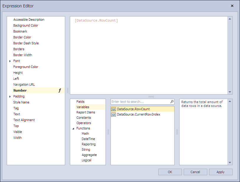
You can invoke the Expression Editor to specify an expression:
Custom Control Implementation Basics
General
- A new
NumericLabelclass inherits the existing XRLabel control class. - The
NumericLabelclass implements a newNumberproperty and overrides the Text property. - The
ToolboxItemattribute for theNumericLabelclass is set totrueto display the custom control in the Toolbox.
Data Binding
The DefaultBindableProperty attribute for the Number property is set to true. When you drop a field from the Field List onto the control, the Number property is bound to that field.
Expression Bindings
A static constructor for the NumericLabel class enables the Number property in the Properties window’s Expressions tab and Expression Editor.
Make Properties Serializable
Use the XtraSerializableProperty attribute to serialize custom properties.
The XtraSerializableProperty attribute is responsible for serializing the property in XML. The attribute should be specified to serialize a property that returns a simple type. Complex types require a constructor with the XtraSerializationVisibility argument type (the most commonly used values are Hidden, Collection, Reference, Content).
The DesignerSerializationVisibility attribute is responsible for serializing the CodeDOM in Visual Studio Designer. It has three options - Hidden, Visible, and Content. You should apply Visible to collections or references.
The DefaultValue attribute determines whether the property value is serialized.
Refer to the following help topic for more information: XML Serialization.
Serialize Collection Properties
To ensure proper serialization of collection properties, apply the XtraSerializableProperty attribute with the XtraSerializationVisibility.Collection parameter, as in the following code snippet:
[XtraSerializableProperty(XtraSerializationVisibility.Collection)]
public List<CustomParameter> CustomParameters { get; set; }
You should implement the IXtraSupportDeserializeCollectionItem interface to define how new elements of the collection are created. All required properties of the CustomParameter class must also be marked with the XtraSerializableProperty attribute.
For more information, review the following article: K18435 - How to serialize a custom property of the DevExpress control’s descendant.