Arrange Dynamic Report Contents
- 8 minutes to read
Sometimes it is not possible to determine the final layout of a report at design time because the actual data may require more space for its placement, more columns, and a wider page. This document describes techniques to maintain the correct layout of the report elements in a published document.
Insert Page Breaks
Use the XRPageBreak control to insert a page break in a report.

You can use the Band.PageBreak property to add a page break before or after a band.

The following bands support this feature:
- Detail band
- Detail report band
- Report header and footer
- Group headers and footers
Position Band on a Page
Use the GroupFooterBand.PrintAtBottom and ReportFooterBand.PrintAtBottom properties to specify the position of group and report footers – at the bottom of the page or after the previous band.
| ReportFooterBand.PrintAtBottom = false | ReportFooterBand.PrintAtBottom = true |
|---|---|
 |
 |
Use the PageBand.PrintOn property to avoid printing page headers and footers on the same page as the Report Header and Report Footer bands.

PageHeaderBand.PrintOn = AllPages

PageHeaderBand.PrintOn = NotWithReportHeader
Use the GroupBand.RepeatEveryPage property to repeat group headers and footers on every page.

GroupHeaderBand.RepeatEveryPage = false

GroupHeaderBand.RepeatEveryPage = true
Keep Content Together
Report Controls
The KeepTogether property ensures that the entire content of an element stays together on the same page. The report engine will attempt to keep the element on a single page, even if it means moving other report elements or adjusting the page layout.

KeepTogether = false

KeepTogether = true
Once this property is enabled for one control, it makes the controls in the same band behave as if they have this option enabled.
Report Bands
Use the Band.KeepTogether property to enable the KeepTogether setting for all controls within the band.
Note
This feature is not available for the XRChart, XRSparkline, and XRSubreport controls.
In a master-detail report, you can print the detail band on the same page as the detail report band using the DetailBand.KeepTogetherWithDetailReports property.
Groups
Use the GroupHeaderBand.GroupUnion and GroupFooterBand.GroupUnion properties to specify whether group rows can be printed on different pages, or whether the entire group will be printed on the same page.
Split Content Between Pages
The XtraReport.VerticalContentSplitting property allows you to control how report controls are handled when they exceed the right page margin.
The VerticalContentSplitting property has two options:
- VerticalContentSplitting.Exact
If the control extends beyond the right margin, it will be split and displayed partly on the current page and partly on the next page.

- VerticalContentSplitting.Smart
If the control extends beyond the right margin, it will be moved completely to the next page, resulting in a more professional appearance.

Fit the Control Size to Content
Adjust Height
You can specify the CanGrow and CanShrink properties for the XRLabel, XRTableCell, XRCharacterComb, and XRRichText controls to adjust a control’s height to its content size.
The following images illustrate how the CanGrow property affects the height of a label whose content size is larger than its width:
| Designer | Preview (CanGrow = false) | Preview (CanGrow = true) |
|---|---|---|
 |
 |
 |
The images below show how the CanShrink property affects the height of a label whose content size does not occupy the entire control height.
| Designer | Preview (CanShrink = false) | Preview (CanShrink = true) |
|---|---|---|
 |
 |
 |
The CanGrow and CanShrink properties have no effect on a control in the following situations:
- The AnchorVertical property is set to
BothorBottom. - The control is a label that displays summary function results.
The WordWrap property allows you to specify whether long strings of text should be split into multiple lines when they exceed the available width of the control.
The following example shows a label whose content size is larger than its width. The label’s CanGrow property is enabled. The images demonstrate how the WordWrap property affects the label size.
| Designer | Preview (WordWrap = false) | Preview (WordWrap = true) |
|---|---|---|
 |
 |
 |
Adjust Width
If you want to increase or decrease a control’s width based on its content size, enable the control’s AutoWidth property. The behavior of this property depends on the following properties:
- TextAlignment
- If a control’s text alignment is set to Left, the control grows to the right or shrinks from the right, and when the alignment is Right, it grows or shrinks on the left side. If the control’s text alignment is set to Center, the control grows or shrinks in both directions.
- WordWrap
- If the property is enabled, the control can only decrease its width. Otherwise, the control can both increase and decrease its width.
The following example shows a label with text that is larger than the control’s width. The label’s AutoWidth property is enabled. The images show how the label’s width changes depending on the control’s text alignment.
Designer

Preview, TextAlignment = TopLeft. The label grows to the right.

Preview, TextAlignment = TopRight. The label grows to the left.

Preview, TextAlignment = TopCenter. The label grows in both directions.

The following examples show a label with text that is smaller than the control’s width. The label’s AutoWidth property is enabled. The images show how the label’s width changes depending on the control’s text alignment.
Designer, TextAlignment = TopLeft.

Preview. The label’s right border shrinks.

Designer, TextAlignment = TopRight.

Preview. The label’s left border shrinks.

Designer. TextAlignment = TopCenter.

Preview. Both label borders shrink.

Adjust Font Size to Fit Control
Use the TextFitMode property to specify whether the font size should be automatically changed to fit the XRLabel and XRTableCell controls.
The following images show how the TextFitMode property affects the font size when text is larger than the label:
| Designer | Preview (TextFitMode = GrowAndShrink) |
|---|---|
 |
 |
The following images show how the TextFitMode property affects the font size when text is smaller than the label:
| Designer | Preview (TextFitMode = GrowAndShrink) |
|---|---|
 |
 |
The TextFitMode property has no effect under any of the following conditions:
- The CanGrow, CanShrink, or AutoWidth property is enabled.
- The Angle property is not 0 (zero).
- The AnchorHorizontal or AnchorVertical property is set to Both.
Anchor Controls
You can specify how report controls should behave and adapt their positions when the size of the report changes.
You can anchor a control to the top, bottom, or both edges of its parent container using the XRControl.AnchorHorizontal and XRControl.AnchorVertical properties.
| AnchorHorizontal = None | AnchorHorizontal = Right | AnchorHorizontal = Both |
|---|---|---|
 |
 |
 |
Hide Controls
Merge or Hide Duplicate and Empty Values
When identical or null values appear in the report’s data source, you can process these values and merge or hide controls in a report using the following properties:
ProcessDuplicatesModeSpecifies how to process report controls with identical values (leave them as is, merge, suppress, or suppress and shrink).
ProcessNullValuesSpecifies how to process report controls that receive null values from a data source (leave them as is, suppress, or suppress and shrink).
ProcessDuplicatesTargetSpecifies whether the data field values or the Tag property values should be considered duplicates.
These properties are available for the following controls:
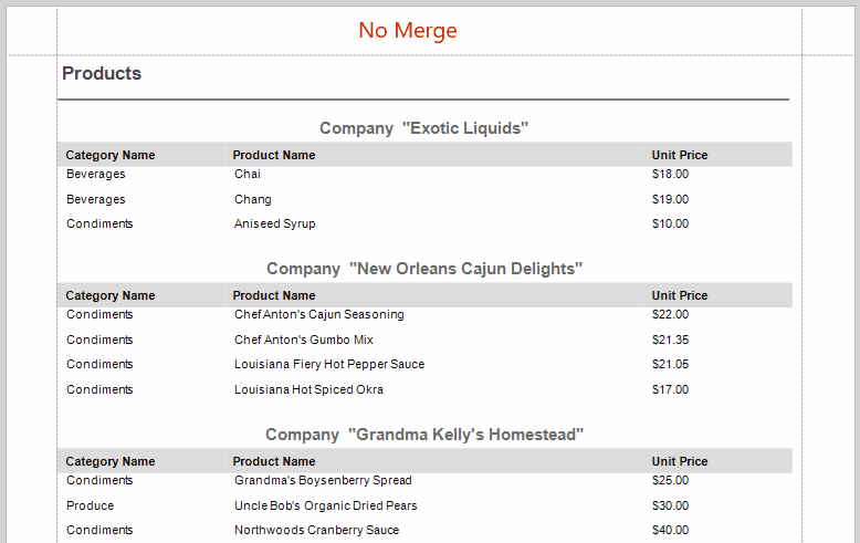
The following image shows vertically merged cells with duplicate values:
Conditionally Hide a Control
You can hide a control when a specified logical condition is met by specifying the XRControl.Visible property expression. For more information, review the following help topic: Conditionally Hide Controls.
When a control is hidden, a space remains in the band at the control’s location. You can avoid this by placing these controls onto an XRPanel and setting its XRPanel.CanShrink property to true.

This feature works correctly if you consider the following:
- Do not change the panel’s
Visibleproperty. Instead, specify theVisibleproperty for the controls in the panel. - Do not specify borders other than
Nonefor the panel container. The borders are displayed even when the panel’s content is hidden.
Hide Report Controls in Exported Documents and Printouts
Use CanPublishOptions to hide report controls in exported documents and printouts. The XRControl.CanPublishOptions property allows you to access the CanPublishOptions object. Specify settings to hide a report control on printouts or when exported to a document in a certain format.
To hide a report control on printouts and in all exported documents, set CanPublishOptions.AllFormats to false.
The following code snippet excludes page information (the XRPageInfo instance) when exporting a report to XLS, XLSX, and CSV formats:
using DevExpress.XtraReports.UI;
// ...
XtraReport report = new XtraReport();
  DetailBand detailBand = new DetailBand();
  report.Bands.Add(detailBand);
  XRPageInfo xrPageInfo1 = new XRPageInfo{
  // Add content.
  };
  detailBand.Controls.Add(xrPageInfo1);
  // Hide xrPageInfo1 from XLS, XLSX, and CSV formats.
  xrPageInfo1.CanPublishOptions.Xlsx = false;
  xrPageInfo1.CanPublishOptions.Xls = false;
  xrPageInfo1.CanPublishOptions.Csv = false;
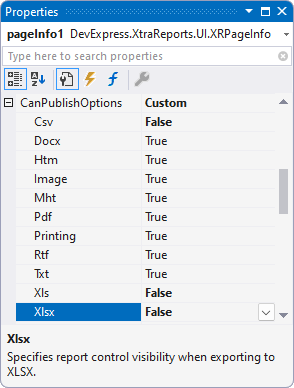
You can also specify CanPublishOptions in the Properties grid:
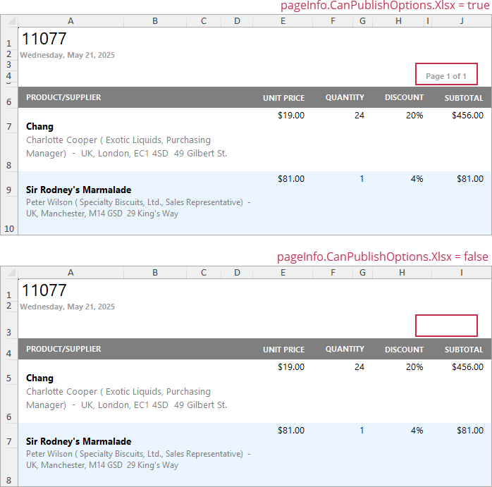
The following image illustrates the resulting XLXS document with and without page information:
Arrange Dynamic Report Contents in the End-User Report Designer
Tutorials that explain how to use this functionality in EUD Report Designers for WinForms and Web are included in the End-User Documentation online help section: