Columns Overview
- 3 minutes to read
Important
This documentation topic describes legacy technology. We no longer develop new functionality for the Grid
GridControl is a data-aware control designed to display tabular information from the bound data source. Data sources present this information using data fields and records.
In GridControl, data fields are represented as columns, and records are displayed as rows. So, to display data, a grid should contain columns bound to fields of the underlying data source. In addition to columns bound to data fields, a grid can include unbound columns to display data values calculated according to a formula based on values of other columns.
Grid columns are stored in the GridControl.Columns collection. An individual column is specified by a GridColumn class descendant that corresponds to the type of data displayed in this column. The following column types are supported.
| Column Object | Description |
|---|---|
| Text |
A grid column to display and edit text values. |
| Number |
A grid column to display and edit numeric values. |
| Date |
A grid column to display and edit date values. |
| Switch |
A grid column to display Boolean values and select between two states. |
| Image |
A column type that allows you to display images. |
| Picker |
A grid column allowing an end-user to edit a cell value by selecting an item from the predefined set. |
| Template |
A column type that allows you to define a custom template for column cells. |
Any column object provides a set of properties to adjust column settings (for example, to set the data display format - GridColumn.DisplayFormat, column width - GridColumn.Width, column visibility - GridColumn.IsVisible, column content alignment - GridColumn.ContentAlignment, etc.), as well as to manage and shape grid data (for example, to sort - GridColumn.SortOrder, GridColumn.SortIndex, GridColumn.SortMode, group - GridColumn.IsGrouped, GridColumn.GroupInterval, or filter data by column values - GridColumn.AutoFilterCondition, GridColumn.ColumnFilterMode, GridColumn.ImmediateUpdateAutoFilter, etc.).
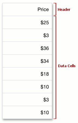
Each column consists of the following elements.
A column header that displays the column caption and identifies the column for end-users. By default, a friendly caption is generated for a column based on its GridColumn.FieldName property. Friendly captions are generated by adding SPACE characters between parts of the field name starting with uppercase letters. For example, if the field name is “CustomerName”, the display caption will be “Customer Name”. If you need to replace the automatically created column caption with you own text, assign the corresponding string to the GridColumn.Caption property. To obtain a column caption as it is displayed in a column header, use the GridColumn.ActualCaption property.
To hide column headers, set the GridControl.ColumnHeadersVisibility property to false.
- Data cells that display values from the corresponding field in the bound data source, or calculated values if a column is unbound.
#End-User Capabilities
By default, an end-user can manage grid columns in the following ways.
- Select columns to be displayed or hidden in the grid using the Column Chooser.
- Resize column widths with the pinch and spread gestures.
- Sort data by column values by tapping a column header or tapping Sort Ascending or Sort Descending in a menu that appears when an end-user touches and holds a column cell or header.
- Group data by column values by tapping the corresponding item in a menu that appears when an end-user touches and holds a column.
- Filter data on the fly by column values using the auto-filter panel.
- Calculate data summaries (group and total) for columns.