Create Columns and Bind Them to Data Fields
- 5 minutes to read
Important
This documentation topic describes legacy technology. We no longer develop new functionality for the Grid
To work with a GridControl, bind it to a data source. To do this, you need to create columns and bind them to data fields. There are two ways to add columns to a grid and associate them with data fields of the underlying data source.
Create columns for all fields of the bound data source automatically.
By default, a GridControl instance automatically generates columns based on the bound data source - one column for one field of a data source object, except complex fields. In terms of objects, a complex field can be a field of the nested object. A complex field name is constructed in the “String1.String2” form. For example, in Lesson 1 of the Getting Started tutorial, a grid displays orders. Columns for the Date, Shipped and Quantity properties of an Order object are generated automatically, however columns for fields of a related Product are not created (you can create columns bound to these complex fields in the grid manually by using the “Product.Name” and “Product.UnitPrice” field names, as shown in Lesson 2).

The order of columns generated automatically in the grid is the same as the order of fields in the data source. You can prevent columns from being automatically created or set another mode of auto generating columns, using the GridControl.AutoGenerateColumnsMode property.
Create columns and bind them to fields manually.
You can manually specify a collection of grid columns. To do this, create corresponding column objects, bind each column to the corresponding data field using the GridColumn.FieldName property and add columns to the GridControl.Columns collection in the order you want to show them in the grid. You can manage the grid’s collection of columns in XAML or C# code.
#Create and Bind Columns in XAML
This example shows how to add columns to GridControl to display and edit data of different types. The grid is bound to a collection of Employee objects. Each Employee object contains an employee’s photo (image), name, position, phone, address (strings), hire and birth dates (DateTime values), a value that specifies an employee’s access level, and a Boolean value indicating whether an employee is on vacation.

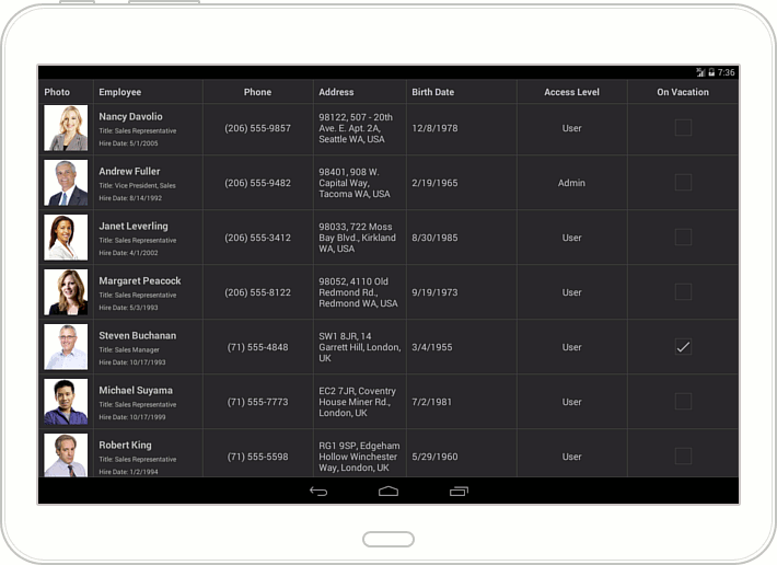
Grid columns are stored in the GridControl.Columns collection. An individual column is specified by a GridColumn descendant, which is appropriate to the type of data contained in this column. In this example, to display information on employees and allow end-users to edit it, the following columns are created in the grid.
Grid Column | Description |
|---|---|
Photo | This column displays employee photos which are images added to a project as embedded resources. |
Employee | A cell in this column displays three employee properties: Name, Position and Hire A cell template data context is specified by the Cell Use the Grid |
Phone | The employee’s Phone property is of the string type. The keyboard allowing text input is automatically displayed when an end-user activates this column cell to edit an employee’s phone. |
Address | This column is bound to the employee’s Address string property. The keyboard allowing text input is automatically displayed when an end-user activates this column cell to edit an employee’s address. |
Birth Date | This column displays and allows editing employee birth days. The Grid |
Access Level | The employee’s Access property is of the Access |
On Vacation | The employee’s On |
#Create and Bind Columns in C#
The following example shows how to create columns and bind them to data fields using C# code.
using DevExpress.Mobile.DataGrid;
// ...

GridControl grid = new GridControl ();
grid.Columns.Add (new TextColumn (){FieldName = "Product.Name", Caption = "Product" });
grid.Columns.Add (new NumberColumn (){FieldName = "Product.UnitPrice", Caption = "Price", DisplayFormat="C0" });
grid.Columns.Add (new NumberColumn (){FieldName = "Quantity"});
grid.Columns.Add (new DateColumn (){FieldName = "Date", DisplayFormat="d" });
grid.Columns.Add (new SwitchColumn (){FieldName = "Shipped"});