GridControl Class
The grid control.
Namespace: DevExpress.Mobile.DataGrid
Assembly: DevExpress.Mobile.Grid.v18.2.dll
#Declaration
public class GridControl :
    GridLayout,
    ICommandAwareControl<GridCommandId>,
    IFormatConditionCollectionOwner,
    IGestureRecognizerDelegate,
    ISelectedRowHandleProvider,
    IHitTestAccess,
    IDisposable,
    IThemeChangingHandler,
    IAndroidThemeChanger,
    IXtraSerializableLayoutEx,
    IHorizontalScrollingData,
    ICustomCellTextProvider,
IServiceProvider#Related API Members
The following members return GridControl objects:
#Remarks
Important
This documentation topic describes legacy technology. We no longer develop new functionality for the Grid and suggest that you use the new Data
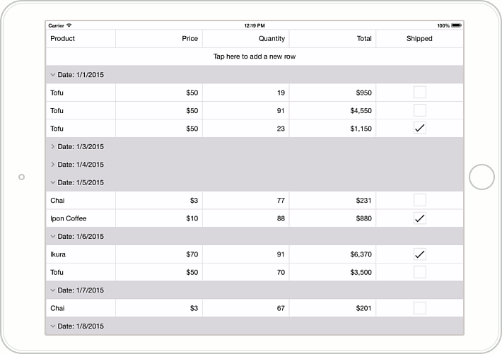
GridControl is a data bound control that provides a set of data shaping and manipulation features, including data sorting, grouping, filtering and summary calculation.

To get started with GridControl, see the Getting Started tutorial.
#Example
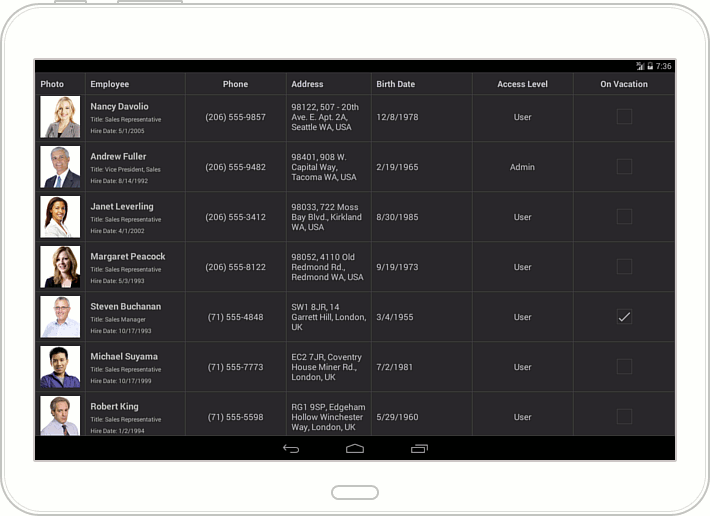
This example shows how to add columns to GridControl to display and edit data of different types. The grid is bound to a collection of Employee objects. Each Employee object contains an employee’s photo (image), name, position, phone, address (strings), hire and birth dates (DateTime values), a value that specifies an employee’s access level, and a Boolean value indicating whether an employee is on vacation.


Grid columns are stored in the GridControl.Columns collection. An individual column is specified by a GridColumn descendant, which is appropriate to the type of data contained in this column. In this example, to display information on employees and allow end-users to edit it, the following columns are created in the grid.
Grid Column | Description |
|---|---|
Photo | This column displays employee photos which are images added to a project as embedded resources. |
Employee | A cell in this column displays three employee properties: Name, Position and Hire A cell template data context is specified by the Cell Use the Grid |
Phone | The employee’s Phone property is of the string type. The keyboard allowing text input is automatically displayed when an end-user activates this column cell to edit an employee’s phone. |
Address | This column is bound to the employee’s Address string property. The keyboard allowing text input is automatically displayed when an end-user activates this column cell to edit an employee’s address. |
Birth Date | This column displays and allows editing employee birth days. The Grid |
Access Level | The employee’s Access property is of the Access |
On Vacation | The employee’s On |