TileViewOptionsKanban.GroupHeaderContextButtons Property
Provides access to the collection of buttons displayed in group headers.
Namespace: DevExpress.XtraGrid.Views.Tile
Assembly: DevExpress.XtraGrid.v20.1.dll
NuGet Package: DevExpress.Win.Grid
Declaration
[DXCategory("Context Buttons")]
public ContextItemCollection GroupHeaderContextButtons { get; }Property Value
| Type | Description |
|---|---|
| ContextItemCollection | The collection of buttons displayed in group headers |
Property Paths
You can access this nested property as listed below:
| Object Type | Path to GroupHeaderContextButtons |
|---|---|
| TileView |
|
Remarks
Kanban groups can display buttons in their header regions. You can create buttons that are always visible or visible on header hovering.
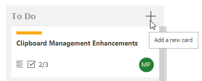
Use the TileView.OptionsKanban.GroupHeaderContextButtons collection to create and customize buttons. At design time, use a dedicated editor.
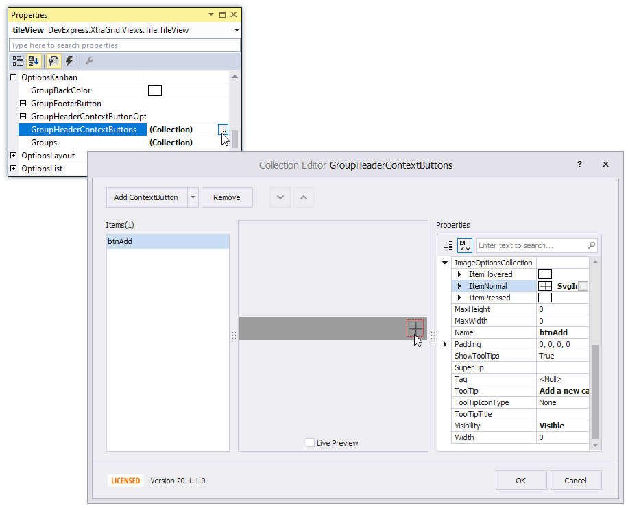
Each button provides settings to specify the text, image, visibility, tooltip, etc.
The TileView.OptionsKanban.GroupHeaderContextButtonOptions object allows you to customize settings specific to all header buttons.
The following events allow you to control the visibility and other display settings of individual header buttons:
- TileView.GroupHeaderContextButtonClick - Allows you to perform actions when a button in a group header is clicked. This event is in effect when you add group header buttons in Kanban layout mode.
- TileView.GroupHeaderContextButtonCustomize - Allows you to customize individual group header buttons in Kanban layout mode.
- TileView.GroupHeaderContextButtonToolTip - Allows you to provide custom tooltips for Rating and Track Bar context buttons in group headers. This event is in effect when you add group header buttons in Kanban layout mode.
Example
See the Tile View Kanban Board module in the XtraGrid MainDemo for an example.