Quick Actions
- 3 minutes to read
This topic describes actions available in Quick Actions.
Access Quick Actions
Select a control and click the “light bulb”  to expand the Quick Actions menu.
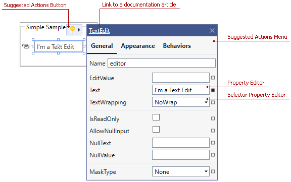
You can also use the Document Outline Window to select an element.
The Quick Actions menu’s title displays the selected control’s class name. You can click this name to open a documentation article that describes the control.
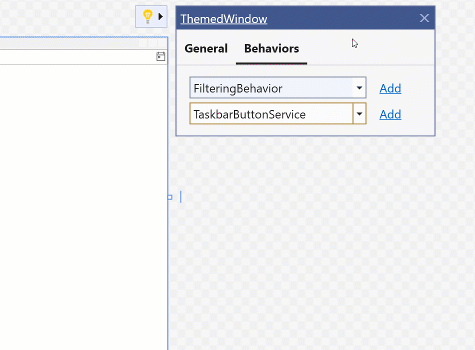
Attach MVVM Behaviors and Services
To add a behavior or service to the selected control, switch to the Behaviors tab, select the desired element, and click the Add button.
Tip
The list of available behaviors and services can differ depending on which element is selected.
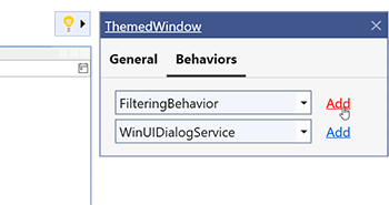
When you add a behavior or service, you can specify its properties.
The following animation adds the TaskbarButtonService to the ThemedWindow and specifies service properties:
Specify Properties for Nested Items
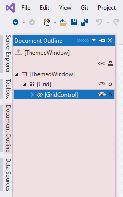
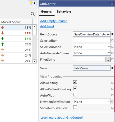
A control’s general tab may contain properties of a nested item. On the following image, GridControl’s Quick Actions menu contains properties of the Grid’s view (TableView):
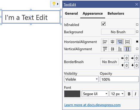
Customize the Appearance of Controls and Visual Elements
To customize the appearance of the selected element, switch to the Appearance tab. In this tab, you can change the selected control’s appearance (for example, Background and Alignment).
Bind Property to a Source
Each property can be either set manually or bound to a source. To bind a property to a source, click the square button that opens the Property Menu and select the Create Data Binding item.
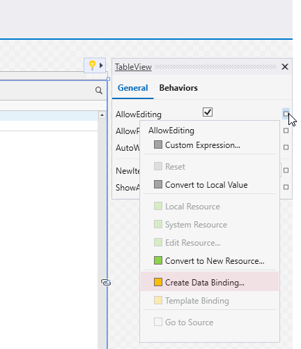
If a property is already bound to a source, the square button is marked in yellow.
Choose a Binding Type
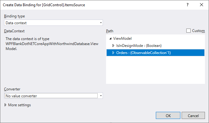
Use the Binding Editor Dialog to specify a binding type: DataContext, ElementName, RelativeSource, StaticResource. These modes set different sources for target properties.
In the DataContext source mode, the Binding Editor Dialog displays properties defined in the data context object.
Tip
Set the DataContext or d:DataContext property in XAML to display the list of available data context properties in the Binding Editor Dialog.
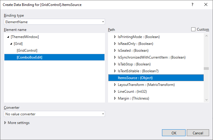
Use the ElementName type to bind to a property of any XAML element within the same namescope.
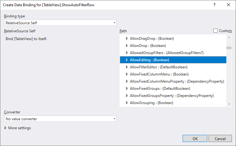
Use the RelativeSource types to set the source of the Binding and override the inherited data context.
- If your source object is placed inside a static resource, use the StaticResource mode.
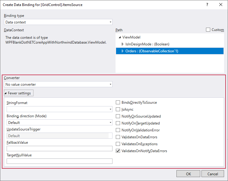
Specify Binding Settings
In the Binding Editor Dialog, you can specify the binding expression’s settings like BindingMode, UpdateSourceTrigger, and Converter.
Select the Application Theme
The Application Theme applies a theme to the entire application or a UserControl.
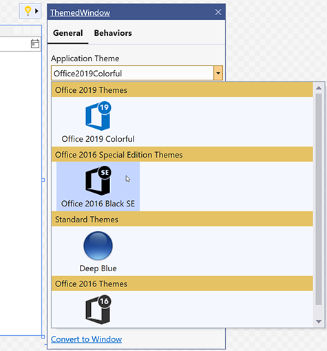
The Quick Actions menu lists only themes that are referenced in the project. You can reference the DevExpress.Wpf.Themes.All package to get access to all themes.
When you apply a theme, Quick Actions generate and add the following code to your application:
<?xml version="1.0" encoding="utf-8"?>
<configuration>
    <configSections>
        <section name="DXThemeManager" allowExeDefinition="MachineToLocalUser" requirePermission="false"
                 type="System.Configuration.ClientSettingsSection, System, Version=4.0.0.0, Culture=neutral, PublicKeyToken=b77a5c561934e089" />
    </configSections>
    <DXThemeManager>
        <setting name="ApplicationThemeName" serializeAs="String">
            <value>Office2019White</value>
        </setting>
    </DXThemeManager>
</configuration>
Refer to the WPF Application Themes topic for more information about DevExpress themes.
Use the Image Picker to Get Image Paths
The DevExpress Image Picker dialog integrated into Visual Studio allows you to configure images for WPF controls. The dialog shows images found in the application’s solution or from the DevExpress.Images NuGet package. The package contains common images that are referenced by multiple DevExpress controls. Refer to the DevExpress Image Picker topic for more information.
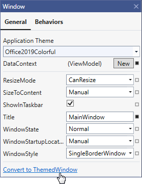
Convert to ThemedWindow
The Quick Actions menu for the Window elements allows you to convert the Window to ThemedWindow.