.NET MAUI Shimmer View Layout
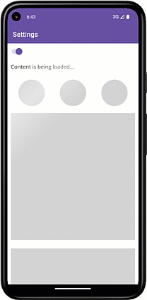
The ShimmerView control allows you to show a custom layout during a loading operation (IsLoading is True). For this purpose, use the LoadingView property. The ShimmerView component draws shapes you add to the LoadingView. For example, you can specify Ellipse or Rectangle objects to display circles and rectangles:
<ContentPage ...
    xmlns:dxco="clr-namespace:DevExpress.Maui.Controls;assembly=DevExpress.Maui.Controls">
    <dxco:ShimmerView ... >
        <!--...-->
        <dxco:ShimmerView.LoadingView>
            <Grid RowDefinitions="40,100,400,180" ColumnDefinitions="*,*,*" Padding="10">
                <Label Text="Content is being loaded..." Grid.Row="0" Grid.ColumnSpan="3" FontSize="16"/>
                <Ellipse Grid.Row="1" Grid.Column="0" Fill="LightGray" HeightRequest="80" WidthRequest="80"/>
                <Ellipse Grid.Row="1" Grid.Column="1" Fill="LightGray" HeightRequest="80" WidthRequest="80"/>
                <Ellipse Grid.Row="1" Grid.Column="2" Fill="LightGray" HeightRequest="80" WidthRequest="80"/>
                <Rectangle Grid.Row="2" Grid.ColumnSpan="3" Fill="LightGray" HeightRequest="380"/>
                <Rectangle Grid.Row="3" Grid.ColumnSpan="3" Fill="LightGray" HeightRequest="150"/>
            </Grid>
        </dxco:ShimmerView.LoadingView>
    </dxco:ShimmerView>
</ContentPage>
Note: Content placed in the Loading View does not support Behaviors.