.NET MAUI Form Items Custom Appearance
- 5 minutes to read
Use properties listed in this topic to configure the appearance of FormItem elements.
Text
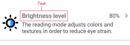
Properties in this section customize a form item’s primary text (header):
- Text
- Specifies the content of a form item’s primary text.
- TextColor
- Specifies the form item text’s color.
- TextFontAttributes
- Defines font attributes for the form item’s text. You can use the following options:
Bold,Italic, orNone. - TextFontFamily
- Specifies the text’s font name. You can only use fonts previously registered in the app. For more information, refer to: Register Fonts.
- TextFontSize
- Defines the text’s font size.
- TextLineBreakMode
- Specifies the line break mode for a font item’s text.
- TextMargin
- Allows you to set the gaps between the text and other form item elements.
- TextMaxLineCount
- Defines the maximum number of text lines.
The markup below adds a text header to a form item and specifies text settings:
<dxe:FormItem Text="Brightness level"
              TextColor="Gray"
              TextFontAttributes="Bold"
              TextFontFamily="OpenSansRegular"
              TextFontSize="18"
              TextLineBreakMode="CharacterWrap"
              TextMargin="4"
              TextMaxLineCount="2"/>
Detail
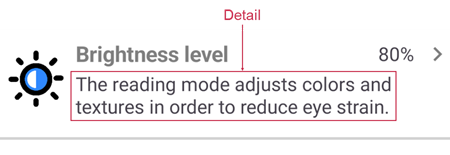
The Detail is the form item’s secondary text (description). Use the following properties to specify a form item’s detail text and configure its appearance:
- Detail
- Specifies the content of a form item’s secondary text.
- DetailColor
- Specifies the form item detail’s color.
- DetailFontAttributes
- Defines font attributes for the form item’s detail. You can use the following options:
Bold,Italic, orNone. - DetailFontFamily
- Specifies the detail’s font name. You can only use fonts previously registered in the app. For more information, refer to: Register Fonts.
- DetailFontSize
- Defines the detail’s font size.
- DetailLineBreakMode
- Specifies the line breaking mode for a font item’s detail.
- DetailMargin
- Allows you to set the gaps between the detail and other form item elements.
- DetailMaxLineCount
- Defines the maximum number of detail lines.
The markup below adds secondary text for a form item and configures text options :
<dxe:FormItem Detail="The reading mode adjusts colors and
              textures in order to reduce eye strain."
              DetailColor="LightGray"
              DetailFontAttributes="Italic"
              DetailFontFamily="OpenSansRegular"
              DetailFontSize="14"
              DetailLineBreakMode="TailTruncation"
              DetailMargin="4"
              DetailMaxLineCount="2"/>
Image
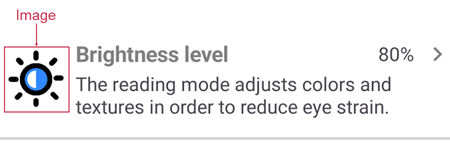
You can use the following properties to specify and configure a form item’s image (icon):
- ImageSource
Specifies the image source. In XAML, use the name of an image in the Resources/Images folder to define the source. Ensure that the image’s Build Action is MauiImage.
For more information about images, refer to the following page: Add images to a .NET MAUI app project.
- ImageColor
- Defines the tint color of the form item’s image.
- ImageHeight
- Specifies the height of the form item’s image.
- ImageWidth
- Specifies the width of the form item’s image.
- ImageMargin
- Allows you to set the gaps between the image and other form item elements.
- ImageVerticalOptions
- Specifies how the image is positioned vertically. You can use the following options:
Fill,Center,Start, andEnd. - ImageTemplate
- Defines a template that configures image appearance.
Example: Configure the Image Icon for a Form Item
The following example configures image settings:

<dxe:FormItem Text="Brightness level"
              TextMargin="4,4,4,16"
              InlineContent="80%"
              ShowArrow="True"
              ImageSource="brightness"
              ImageColor="#F9C938"
              ImageHeight="36"
              ImageWidth="36"
              ImageMargin="4"
              ImageVerticalOptions="Start">
</dxe:FormItem>
Example: Use a Template to Configure the Image
The following example shows how to create a DataTemplate to customize the image’s content:

<ContentPage ...
             xmlns:dxco="clr-namespace:DevExpress.Maui.Controls;assembly=DevExpress.Maui.Controls"
             ...>
        <ScrollView>
            <VerticalStackLayout>
                <dxe:FormItem Text="Brightness level"
                              TextMargin="4,4,4,16"
                              InlineContent="80%"
                              ShowArrow="True">
                    <dxe:FormItem.ImageTemplate>
                        <DataTemplate>
                            <Border StrokeThickness="2" Stroke="LightGray"
                                    WidthRequest="50" HeightRequest="50"
                                    VerticalOptions="Start">
                                <dxco:DXImage Source="brightness"
                                              TintColor="#F9C938"
                                              WidthRequest="30"
                                              HeightRequest="30"/>
                            </Border>
                        </DataTemplate>
                    </dxe:FormItem.ImageTemplate>
                </dxe:FormItem>
            </VerticalStackLayout>
        </ScrollView>
</ContentPage>
Arrow
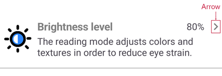
An Arrow indicates that a user can tap the form item to perform an action. Use the following properties to display the arrow and customize it:
- ShowArrow
- Specifies whether to show the form item’s arrow.
- ArrowColor
- Sets the arrow’s fill color.
- ArrowTemplate
- Specifies a template that configures the arrow’s appearance.
- ArrowMargin
- Allows you to set the gaps between the arrow and other form item elements.
- ArrowVerticalOptions
- Specifies how the arrow is positioned vertically. You can use the following options:
Fill,Center,Start, andEnd.
Example: Specify the Default Arrow’s Settings
The following markup customizes the default arrow’s settings for a Form Item:
<dxe:FormItem ShowArrow="True"
              ArrowColor="Gray"
              ArrowMargin="10"
              ArrowVerticalOptions="Center"/>
Example: Configure the Arrow Template
The following markup shows how to replace the default arrow icon with a custom icon:
<dxe:FormItem ...
              ShowArrow="True">
    <dxe:FormItem.ArrowTemplate>
        <DataTemplate>
            <dxco:DXImage Source="rightarrow"
                          WidthRequest="30"
                          HeightRequest="30"
                          TintColor="Coral" />
        </DataTemplate>
    </dxe:FormItem.ArrowTemplate>
</dxe:FormItem>
Separator
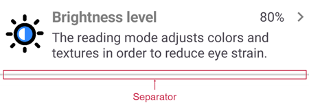
The Separator is a line that separates form items. The settings below allow you to show a form item’s separator and define its appearance:
- ShowSeparator
- Specifies whether the separator is visible.
- SeparatorColor
- Defines the separator’s fill color.
- SeparatorThickness
- Specifies the separator’s thickness.
<dxe:FormItem ShowSeparator="True"
              SeparatorColor="LightGray"
              SeparatorThickness="1">
Inline Content
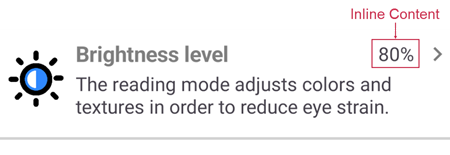
The form item displays Inline Content to the left of the arrow. Inline content can contain any image and/or text. Use the following properties to customize this element:
- InlineContent
- Specifies the content of a form item’s inline content.
- InlineContentTemplate
- Defines the template that specifies the appearance of the inline content.
The example below shows how to create a template that changes the text color for inline content:
<ContentPage.Resources>
    <DataTemplate x:Key="inlineContentTemplate">
        <Label Text="{Binding}" TextColor="#999999"/>
    </DataTemplate>
</ContentPage.Resources>
<ScrollView>
    <VerticalStackLayout>
        <dxe:FormItem ...
                        InlineContent="60 Hz"
                        InlineContentTemplate="{StaticResource inlineContentTemplate}"/>
    </VerticalStackLayout>
</ScrollView>
Custom Content
You can show any content in a form item. Use the following properties to specify the content and configure its appearance:
- Content
- Specifies the form item’s content.
- ContentTemplate
- Sets the template that configures the content’s appearance.
The following example shows how to create a form item with custom content:

<dxe:FormItem ShowSeparator="True" Padding="10,20">
    <dxe:FormItem.ContentTemplate>
        <DataTemplate>
            <Frame BorderColor="Gray" BackgroundColor="#20606060" CornerRadius="10">
                <VerticalStackLayout>
                    <Label Text="Need other settings?" />
                    <Label Text="Font settings" TextColor="CornflowerBlue">
                        <Label.GestureRecognizers>
                            <TapGestureRecognizer Tapped="TapGestureRecognizer_Tapped" />
                        </Label.GestureRecognizers>
                    </Label>
                    <Label Text="Status bar settings" TextColor="CornflowerBlue">
                        <Label.GestureRecognizers>
                            <TapGestureRecognizer Tapped="TapGestureRecognizer_Tapped"/>
                        </Label.GestureRecognizers>
                    </Label>
                </VerticalStackLayout>
            </Frame>
        </DataTemplate>
    </dxe:FormItem.ContentTemplate>
</dxe:FormItem>