.NET MAUI Form Items - Single and Multiple Selection
- 2 minutes to read
The FormListPickerItem control allows users to select and display a single item or multiple items.
Single Item Selection
The FormListPickerItem control shows a single selected item as the inline content to the left of the arrow:
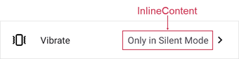
You can use InlineContent and InlineContentTemplate properties to customize the appearance of a single selected item. To hide the selected item, set InlineContent to {x:Null}.
Multiple Item Selection
If you want to select multiple options in the picker, set the IsMultipleSelectionEnabled property to true. Multiple selected items appear as tokens:
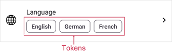
Use the Content property to specify content for the selected item placeholder. The ContentTemplate property allows you to customize the appearance of selected items. To hide selected item tokens, set Content to {x:Null}.
The following example shows how to use the Content property to show selected items as a single text line:

<ContentPage.BindingContext>
    <local:SettingsViewModel />
</ContentPage.BindingContext>
<!--...-->
    <dxe:FormListPickerItem ...
        Content="{Binding Blacklist, Converter={helpers:BlacklistCollectionConverter}, Mode=TwoWay}"/>
using System.Collections.ObjectModel;
using System.Collections.Specialized;
using System.ComponentModel;
using System.Runtime.CompilerServices;
using System.Windows.Input;
namespace FormItemExample;
public class SettingsViewModel : INotifyPropertyChanged {
    public SettingsViewModel() {
        //...
        Blacklist.CollectionChanged += OnBlacklistCollectionChanged;
    }
    public ObservableCollection<string> Blacklist { get; } = new();
    void OnBlacklistCollectionChanged(object sender, NotifyCollectionChangedEventArgs e) {
        OnPropertyChanged(nameof(Blacklist));
    }
}
public class BlacklistCollectionConverter : IValueConverter {
    public object Convert(object value, Type targetType, object parameter, CultureInfo culture) {

        if (value is IList<string> contacts) {
            return String.Join("; ", contacts.Select(x => x));
        }
        return String.Empty;
    }
    public object ConvertBack(object value, Type targetType, object parameter, CultureInfo culture) {
        return null;
    }

}
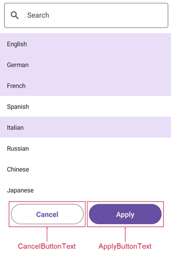
If a picker allows multiple selection, it displays Apply and Cancel buttons. To change button captions, use ApplyButtonText and CancelButtonText properties.
Picker Modes
The PickerShowMode property specifies how to show picker content: in a page, popup, or bottom sheet.

You can use the PickerTitle property to define the picker header.
Initially, the picker shows a search box to allow users to filter available options. You can use the ShowSearchPanel property to hide the search box.
Access Selected Items
Use the properties below to obtain single or multiple selected items:
To customize selected item appearance in the picker list, use PickerSelectedItemBackgroundColor, PickerSelectedItemTextColor, and PickerSelectedItemTemplate properties.